HOME | DD
 chromaphobia — field depth

Published: 2004-12-17 16:49:38 +0000 UTC; Views: 1407; Favourites: 16; Downloads: 181
Redirect to original
Description
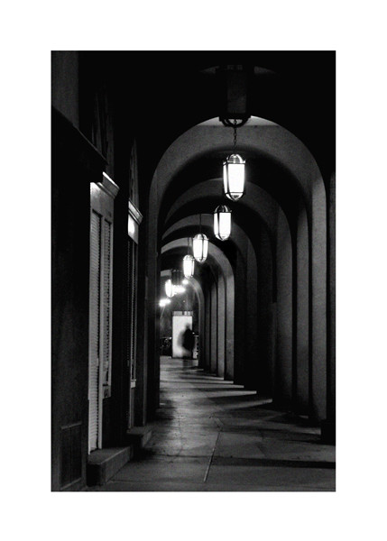
U-Bahn 8 - Berlin--
Manipulations:
- gradient map (only the green tones, reds are original)
- constrasts
Related content


Comments: 17

The colors are great. The lighting is wonderful.
Another definite fave.
👍: 0 ⏩: 0

great great great beautiful
and again: great great great beautiful
no, it's really great.. I like the colors, lights, contrast, people..everything...
")
 (Wink)")
👍: 0 ⏩: 0

Very nice photo, I like the perspective that you have used. Orange and green look good together.
 (Smile)")
👍: 0 ⏩: 0

dass sie jetzt überall Werbefernsehen in den U-Bahnen installieren, ist mir manchmal schon ein graus.
aber zugegeben - sie aber eigentlich die ganze Farbgebung und Perspektive macht schon was her ..
👍: 0 ⏩: 1

das stimmt, und die dämlichen bz nachrichten sind auch für den a... llerwertesten...
kuhles bild trotzdem
👍: 0 ⏩: 0


Jolie photographie. J'aime beaucoup l'angle.
Les couleurs sont vivante et perçantes, j'aime beaucoup.
👍: 0 ⏩: 1


brilliant!
I'm a sucker for this certain colour combination + noise....just too beautiful and stylish!
+fav
👍: 0 ⏩: 1

They should have done the matrix sequels like this, nice and gritty and urban.
👍: 0 ⏩: 0


Wicked angle and colour!! I love how the figures are not all clear. Its like some twisted never ending tunnel sort of thing. I really like its abstract reality appeal.
👍: 0 ⏩: 0

oooooo really like this one. the orange on the roof contrasts well with the green, and i like the fact that the people are pretty faceless, infact difficult to see but you know they are there. great perspective aswell, the carridge almost looks never ending
👍: 0 ⏩: 0
