HOME | DD
 clackographix — Minimalistic Webdesign
Published: 2010-10-24 21:19:20 +0000 UTC; Views: 6318; Favourites: 46; Downloads: 182
Redirect to original
Description
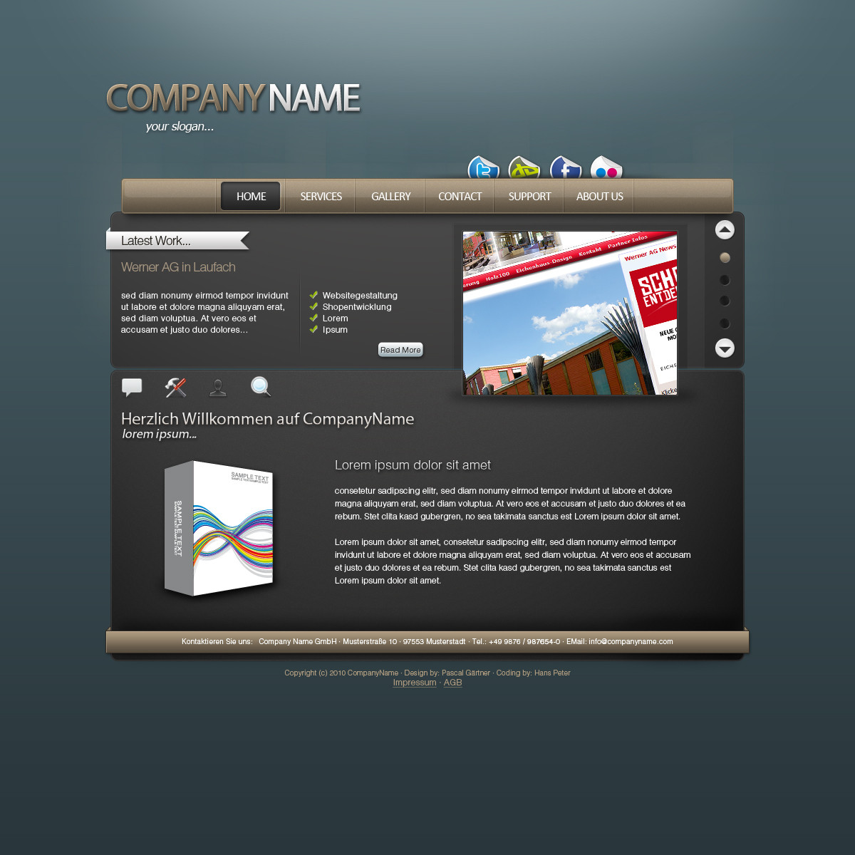
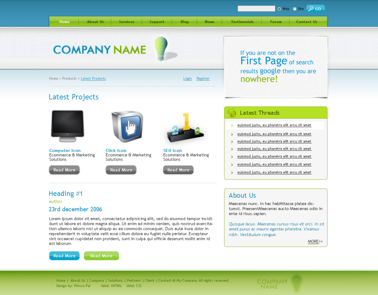
Minimalistic Webdesign by clackographix
Socialize Icon by dryicons.com
- Finished the navigation including a mouseover effect
- Added a weak noise effect to the navigation
Thanks for C&C & Favs.
Related content


Comments: 13


It is indeed a minimalistic webdesign. Colours and Typo work perfectly together, a nice colour scheme; the only weak spot in my opinion is - despite the menitioned shadow issues - the slideshow navigation on the right. I'd like the arrows and bullet points closer to the images sliding, looks like a page scrolling rather than a navigation for slides.
Cheers.
👍: 0 ⏩: 1

Thanks for your comment. I really appreciate it.
👍: 0 ⏩: 1

Well I wanted to add a critique but forgot that I didnt have full DA access!
So Ill write a short one here:-
I love the layout of this design, it feels great and can be used for a great many things. I particularly like the social networking icons added at the top, hopefully these will have some small animation with them.
The background is simple, but crisp and clear and keeps the user focused on the details on the main of the page rather than creating too much eye candy and confusing the user.
The only minor criticism about it that i can see is the menu buttons are a little old hat and clunky, and product images and photos could have the more modern reflection treatment given to them rather than just a simple shadow. The current shadow in the top right is from the wrong direction in comparrison to the lighting in the ramp on the background and buttons. Finally the shadow also doesnt reach the whole of the sides of the photo on the right, stopping at around 3/4 length with a bottom shadow as well.
This is a great design and if it came in an easy to customise pacakge I would jump at the chance to use it.
Great work, keep the inspiration coming!


👍: 0 ⏩: 0

Thanks, I'm very pleased to hear that.
👍: 0 ⏩: 1
")


I like it  (Smile)")
👍: 0 ⏩: 1
Thanks. Glad you like it.
👍: 0 ⏩: 0