HOME | DD
 ClaireJones — Robin - Coloring Exercise

Published: 2006-01-16 00:40:08 +0000 UTC; Views: 610; Favourites: 18; Downloads: 22
Redirect to original
Description
Go here for the updated version with the better hair: [link]Painting/color manipulation in Photoshop Elements 2.0 and touchups/color correction in GIMP.
Instead of writing as I had planned, I spent much of yesterday painting a scan. There were additional touch-ups today.
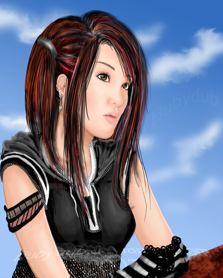
Another fanart of Robin Sena from the anime Witch Hunter Robin. I was going to do Al from Last Exile, but after I started, I realized I didn't know what colors were present in her dress. There's much less detail in Robin's face this time and I'm not too happy with the hair since I used a new technique at the wrong time. However, I wasn't so unhappy that I was willing to spend another couple of hours redoing it. In fact, I had lost so much interest in this piece that I kept the original scan lines. I'm hoping it adds a different element to the piece instead of detracting.
 But this is a shading/coloring exercise and not perfection.
The original drawing is based off of a DVD cover and the first sketch I had done which actually looked like Robin.
EDIT: Oh yeah, forgot to mention that I didn't use any references for shading, so if something looks off, that's why.
EDIT 2: Yeah, I know the mouth and nose suck. It was a logistical problem that doesn't show up on the sketch. Remember, this was the second real digital painting, so that should explain some things as to why the painting sucks in general.
Related content


Comments: 28

wtf? what's this doing in ur scraps? This is so kewl! Anywayz, I like what I see, so keep it up... or else

👍: 0 ⏩: 1

This is me not being able to take criticism, so...I stopped drawing and scrapped my work. I was so proud of this piece when I first uploaded it, but I stick with fractals for my art now.
👍: 0 ⏩: 1
well, criticism is a good thing cuz it helps inprove ur work... for example, if you compare my second deviation to my eleventh deviation, you would see a great difference
👍: 0 ⏩: 1
It just makes me depressed. 
👍: 0 ⏩: 1
well, I got pissed off when someone critiscised my deviation Chihoon, but after that, I learn that I need to get over it cuz it's for my own good
👍: 0 ⏩: 0

I really like this one Very nice texture to the leather jacket. and the strands of hair on the sides are a nice touch.
Crit however
The nose seems too low and flat. Try to bring it out a little. the fading cut off effect is nice however I think i'd like to see more of her heh ^.^
👍: 0 ⏩: 1
Thanks for stopping by.
This was the first sketch I had done of the character that looked right and it was based exactly off of the DVD cover - cutoff and all (that was as much as I could handle at the time). I did actually do a graphite headshot version later: [link]
I already pointed out the problems with the nose (and mouth) in the description. That's why this is in scraps and I no longer draw.
👍: 0 ⏩: 0

I like the concept and the composition for this one. The mood is also set very well with the colors. Nice work. ^^
👍: 0 ⏩: 1
Thanks for the comment. 
👍: 0 ⏩: 0

Some parts look a bit misproprtioned, but over-all, your work is really nice...
The mouth also looks weird though...
I'm sure you could do better!
 (Smile)")

👍: 0 ⏩: 1
This was the first serious fanart I ever did and completed about a month after I started really drawing. Before, I had stuck with geometric shapes and inanimate objects. Since this was a coloring exercise, I focused on the shading and not on the line art, which is why I didn't bother to do anything with the outline.
Besides the nose and mouth, what else looks off? I had thought that I had gotten everything else about right. Aww man, this makes me just want to stop drawing. I've never been that great of artist.
👍: 0 ⏩: 1
Hey, its okay...
I really suck at coloring...
And sometimes the bodies of my characters are so unproportioned...
You can see that in my gallery...
The comics you see there are the ones I made last year...
It's been like six months since I've actually got the drive to make comics...I'm starting all over again, ya know, so I could correct my mistakes... I used to be so paranoid about people seeing my mistakes, but hey... I guess no one's really perfect...
And you ARE a great artist... Not everyone can do Digi-Art, and that's something...

👍: 0 ⏩: 1
Unfortunately, not good enough...
👍: 0 ⏩: 0

the line arts are a bit arkward and not clean and some parts do not fit to the style of the rest e.g. the mouth and nose
👍: 0 ⏩: 1
I know, the mouth and nose didn't turn out as I had expected. I wanted to keep the original placement and lines, but there were some logistical reasons why I couldn't do that. Oh well, it's just a practice piece.
Now the lines are from the original drawing and since it's a sketch, they're a bit messy. As I was focusing on the coloring aspect and not the work as a finished piece, I didn't create line art like I usually do. Although, you do have to take into account that I've only been really drawing on and off for about 5 months, so I have quite a bit to learn still. ^^:
Thanks for commenting.
👍: 0 ⏩: 1
Thanks for the fave!
I loved how well the shirt came out, but I really should have redone the hair. I just lost interest too quickly. I'm quite surprised that digital painting is a lot easier than I expected. LOL. That's a good thing for me.
👍: 0 ⏩: 1

it's so much fun though, isn't it?
👍: 0 ⏩: 1
Yes! I think I like painting much better than drawing.
👍: 0 ⏩: 0

very nice, love the cropping, and how soft the lips are
👍: 0 ⏩: 1
Thanks.
The cropping comes mostly from the quick resize I did since I wasn't too concerned with how the details because this was just a practice endeavor. LOL, her mouth was the one part I just couldn't get right and I was disappointed after how well I had done with the first Robin painting. Well, anyway, thanks for taking the time to stop by.
")
👍: 0 ⏩: 1

Thanks.
Once I gave it a try, digital painting has been much easier than I expected. Surprisingly, I find it easier than cel shading.
👍: 0 ⏩: 1

I did some basic coloring with photoshop, buts its nothing more the filling in color.. i liked it, but its not the same as what you have here
👍: 0 ⏩: 1
I was really surprised at how much easier shading was than I had initially thought. Start out with dodging and burning to get a feel for it, then work up to painting with color. After that, commence with the smudging.

👍: 0 ⏩: 1

👍: 0 ⏩: 0