HOME | DD
 Claytonneko — OneNight2
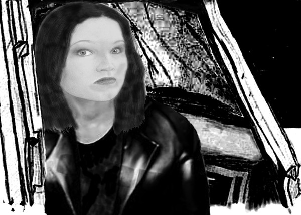
Published: 2007-02-13 00:58:16 +0000 UTC; Views: 152; Favourites: 1; Downloads: 0
Redirect to original
Description
I altered the background to be slightly darker and less pencil-like. I still don’t want to go to the same graphic quality of backgrounds as actual characters. Let me know if this works any better.Related content


Comments: 4

I works alot better! Thank you for considering my suggestion! ^^
👍: 0 ⏩: 1

Thanks. I’m glad you like the refurbished pic. Thanks again for the suggestion. I think you were right about the pencil lines clashing with the computer color black.
👍: 0 ⏩: 1
