HOME | DD
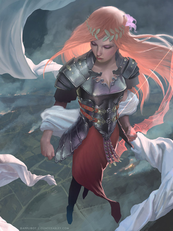
 ClintCearley — Lady Paradoxia - Stages

Published: 2012-12-06 03:23:34 +0000 UTC; Views: 35641; Favourites: 1149; Downloads: 1353
Redirect to original
Description
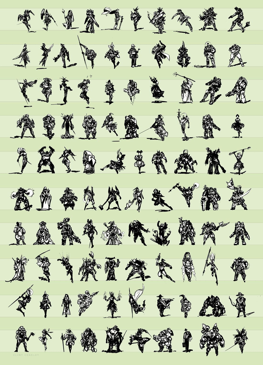
TFsean requested to see the creation process of Lady Paradoxia which reminded me that it's been a long time since I posted such a piece. So here's a twelve stage breakdown of the creation with basic notes. CheersDownload for Full-size
Related content


Comments: 51


Can you please tell me what type of Graphic Tablet you have been using for your artworks? Thank you very much.
👍: 0 ⏩: 1

I use a Wacom Bamboo with the live surface area of 7x10. I picked mine up at the local electronics store Best Buy for under $200.
👍: 0 ⏩: 0

How do you go from monotone to the basic colors?..
👍: 0 ⏩: 1
I actually have a video on that very topic, watch it at [link] .
👍: 0 ⏩: 1
Thankyou
I was able to grasp what you were getting at in the video but I don't have photoshop unfortunately..
Any other tips I should know about though?
👍: 0 ⏩: 0


How did you get involved with Applibot? They contact you out of the blue? What did they ask for? How much back and forth was there before the image was accepted? More work in the pipeline?? Cheers
👍: 0 ⏩: 0

assuming you use a table/wacom.. when doing the monochrome tone part, is it a pressure sensitive painting style? or is it, select a dark grey for the cool area then switch to a light grey for warmer area (etc.)? same question for the basic color part as well if you could. i'm led to think since it as such a realistic color feel to it, it seem like the first one.. ha So Intense
like Magic Card art, but better.
👍: 0 ⏩: 0

I've always had a problem painting out the line art. Do you have a quick advice on ditching the line art without ruining the dimensions of a subject in the drawing?
👍: 0 ⏩: 0

I fell in love with this piece, so I'm happy you posted a process! Thanks for being awesome and answering to everyone's comment, not a simple task..
I do have a few questions.. when you mask areas off, how detailed do you get? (For example metal stuff will sub-layers for highlights or reflections..)
And what's the ratio between painting and using Photoshop-y stuff such as adjustment layers and all that for you?
thankss
👍: 0 ⏩: 0


This is awesome!
I do have a question though, if that's ok: In going from monochrome to colors, how would you get warm lights/highlights? When painting skin I usually like my lights to be warm and my darks to be cool. Whenever I try adding color to black and white, the lights will stay white, not the bright saturated version of my color choice. As in, my colors don't have warm/cool variation. Normally I just have to saturate the bright areas on my own, but it's such a pain.
I hope my question wasn't too jumbled.
Also, by metal textures, do you mean that you just painted the metal, or that you used texture overlays and painted over those?
👍: 0 ⏩: 1
I may be misunderstanding your question and if so feel free to rephrase but let me take a jab at it.
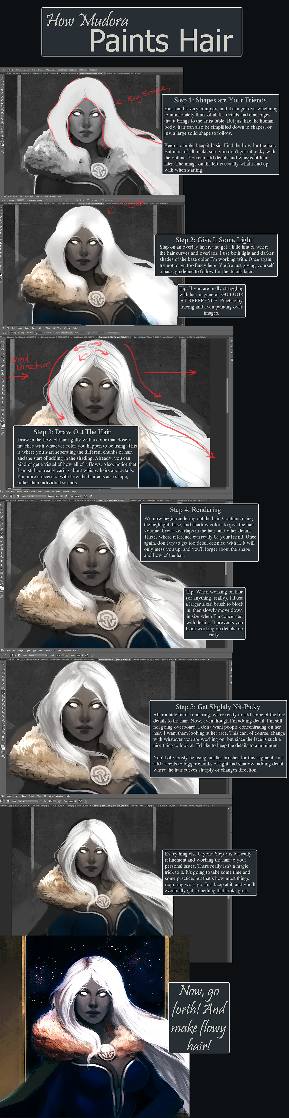
When I move from monochrome to color I do so using a Color layer over my greys. The Color layer will only adjust the chroma and saturation of anything beneath it but it will not adjust its value (how light or dark it is). It is at this point that you can encounter an interesting problem, I believe the same one you speak of as "the lights will stay white". White and black are both very cool colors (temperature-wise) and have no capacity to carry chroma to be warm. It doesn't matter if you put straight orange on a Color layer over white, the white will remain a cool color because color requires some amount of darkness and white has none. That's why the most saturated colors are midtones, anything lighter will start removing chroma and anything darker will dilute it with black. To get around the problem you have to paint the lights a bit darker so the color added later will have some value to carry the chroma.
I meant that at the "metal textures" stage I simply painted the elements made of metal, I used no texture overlays.
Let me know if that answers your question.
👍: 0 ⏩: 1
Perfect answer, I was wondering myself if going too white was the problem. thanks a lot for the advice, and the quick reply!
👍: 0 ⏩: 0


did you paint the monochrome, or did you grayscale the basic colors? Just curious!!
👍: 0 ⏩: 1
I actually painted it in grey tones first then added the color via a Color layer afterwards.
👍: 0 ⏩: 0

Thanks for this man!  (Smile)")
👍: 0 ⏩: 1
I believe I used Colors layer in this case which is my usual but I do use Overlay sometimes.
👍: 0 ⏩: 1

Great work. I love the action. It´s nice to see all these steps.
👍: 0 ⏩: 0


She reminds me of impa, from legend of zelda! nice inspiration, thanks for sharing!
👍: 0 ⏩: 0

Way cooler when her left leg was showing in the beginning process
👍: 0 ⏩: 2
no way, he made the right call.
👍: 0 ⏩: 1
I see your point of view but I would have to disagree because if you notice now the image does not justify the reason why the rest of her Left leg is not at all visible behind her Right leg in that angle. It just looks off that's all. I do like the work overall but I think it would have benefited more from sticking to the original idea.
👍: 0 ⏩: 2
I had to really give some thought on this very topic. In the end, the first pose was found to be too anatomically ridiculous. The shoulders and hips are almost opposite directions and it could easily appear that I screwed up the anatomy. I decided to change it to something more believable. The second pose is accurate with the way the back leg is largely hidden by the front leg, I did find reference for that.
I may have been able to pull off the first pose but if it didn't work then there would be a ton of reworking and time wasted. Sometimes you have to choose to go with something a bit simpler that you know you can accomplish on a deadline.
👍: 0 ⏩: 1
Yeah that's fair and makes a lot of sens. Working with a deadline changes the whole dynamic of the process of making a piece because you gotta get the best results possible in a specific amount of time. And with your skills I never doubted that you could have pulled off the whole thing with both legs showing naturally hence why I wanted to point out that potential aspect of your work from the start.Could be nitpicking at this point but either way great job
👍: 0 ⏩: 0
Well yes, It's true that in the final version the left leg is not as described, but I believe it was a sacrifice made in order to maintain a strong composition. In the final version there is a strong sense of shape in the legs. The straight lines of the angles contrast the surrounding rounded contour of the skirt very well and pull the viewer back to what was intended to be the main focus. Also I think it helps her anatomy come off as less confusing.
not that it matters, I just like thinking about these kinds of things. haha
👍: 0 ⏩: 1
Yeah I agree, you always wanna keep what was intended to be the main focus. I just always like to focus on a work from all angles and see all the components of it from top to bottom. It's mostly hard on me'cause I tend to analyse my own work that way lol
👍: 0 ⏩: 0

haha i was thinking the same thing. made the pose more dynamic. but to each their own
👍: 0 ⏩: 1
Yep I agree it made the pose a lot more dynamic.
👍: 0 ⏩: 0

I wonder what is the "painting out sketch lines" stage!... is it when you merge outline with the painting?...
👍: 0 ⏩: 1
I try to avoid merging the two for as long as I can, the heavy blackness of the lines would affect the edge work and color temperature of the colors. Instead, I apply a Mask to the lines layer and mask out the areas that I no longer need the lines as a guide for. I also begin painting on a new layer above the lines which becomes my main painting layer.
👍: 0 ⏩: 1
I understand. Normally i try to put the line in grey or a darker tone of the color below... but i continue not liking my paintings result. I'll try your way next time
👍: 0 ⏩: 0

This is marvelous!
Do you keep any of the outlines a bit darker when you go over the sketch lines or is that not necessary?
👍: 0 ⏩: 0
While this isn't for MTG, you can search Magic's site and somewhere there is an email listed for art submissions. Just send them a sample of your work and a cordial message expressing interested in working with them.
👍: 0 ⏩: 1

much appreciated ty
👍: 0 ⏩: 0

wow this is awesome. I play legend of the cryptids and I have always been amazed by the quality of the artwork.
👍: 0 ⏩: 0

Thanks for putting this up, it's great to see your process ")
👍: 0 ⏩: 0

Cool, how long does this whole process take you, including the character design sketches?
👍: 0 ⏩: 1
This was my primary project for about two weeks. I was also quite ill at the time so that may have slowed me down some.
👍: 0 ⏩: 0

This was my primary project for about two weeks. I was also quite ill at the time so that may have slowed me down some.
👍: 0 ⏩: 1

it does look like a lot of work, thanks for answering
👍: 0 ⏩: 0


Awesome! It's great to see a process of your work!
👍: 0 ⏩: 0