HOME | DD
 ClockworkShrew — Style Tryouts Results
Published: 2012-01-29 19:27:42 +0000 UTC; Views: 1190; Favourites: 45; Downloads: 16
Redirect to original
Description
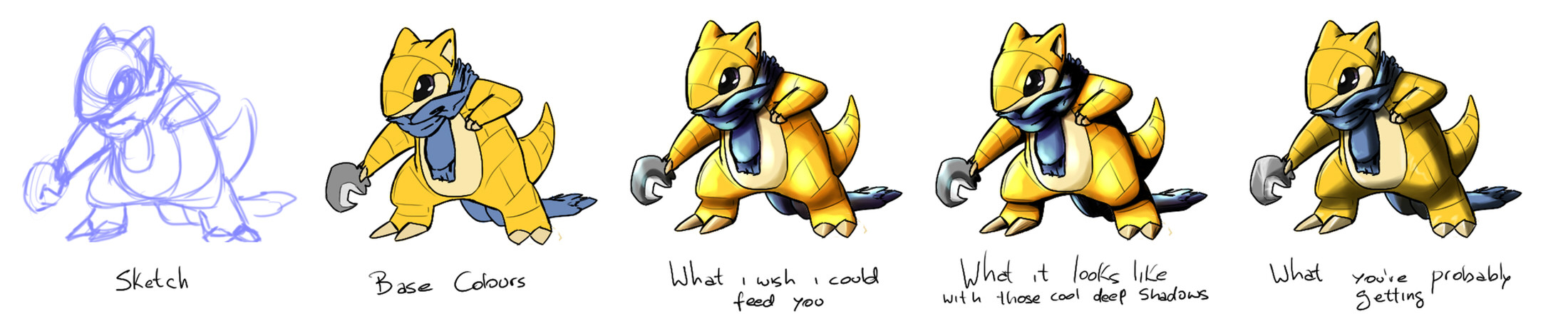
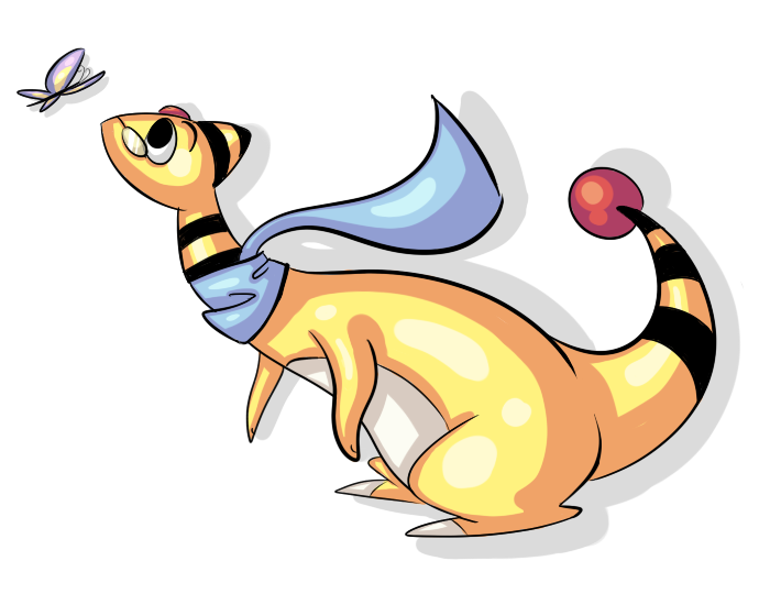
End result of these last few days of trials. I'm going to play with the brushes a little more, but this is what you'll get if i don't have any breakthroughs in the next few days.Related content


Comments: 13

What you wish you could feed us but cant because of time.
Still, it looks amazing. I personally prefer the one you like best too.
But heh, they are all AWESOME.
I'm really digging your style.
👍: 0 ⏩: 0

............XD I love the labels there. I'm looking forward to it. ;d
👍: 0 ⏩: 0

no se porque, pero la verdad al ver el de mas a la derecha se ve mejor.
talvez tenga que ver por poner mas enfasis la sombra en vez de iluminarlo tanto. tambien que con lo poco y especifico de las partes brillantes termina implicando la tridimensionalidad mejor que los del medio. y ademas de que parece darle mas personalidad. lo de la luz.
ah y tambien que la parte de adentro del item quedo mejor en el de la derecha que en los otros.
hope this helps
👍: 0 ⏩: 1

Si, la verdad es que lo pense, los reflejos en los del medio achatan el dibujo mas porque hay mucha transicion entre los colores, a diferencia del ultimo en el que el cambio es mas concetrado. Admito que la iluminacion del ultimo tambien me gusta mas.
JUST IN CASE ANYONE WONDERS, SPANISH IS MY FIRST LANGUAGE.
👍: 0 ⏩: 0

How do you do it, man? Seriously, this is amazing. A true inspiration! Plus, I love Sandshrew. So props for that
👍: 0 ⏩: 0


They all look great to me
but I think the deep shadow one looks the best because of the dark and light contrast
 (Smile)")
👍: 0 ⏩: 0

I love the base color version and the one we're probably getting, they just look so cooool~ haha
👍: 0 ⏩: 0

I'd say the one in the middle and the one on the end are my favs
👍: 0 ⏩: 0

I really like the deep shadows one, it really makes the colors pop out with a great intensity and the shadows makes it feel more life like and realistic, good work! ^^
👍: 0 ⏩: 0

i like the deep shadow one! it's super intense! awesome!
")
👍: 0 ⏩: 0

