HOME | DD
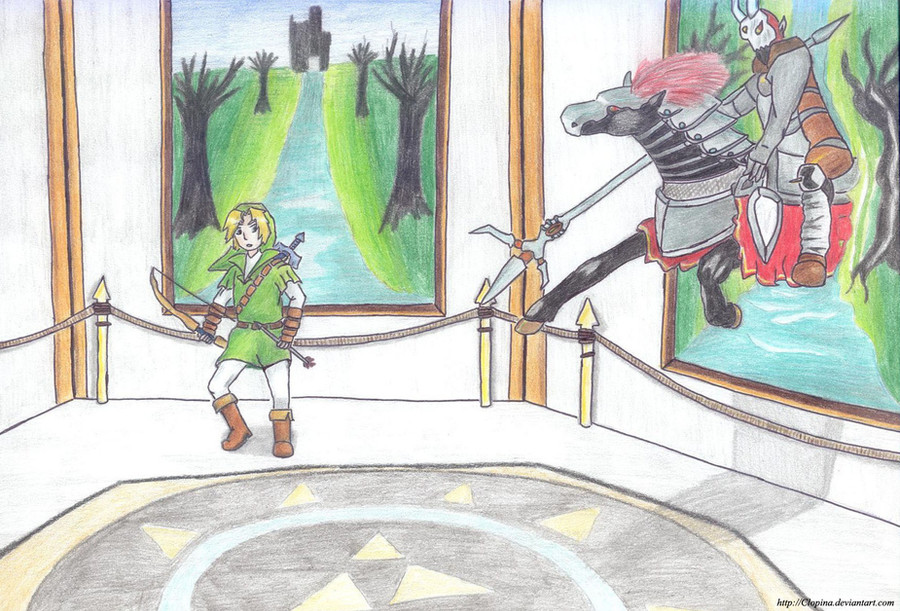
 Clopina — + Twilight and Time +

Published: 2009-02-07 21:19:09 +0000 UTC; Views: 4655; Favourites: 107; Downloads: 7
Redirect to original
Description
I've... finally... finished it. Too... tired... *dies*Huh
...
I guess this is the pic that took me more time to do (and to color ;___; ), but it is also the one I'm most proud of
I would be really happy to hear what to you think of it, it really means a lot to me
 (Smile)")
Time: 3 hours for the charcoal drawing - about 7 hours for the coloring
All Characters (Nintendo)
 Art (c) Me *Clopina
 Featured in:
[link] by =Tsaalyo
[link] by =khrisjuhlin
Related content


Comments: 100

Its a time paradox! History is making history! Thanks this is so good!
👍: 0 ⏩: 1

Good question XD
Actually Wolf Link was there because I wanted to mirror it with the Golden Wolf in OoT Link's side, but then I thought better of it. XD
👍: 0 ⏩: 1

So u skiped the golden wolf? oh I get it
👍: 0 ⏩: 1

It's nice! I like the look on Link's face and how you drew Navi!!
👍: 0 ⏩: 1


woot woot! I <3 the legend of zelda series. Especially Minda
👍: 0 ⏩: 1
")

Time well spent. this is kind of how I'd expect Link from two different titles to react when they see each other. Also, it's almost like a dark mirror. Love it
👍: 0 ⏩: 1

I especially like Navi! ^^
She's very well done!
Overall, the work is great.
I like it! ^^

👍: 0 ⏩: 1

Awesome! I love the color schemes you used for each, how Twilight is more orangey, autumn-colored, and the OoT picture has a greenish tint. This is so well-done, and you can only get better.
Great work. ^^
👍: 0 ⏩: 1


impressive! more like wow not much is coming to mind but i tell you, WOW!
👍: 0 ⏩: 1
ur welcome
its true i really have nothing to say but WOW
i really love the pic
👍: 0 ⏩: 1


You did a nice job of portraying the characters within their own, illusionistic space on the canvas; the shadows are a great help to that. The choice to make Link's tunic in the twilight duller than the other was also a nice decision. Good contrasts ")
👍: 0 ⏩: 1
Thank you so much 
👍: 0 ⏩: 0

man ur works are cute
i like ur stuff and ur love of LoZ

👍: 0 ⏩: 1


omg you color so pretty!! I am jealous!! >.< I love the backgrounds and Navi in particular. 
👍: 0 ⏩: 1
Awww thankies!
👍: 0 ⏩: 0


You've got a good start on these! I like the colors, and Midna's pose looks just right on the Twilight Princess pic.
A few things I hope might help...stance. Link's stance is slanted...if he were standing that way in real life, he'd be in danger of tipping over. I might suggest drawing the torso first...that's going to be the center of balance. Once you have the torso drawn in, then you can place the legs firmly underneath so that the figure is supported by them. (I hope this makes sense...I can do a redline picture if it will help.)
Second: his eyes...I know the anime style gives him big eyes, but I still think they're too big for his face...they look crowded. If you were to make them a bit smaller (on both pics) and a bit farther apart, I think that would even out the face. Also on the profile...the eye is too close to the front edge of the face. In a profile, the eye sits back farther, to give the illusion of depth. If you moved it back a little and down a little, that would help.
The shine on the hair looks pretty good, and you've made them fit well with their backgrounds. Best of luck!
👍: 0 ⏩: 1
Aww thank you so much for your long critique!
You mean TP Link's stance, right? I already tried to fix it, in the sketch it was even worse, but now that you make me notice that I see that it still isn't ok @__@
I still have the Photoshop file, so I should be able to fix it - I never did something like that before, but it sure won't kill me to try XDD
And thank you for the tip! It really was usefull, cause I've never thought of drawing the torso first. I'll keep that well in mind when I'll draw again
Oh yes... the eyes. I usually draw them too big @__@ Aw well, this sure will be easy to fix!
For the profile one, I must say that I didn't know that the eye has to sit back farther, thank you for telling me! :3
Thankies so much again, today I'll try to fix everything!
 (Wink)")
👍: 0 ⏩: 1
TP Link mostly, yes. Stances are NOT easy things, for sure!
Try going to [link] and looking up "portrait profile" and look at the eyes. Take one of the pics and put it in Photoshop, put a new layer on it, and trace the outline and the eye...then look at the line art without the original picture. That should give you an idea of where the eye sits.
I'm glad I could be of help, and good luck! : )
👍: 0 ⏩: 0


I don't know anything from nintendo games but I think your drawing is very good!
👍: 0 ⏩: 1
Hey thankies so much! I'm glad you like it

👍: 0 ⏩: 1
| Next =>