HOME | DD
 CloverGraphics — Caught Between

Published: 2010-08-26 22:13:14 +0000 UTC; Views: 488; Favourites: 9; Downloads: 16
Redirect to original
Description
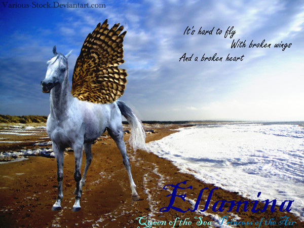
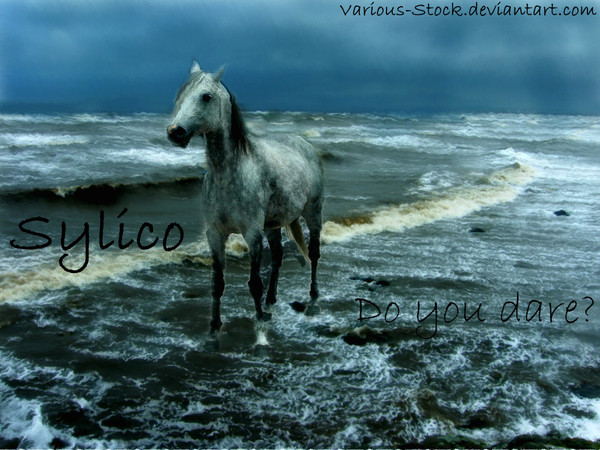
So the other day I was in an artsy mood so I looked through all of my WIP manips (there are currently about 8) to find one to finish and found this one, all ready with all three horses cut out and everything. The inspiration for this manip came from the song 'Good to You' by Marianas Trench featuring Kate Voegle. And for once, the finished product looked pretty similar to the idea in my head at the beginning.whatilike:
The mane and tail of the white horse; the tail is completely made from brushes and my own fail digital painting skills, and I changed the forelock and mane a bit too.
The tail of the brown horse, which I painted a bit too.
The text above the brown horses head
whatidontlike:
The shadows. They're icky and bad and ew.
The text under the brown horse. It kind of blends in with the ground and I couldn't fix it...
The sky. I had meant to find some cool sky stock that was stormy on one side and clear on the other but I was too lazy.
credits:
white horse: [link] by ~Jello88
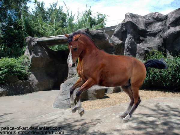
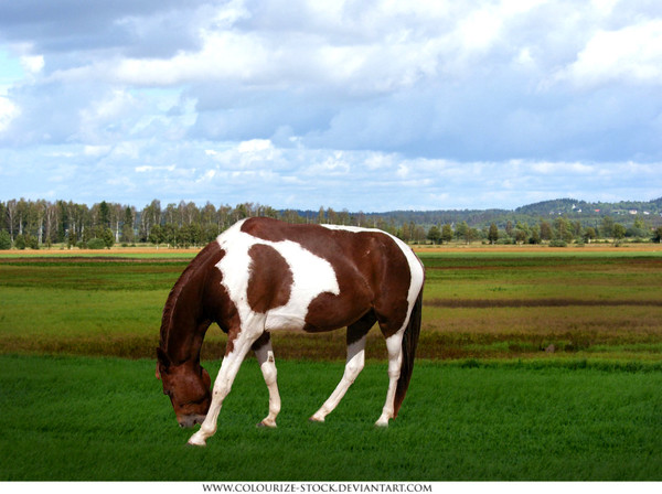
brown horse: [link] by ~Colourize-Stock
grey horse: [link] by *kittykitty5150
background: [link] by =night-fate-stock
brushes: [link] by =arrsistable
Related content


Comments: 7

")

I really like this. The changing scenes, horse poses, and colors really add to the overall effect. You did a great job on the cutting and painting, Thouhg if I may suggest for next time. make the bottom part of the tail have more shadows in it, so that it looks like the sun is shining on it. You did a fairly good job on the shadows the one on the brown horse could be a bit more faded. And the brown horses feet, ara bit more faded out than the other two. I actually like how the middle text is kind of faded into the background, shows how who you really are is fading away, the other two are more prominent. overall a wonderful piece.
👍: 0 ⏩: 1

 (Smile)")
👍: 0 ⏩: 1
you're welcome. glad I could help!
👍: 0 ⏩: 0

Great work! 
Very creative.
👍: 0 ⏩: 1
")