HOME | DD
 cluedog — Cursed Front Cover

Published: 2013-10-06 18:23:52 +0000 UTC; Views: 20318; Favourites: 119; Downloads: 334
Redirect to original
Description
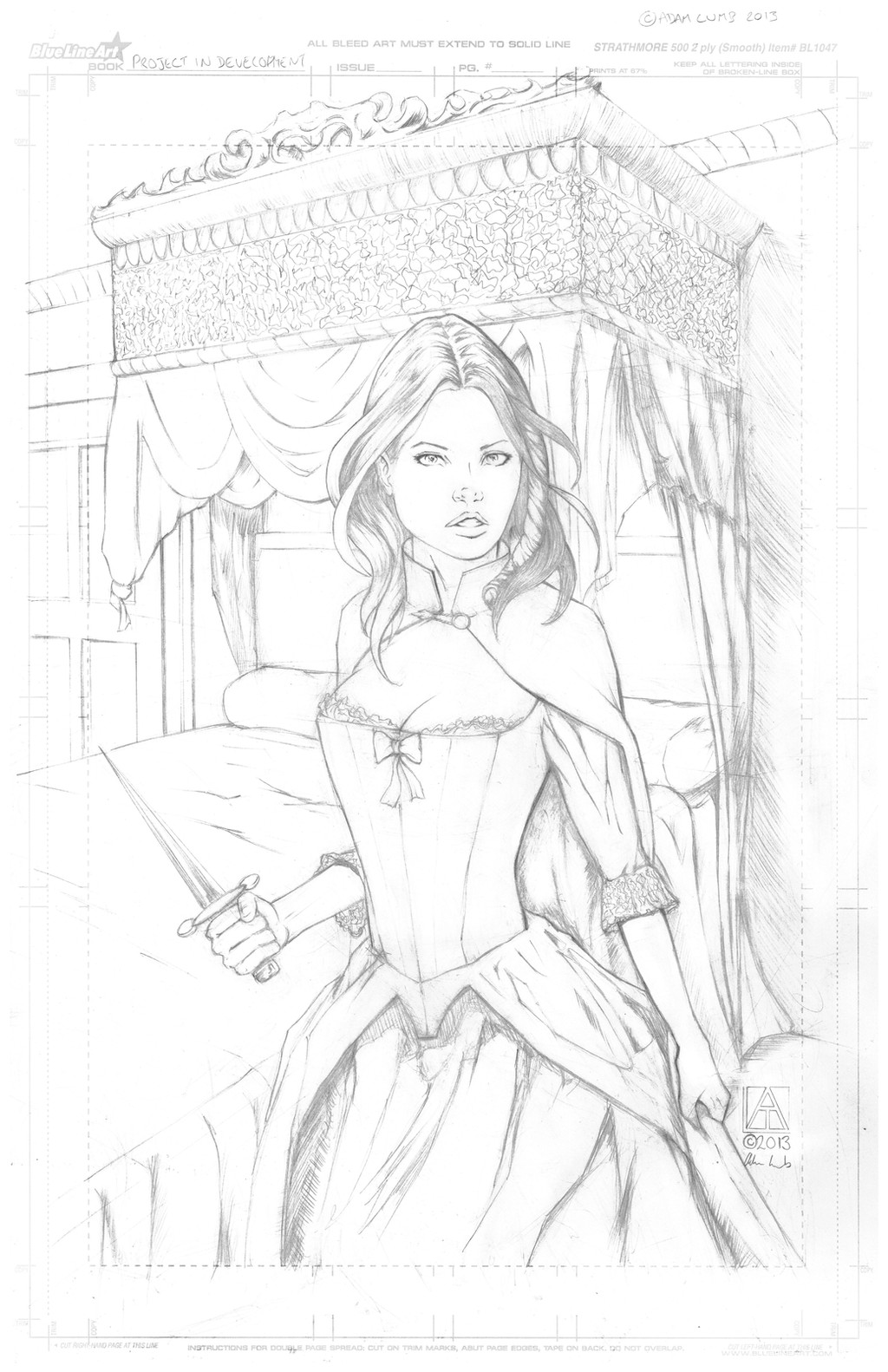
Here's an alternative cover for the "Cursed" comic I'm working on. I'm still not sure I'm going to use it. The funny thing is I'm never entirely happy with what I produce. (Smile)")
What do you folks think? The logo is tentative and this will probably be colored later, if used.
Earlier version of cover:
Related content


Comments: 75


I hope people will really enjoy the story.
👍: 0 ⏩: 1

I like the first one better. This is good stuff, but the first one is more subtle with a better punchline - it takes a moment to hit you with the "wait, what?"
👍: 0 ⏩: 1
I really appreciate your honesty. I agree that the original had more of a punch but the logo really bothered me and the composition didn't seem particularly interesting to me. Of course, I'm not entirely happy about this cover, either, but there is a point where I'll need to draw a line in the sand and just keep moving on.
👍: 0 ⏩: 1
Fair points, I suppose, but the composition not being particularly interesting/dynamic is what allows it to to take a moment to sink in - it's not immediately drawing your attention to the focal point of the gag. I think there's something to be said for subtlety here.
But, well, your comic.
👍: 0 ⏩: 1
Thanks. I really appreciate your opinion and feel what you're saying does have validity.
👍: 0 ⏩: 1
Thanks for letting me shoot off my mouth about it
👍: 0 ⏩: 0

Hmm. I definitely like the new logo better, it's more balanced. I like the little guy in the background. I liked the theme of the previous cover better, not sure why - maybe there was more going on and more emotions, maybe because boobs on a cover don't faze anyone (and should not, I guess) but a scene is a loo is some unexpected cover material.
I guess both covers have their upsides and downsides. And I know that feeling of rarely being completely happy with whatever you do so just figure out what makes you feel better.
👍: 0 ⏩: 1
Thanks! I went through a lot of versions of this cover and finally settled on this one. The bathroom cover hits the theme of the comic better but it struck me as bland and the logo was too busy (although I liked the monsters hovering over the logo). I sense in you the same conflict I suffer and that's when to walk away and be satisfied with what you're producing. I've never been a confident creature and have a perfectionist streak that makes happiness about my work quite difficult. I'm rather surprised I got through four issues of "Opey the Warhead".
👍: 0 ⏩: 1
Yeah, inner perfectionists are such bastards... Personally I spent the last week or two swamped with work and then setting up a new computer so today is the first change I got to work on my comic in a while and it feels so weird. Like I used to be so close and now I'm so distant. Not in the "it doesn't interest me" sense thankfully, more like... I don't feel the usual awkwardness I feel when I see my own work, it's like somebody else scripted and drew this. This might be a start of something new. Does this ever happen to you?
👍: 0 ⏩: 1
I wish I could get rid of the awkwardness I often see in my work but I don't experience it much. I often wince at my own work, even when I've walked away from it for some time. I keep drawing onward, though.
👍: 0 ⏩: 0

Ok...here's how I see it. This cover seems like it...well...covers...more of the main characters and more important pieces of plot. The original gets the general idea across...but in the original, I'm guessing guy gets turned in to a girl. The imps at the top give the impression that they are responsible.
This one, there is a lot more going on, and I just feel like it alludes to more of the story.
But I like the simplicity of the bathroom shot in the last one. The two guys on the sides really help drive the point home. Artistically, it makes the point...I feel like you really reigned in your point on the transformation.
But beyond first glance,I'd need to know more about the story before I decide which one suits it best.
👍: 0 ⏩: 1
Thanks for your thoughts about the cover. The original cover struck me as a little bland but I think you're right. It did highlight more of the gender change that happens in the story. I prefer this one, though, because it is more dynamic.
👍: 0 ⏩: 0

Hey lady, you got your Solid Snake kinda hanging out of your boxers on the side there.
👍: 0 ⏩: 1
Glad it's recognizable.

👍: 0 ⏩: 0

Thank you so much! I thought it would make a nice humorous touch. It was a hoot coming up with all the different smileys.
👍: 0 ⏩: 0

From a design perspective, this one is a lot better than the other and introduces more elements of the story to make me curious and want to pick it up off a shelf
👍: 0 ⏩: 1
Thank you for your comment. I prefer this one myself. The earlier version struck me as a little too bland.
👍: 0 ⏩: 1
The demons and monsters sitting around and behind the logo/title was the only thing about that first cover that really stood out. Perhaps you could incorporate that into the newer cover?
Or do you think that would clutter the new cover too much?
👍: 0 ⏩: 1
I suspect it might clutter the new cover too much, though I really liked drawing those little beasties.
👍: 0 ⏩: 1
I would love to see more of them! Makes me think of the Darklings or Gremlins.
👍: 0 ⏩: 0
<= Prev |