HOME | DD
 Cmyll — Number 7 and more

Published: 2010-08-19 18:28:13 +0000 UTC; Views: 1043; Favourites: 18; Downloads: 17
Redirect to original
Description
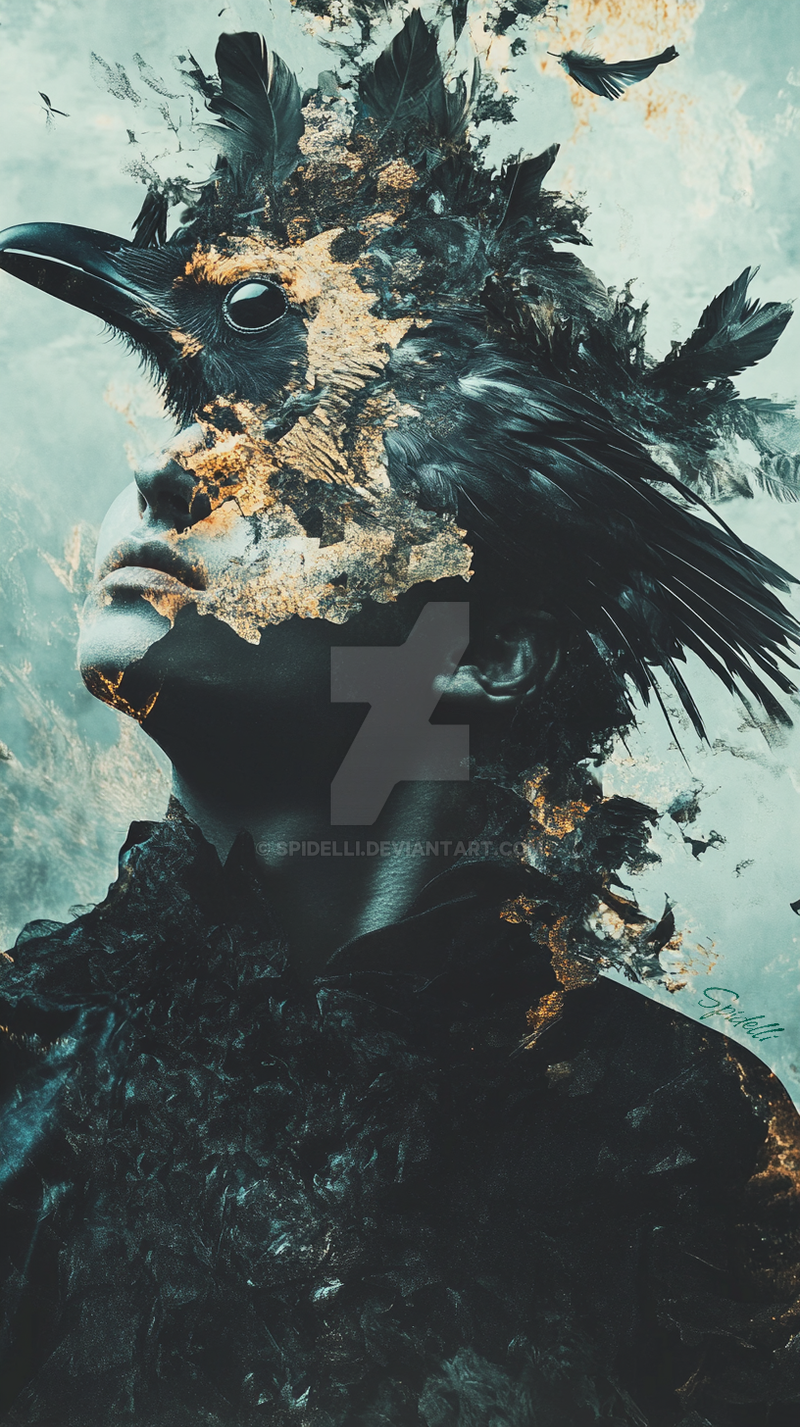
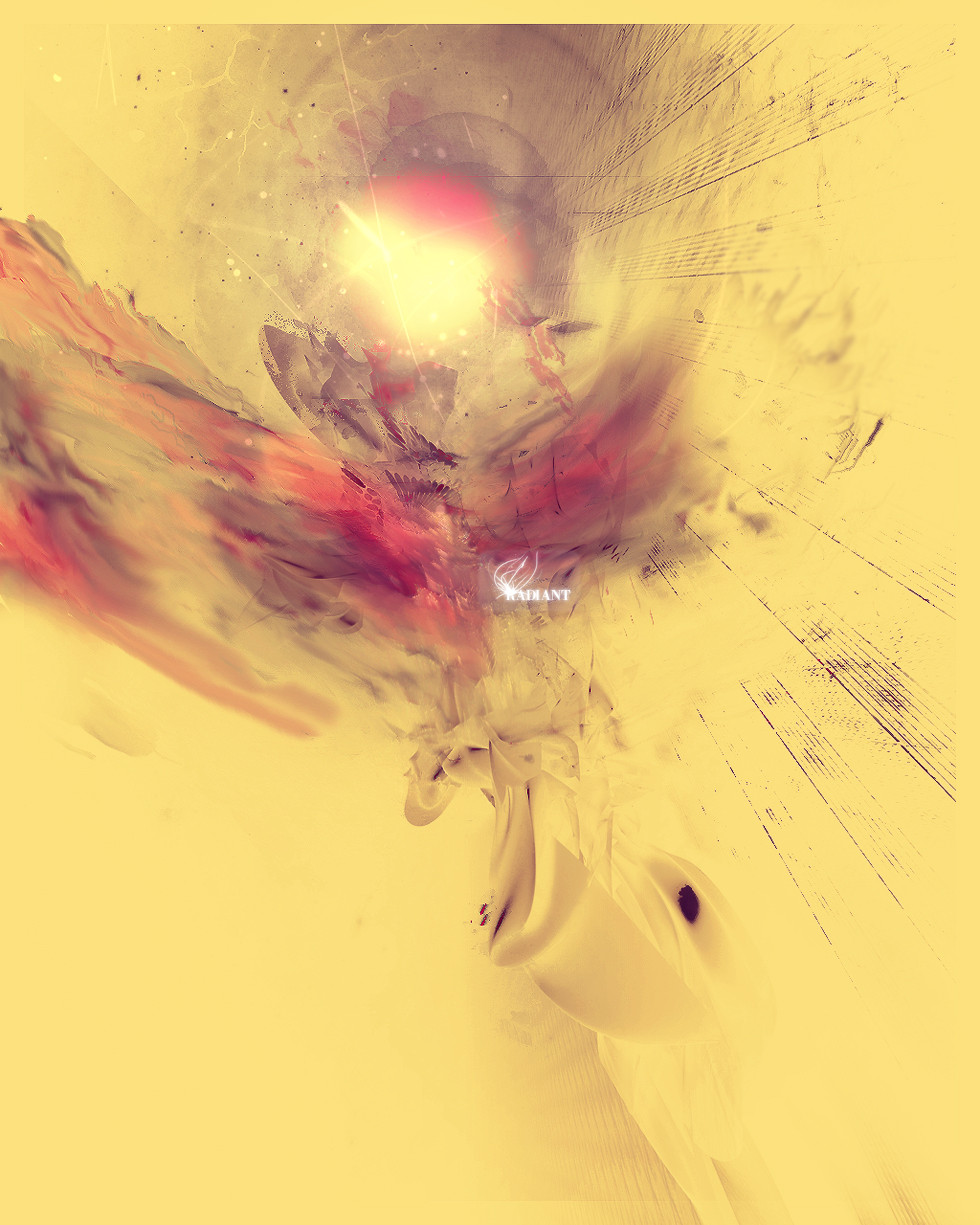
Texturing and 3d-objects in Cinema4d.Furder in photoshop. Was an experiment and I thougt it would be another messy(?) work that I could throw away. Fortunately it became better and I'm happy with it, so I would like to know what you think about it? Wich one do you like more??Related content


Comments: 6

I like more the one below!
I think that the first one has the earth too grainy in comparison with the other elements, and make the whole thing a little hard to blend together.
BUT on the second part, the whole colors has been desatured, and they seem more like the earthy part, and are more blended, imo. The addittion of the text, and the weird opacity of the '7', let us forget about the grainy part I told before, and we then can focus on the piece as a whole. Besides, the little circles that are on the left side of the pictures camuflages very well the grainy nature of the earth part, too, becouse now all the piece has dots.
Those are my thoughs!
Hope you liked them, n_~
")
👍: 0 ⏩: 1

I love them!
Appreciate it a lot, comments like this!
I can't choose, but I think i choose for the second one also, maybe because it took more time, hehe, but I like the colors and think the typography matches nice with the objects, like the 7 with the head of the bird!
Thanks again very mutch for your comment!
 (Wink)")

 (Smile)")

👍: 0 ⏩: 1
No problem at all!
I love to give my thoughs on people who like to hear about them n_~
👍: 0 ⏩: 1

Ik vind deze veel meer eenheid en betere blending hebben dan de vorige. Ik vind ze beide goed maar de bovenste vind ik ietsjes beter omdat die toch levendiger is. en in de onderste heb je "invert colors" waar ik niet zo'n voorstander van ben. maar dat is mss kwestie van smaak.
Goed bezig weer
👍: 0 ⏩: 1
Thanks Roma!!!
Ben het met je eens over de bleding inderdaad!
Wel was dit gewoon een werkje tussendoor, hehe, dus wou kijken of ik anders te werk kon gaan, en vind die invert colors wel grappig, weer eens wat anders! Is indd een kwestie van smaak zo te zien!
Thanks for alle support en comments enzo!! Ik waardeer het enorm!!
Over een tijdje zal ik iets gaan posten met meer typografie en fotografie!
👍: 0 ⏩: 0