HOME | DD
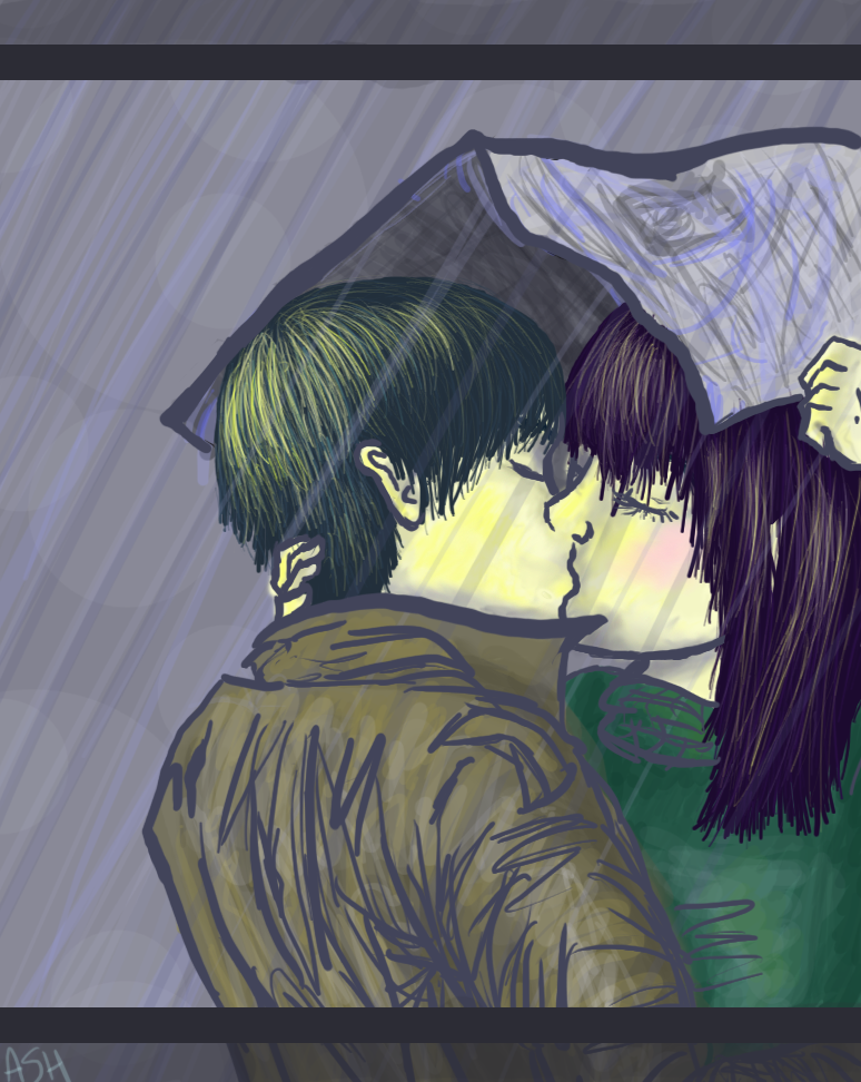
 cobalt-tree — Come Rain or Colour
Published: 2005-04-15 19:51:02 +0000 UTC; Views: 192; Favourites: 5; Downloads: 27
Redirect to original
Description
*hugs her tablet*I'm still learning how to use it.
And I know the jacket looks all fucked up, you really don't need to mention that at all.
otherwise, constructive crits are nice, since im still a-learning
 (Smile)")
--
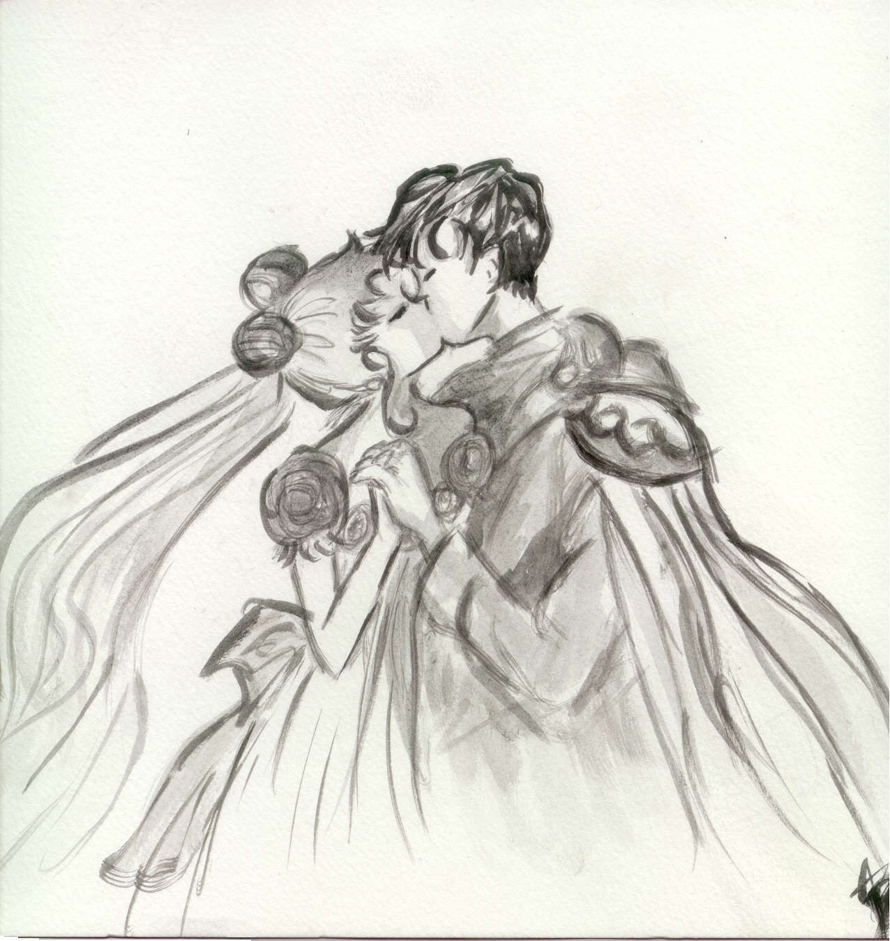
from the original ink drawing: [link]
i think i like it better in the black and white, but colouring it was still fun
Related content


Comments: 9


Nice... they're kinda yellow though.
Suggestions:
If you're gonna colour lines a light shade, colour them something similar to the inner colouring of that object. Skin can be an exception to this, because skin's just like that. So I'd suggest doing the lines for his jacket a shade of brown, and her shirt a shade of green.
Still awesome though. Especially considering it's your first tablet piece, awww.
👍: 0 ⏩: 1

line coloury suggestion noted!

👍: 0 ⏩: 1


i actually like the jacket, i dislike her face more
(mostly to do with that blush)
👍: 0 ⏩: 1
blush complaint noted, but not nessicarily agreed with.
")
👍: 0 ⏩: 0

i think the b&w has a more noir feel attached to it. especially with the composition/arrangement of it.
👍: 0 ⏩: 1
ya i agree. this one's more just flat out sappy.
the newspaper also looks far worse in this one. uhg.
the lessen here? plain black ink is always more bad ass.
👍: 0 ⏩: 0

I'm still trying to get the hang of mine still too.
")
👍: 0 ⏩: 0