HOME | DD
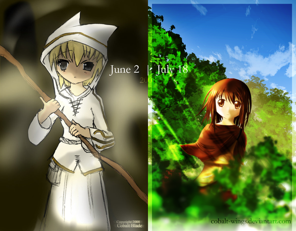
 Cobalt-Wings — Morning's Light
by-nc-nd
Cobalt-Wings — Morning's Light
by-nc-nd

Published: 2008-07-18 21:46:55 +0000 UTC; Views: 702; Favourites: 21; Downloads: 0
Redirect to original
Description
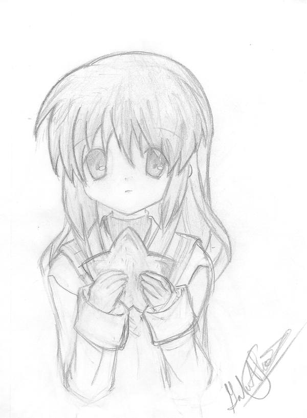
This took far longer than it should have... and even then I took shortcuts in several places. >.<; You'll notice how bushes conveniently cover her undrawn hand and legs.")
Anyway, I couldn't think of a background for this, but I was browsing randomly when I randomly thought of a forest setting. Remarkably enough, I didn't use a stock for the background, so I drew it up from scratch. Though, I somehow feel that the background takes too much from the character, which is what I spent the most time painting.
So, enjoy, and, as always, critique is very welcome. ^_^
^ Too many commaaaas...
++
Almost forgot: Cloud brushes from [link]
Related content


Comments: 68


Oh wow!
This is spectactular.
I have no critisism for this at all!!!
Fantastic!
👍: 0 ⏩: 0


I'm very impressed if you drew the background from scratch. Its odd you can pull it off here but don't put in the effort in any other pieces. If you have that talent, you should always put 100% effort in, or you're betraying your gifts and won't ever grow.
Don't take shortcuts in the art that devalue the artwork if you don't have to. Shortcuts are for deadlines.
And never a good thing. Draw the hands, feet etc if it should be there.
Make sure its a strong image in black and white/greyscale before you colour it. I get the feeling here the colour work does a lot of the pleasing for us.
Because you've gone down the cartooned route, I'll point out two options you have. You could play with line weights. Where the body faces away from the light, it should have a thicker contour edge to give the drawing a sense of weight and help depth cues in the image. I think you might've done this a bit here, but it seems inconsistent, not in keeping with the light source and definately can be pushed more. Also relative to foreground and backgrounds, line weights have no difference in this image.
Alternatively, if you want to push for a more animated style, give the outer contours a consistent line width, but this does not mean depth cues from line widths are not necessarily an option.
Compositionally, its a bit dull. It is sedate though and it seems to work well with the image.
You've rendered the clothing nicely. I'm impressed. Keep at it. Whether you choose to continue this style or not, make sure to study other aspects of art. Perspective, anatomy, design and the techniques an artist should deploy to pull off his chosen aim.
👍: 0 ⏩: 0

I like the light in this picture, also the clouds and background look good, except for the green stuff in the front, perhaps you could have drawn it more sharper. although I do realise you probarbly wanted it this way. personally i'm not a fan of the blurring out the front or background.
the texture of the clothing looks great, but i'm missing an arm? or is she holding it up or something, it's just something that disturbs me.
the composition looks great and in ballance
good work

👍: 0 ⏩: 0

Advanced Critique (composition):
good:
-You fade the colors of the background as it proceeds into the distance
-background intersects with your subject, bringing the eye back to the focal point
-consistent shadowing and good use of contrast in the background foliage
-nice proportion of sky-foreground
Possible improvements:
-background foliage on the left side goes almost right to the corner making and "eye drain." move the left edge of the foliage down even more
- Your subject is nicely offcenter as should be but perhaps just a tad bit more
- Increase contrast even more in the foreground
To be honest with you I'm being somewhat nitpicky here as there are no major flaws in the composition.
👍: 0 ⏩: 1

Thanks for the critique. ^_^
👍: 0 ⏩: 1
You're quite welcome! I hope it was helpful an I'd be honored to give you another anytime you'd like.
👍: 0 ⏩: 0

The background is fantastic! Ah, but you used brushes for the clouds...
")
👍: 0 ⏩: 0

great piece,
but I think the bush closest to the "camera" is a bit too blurred. if thats the way you wanted it though thats ok...
other than that this is a great piece
 (Smile)")
👍: 0 ⏩: 0


Oo, I like the way you made the shrubs in the foreground out of focus. Generally a very beautiful piece =3 Just one thing thouhg, I feel that the shadows on the left side of her head is slightly abrupt and is curving the wrong way. It'd also be more realisitic if you had added some zig zag lines to that part of the shadow because hair has texture and shadows won't fall flat on it like a sphere. great job on the background and trees though. Hope I helped ^^
👍: 0 ⏩: 1


i like the soft colors in this one, and the lighting is done well. the only thing that disturbs me is the odd angle that you drew this.
👍: 0 ⏩: 0

this is great. love the leaves and sky.did you use photoshop? i also love how the bush is blurry in the front. nice job
👍: 0 ⏩: 1
Yeah, this was done in Photoshop.
👍: 0 ⏩: 1


Really cute !!! Good job ! And colours are great !
👍: 0 ⏩: 0


The colors are amazing. I agree with the rule of thirds, but this is stunning nonetheless. Fantastic job.
")
👍: 0 ⏩: 1


Well what can I say that ~Ishrie did not already mention? Not much I guess... so I just say that although this may have its flaws (I hardly recognize them for myself 
👍: 0 ⏩: 0

You said in your thread that you wanted critique, so here goes.
This piece:
I like that you're going for a more abstract feel, but this has some compositional issues. Have you ever heard of the rule of thirds? [link] Basically, it's a way to determine points of interest in a composition. Divide the paper into thirds horizontally and vertically. The places where the lines intersect are areas which are most appealing to the human eye-- putting objects there, in combination with other compositional techniques such as color use, will tell the viewer that they are important. It's also a lot more interesting than placing the character in the middle. ;{D
Speaking of color use... yours seems a little random. I like how the character sticks out so much by being the only really warm source in the picture, but there is one mistake that I see. Remember the rule of thirds? Well, you've got your background trees right about where some lines intersect. Yellow and orange are the two colors that attract the eye the most, and you've got some yellow trees on intersecting lines next to a bunch of cool colors. In short, it's really hard to pull my eyes away from 'em-- they distract too much from the rest of the drawing. For future reference, objects that are farther in the background tend to have bluish tints to them. Try having cool background colors next time.
For more information on color theory: [link]
On your work in general:
You probably aren't going to like what I have to say, but.. your style is what's keeping you from improving. Well, not exactly. Let me elaborate.
Now, that's not to say anime is bad. Heck, I draw it. I'm just saying that it's so stylized that it's hard to learn the basics. If a beginner tried drawing realism, they'd see what is wrong right away. But, if a beginner tried drawing anime, many people would think that it would look good, and it would be hard to tell where the mistakes are.
Try learning the basics of human structure. I know you draw moe and their proportions are different, but that doesn't mean that you can't still study muscle structure. Knowing how the human body bends and squishes, and, more importantly, why it does so, will add fluidity and life to your drawings.
Here's a good guide to proportions: [link] , and here are some muscle anatomy charts: [link] and [link] , and here's a skeleton: [link] .
A good way to study anatomy would be to block out your drawings in steps, with each step on a separate layer (or piece of paper, if you prefer to trace each step). For the first step, you would draw a basic stick figure-- a circle with a center-line for the head, circles where the joints would be, and lines for the bones. On the next step, draw the bones. Not lines, bones. You don't have to get into extreme detail, such as all the little wrist bones or each individual rib, but try to include all of them. Then, draw the muscles on the next layer. Try to draw them all. Pay attention to the way that they flex and bend in different positions.
It seems hard, but learning about the human body is the only way to draw it well-- no matter what style you're using. Right now, you're drawing humans based off what your brain interprets as a human, which isn't exactly correct. By doing these exercises, you're teaching your brain what people look like, so that next time you draw freehand, you'll be able to remember a little bit better.
Another good way to do this is by doing a ton of 30-second figure drawings per day. [link] However, while it's still possible to do what I mentioned above in anime, figure drawings must be done as close to realism as you can get. Basically, look at the figure and try to draw it as close as possible in 30 seconds. If it's too hard, you can increase the time to up to one minute. Don't move in on the details unless you have spare time-- you just want to get a feel for the pose, angle, and general anatomy. These exercises stimulate the other side of your brain, and makes it easier to memorize anatomy.
On a final note, no one is going to penalize you for using a reference, as long as you cite it on the finished deviation and only use what's marked as stock. What matters is the product, not what you did to get there. Be careful with them, though; referencing is fine, but out-and-out eyeballing (looking at a picture and drawing an exact copy) is not. Referencing will help you improve, but eyeballing will only make the original artist really, really mad.
Onto a different issue, now. One thing that I noticed right away is that you're a little too dependent on Photoshop for your coloring. It really looks like your using the Dodge tool as a crutch. You may have read this already in 's tutorial: real light is not white. The Dodge tool only colors on a white-based gradient, and, while it makes things shiny, it also makes them look like plastic. Objects also reflect light onto each other, causing them to change color. For example, in your picture here, the main light should actually be light blue, because the sky is reflecting the blue onto the characters. Sunlight may also have a yellowish tint.
Try playing around with real paint, pastels, or color pencils for a while. Just mix colors. Do not add white to anything. Instead, use a color wheel as a guide to see the relationships between colors, and try to use these relationships to your advantage when creating your composition.
I hope that was helpful. :{) Happy arting.
👍: 0 ⏩: 2
I know its quite impolite to do this in another persons deviation comments, (~Cobalt-Wings , sorry, feel free to hide my comment if you want
but may I suggest you save this and put this up as a tutorial sort of deviation? I think a lot of other people are very interested especially in the composition part and the links you provided there, I will save this for myself.
👍: 0 ⏩: 2
A tutorial? Well, I suppose I could try. I'm not the best at composition, but since you guys thought it was helpful, I guess I could give it a shot.
In the meantime, have you checked out *ArtistsHospital 's library? [link] They've got a bunch of tutorials on everything there; the link I gave you is their composition section.
👍: 0 ⏩: 1
Well I for myself learned about something valuable.
👍: 0 ⏩: 0
It's already saved to a .txt file and I've dragged it into the same folder where I keep my references and Andrew Loomis e-books.
 (Wink)")
👍: 0 ⏩: 0
Ah, I love you for typing that.
Thank you so much for that critique, and I'll be sure to follow your advice. ^_^
👍: 0 ⏩: 0

love the tranquil feeling... ^.^ and awesome painting
ive tried painting anime it didnt turn out well...so i did a dragon instead ^.^
but that didnt really go well either ... paintings not my thing
lol i blabber on a lot LONGEST COMMENT EVER!!!
yeah so awesome ^.^
👍: 0 ⏩: 1

It gives off a very peaceful fee - I can almost hear birds singing!
The clouds are very realistic; is there any particular technique or brush you used to make them?
👍: 0 ⏩: 1
Oh!
*facepalm*
The cloud brushes are Lunaregina's.
Forgot to credit her. >.<;
👍: 0 ⏩: 1
Ah, I see. I'll have to go check 'em out then.
👍: 0 ⏩: 0

nice work..!
very colourful..and very smart how u covered the undrawn legs and hands..heh
👍: 0 ⏩: 1
Yes, my laziness knows no bounds. O_o
Well, maybe not. The drawing I'm working on is a full body.
👍: 0 ⏩: 1
heh...but its reely nice... nice to meet some one cheeky like me..heh..cuz sometimes even i do stuff like that..heh..!
👍: 0 ⏩: 1


Very peaceful! :3 I love the lighting and the beautiful coloring!
👍: 0 ⏩: 1
| Next =>