HOME | DD
 Code-Blu — Geno Beam

Published: 2011-03-07 19:06:29 +0000 UTC; Views: 1249; Favourites: 26; Downloads: 19
Redirect to original
Description
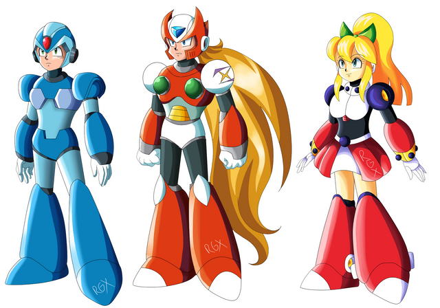
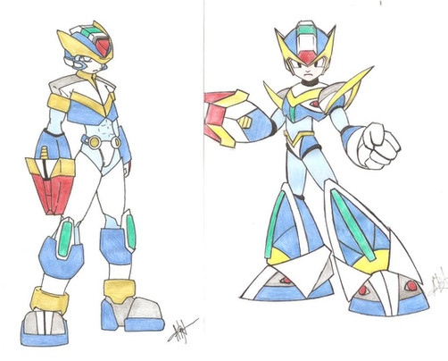
So I made this picture, but I'm not sure which I like the best. I like the one on the left, but I think it might be overkill, the one in the middle seems a little dark, and the one on the right is lighter, but a bit washed out...I dunno you tell me.Related content
Comments: 8

I like the face of the middle one, the cape of the last and the hat from the first +_+; not helpful, though the middle one is the one that appeals me the most c:
👍: 0 ⏩: 0

Really cool variations. The middle one is too busy. Left one has too much contrast. I like softer tones/hues so the right one would be for me. Also there's a nice level of fade on the 'washed' out area(solar system thingy) :3
👍: 0 ⏩: 0

It's hard to choose between left and right... but I think I'll take left for the extra contrast
Wow, he looks ready to kill! (just like the sadistic Geno I sometimes make xD)
👍: 0 ⏩: 1

Yea I ended up choseing the one on the way left.
Haha yea, I think its one of those, "you want a piece of me? Well you asked for it!" kind of moments haha
👍: 0 ⏩: 0

Well, perhaps if you lower the contrast a little on the left one then I think it'd be really good. (A little just means like 2% or something like that. Don't overkill on the contrast lower stuff...or it will look really faded out.)
👍: 0 ⏩: 0

I like the one in the middle- it makes him look more sinister.
👍: 0 ⏩: 0

I agree, I think the left one is best in terms of color and value. REAL cool.
👍: 0 ⏩: 1

Thanks! I think I agree I really do prefer that one too!
👍: 0 ⏩: 0
