HOME | DD
 Cold243 — Aiki

Published: 2005-01-25 22:54:27 +0000 UTC; Views: 307; Favourites: 0; Downloads: 31
Redirect to original
Description
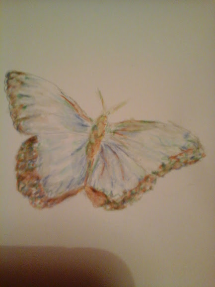
ssg Aiki...aargh...just dont mention the eyes!! lol.Suffice to say not enough time and a small amount of stupidity didnt really help this piece...sorry Aiki!Related content


Comments: 6


Really beautiful, and the color gives it's a very unique expression. (I like the violet concealled of the hair.)
👍: 0 ⏩: 1

Sorry, sweet heart, you know I can't do it. I have to mention the eyes. LOL
But I will do it seperately and a little later in this piece.  (Smile)")
Ok, the eyes. First her left eye. Quite possible the best eye you have ever drawn. Not to say it is perfect, it is not. But is has color, it has depth, it has intensity, it has highlights. Very detailed, very nice... What is wrong with it? I'll get to that in a minute.
The right eye. Also very nice. Much like eyes you have drawn before. Heavy upper lid (which works). Good green color, with highlight. Good shape to the eye. Love the fact that you have put shading in the white of the eye! Very daring, quite advanced.
So, I hear you saying, if all these things are true, why do the eyes bother me? Well, quite simply, they are different eyes. They don't match each other and we are used to seeing eyes that match. Without seeing the reference photo, I would have tried to combined the best of both eyes in both. From the right eye, I would have used the heavy blue of the eyelashes, the shape of the eye, the shading of the whites and the green of the upper retina. From the left eye, I would use the highlights, the detail, the depth. You are bothered, subconciously, because they are different - not because they are bad.
The only other suggestion I have is her nose. It is a little off. While the rest of her face is tilted downward, her nose appears to be tilted upward. Remember to try to picture things in three dimensions and turn them in your head, picturing how they change as you turn them As you build a sense of space, this will become easier.
Congrats on a convincing three quarter pose. It is quite an achievement! Looking forward to the next one.
skritch
👍: 0 ⏩: 1

I KNEW there was something with the eyes darnit,just didnt look right! As soon as you said,it made perfect sense! I had been fiddling with them,and I couldnt quite figure out what was wrong.Because I was concentrating so hard on each one individually,it (stupidly) didnt occur to me to compare them objectively. 
")
👍: 0 ⏩: 1
Not a problem in posting the guidelines. It is precisely for the reason that so many people don't seem to understand the basics as to what they see (and don't see) in their works that I enjoy helping others.
I really enjoy seeing people learn and improve.... 
skritch
👍: 0 ⏩: 0