HOME | DD
 colonel-strawberry — Gatorface concepts
Published: 2010-09-12 00:42:42 +0000 UTC; Views: 5960; Favourites: 93; Downloads: 28
Redirect to original
Description
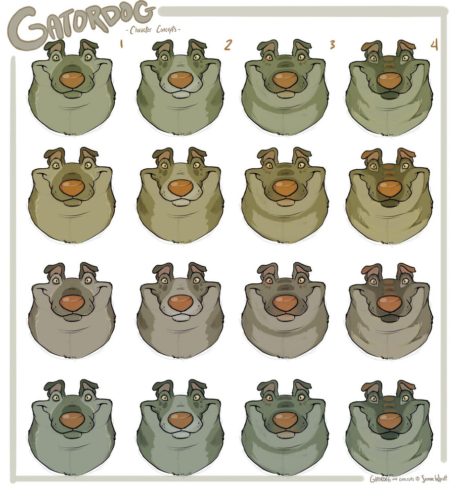
I wasnt going to submit this, but i guess it's always interesting to hear people's opinions, may scrap it later.I feel like i dont have to worry about her color and markings design but I should probably have complete character sheets done soon, this face is actually part of it so i figured it wouldnt hurt to mess around a bit, i probably wont end up using any of these, lol
The top row are the original four and i figured it wouldnt hurt to see different color variations either, although i cant picture her anything but that murky green. I realize its kind of silly to pick one off of a white background since the second any color is introduced in the background they completely change. But meh.
I like the top and third row ones, although i cant picture her being grey like that for the actual film.
I feel like all of these are probably more obnoxious than i should want to do, but depending on how much time I'll have for coloring i feel like it wouldnt be too much of a problem.
I should make one of those little design your own gatordog flash things, lawl
Related content


Comments: 96

I like number two the best I believe but I like the neck of number four. ^^
👍: 0 ⏩: 0

I love love design #2, and in her original color, or the last color! c: <3
👍: 0 ⏩: 0


I like second column.
However, gatordog looks lovable anyway. XD
👍: 0 ⏩: 0


I like the bottom row, second collum one. Though I kinda think It should have had the neck markings, like the bottom row/4th collum one. :U
But thats just my opinion.
👍: 0 ⏩: 1

Haha yeah, that neck marking of 4 would probably be the hardest out of all of em though
and thanks for your opinion
 (Wink)")
👍: 0 ⏩: 0

I like the top two rows for colours. I can't really give an opinion on markings cause it's just the face D: but i've always been quite fond of dark markings around mouth / eyes.
👍: 0 ⏩: 1
Yeah i figured however i did the face would help me decide on patterns for the rest of the body, i guess i could do one like this for body designs though.
👍: 0 ⏩: 0

I love the third column pattern, can't say on the color though :'D
(I'M SO BAD WITH COLORS OTL)
👍: 0 ⏩: 0


marking number 2 color number 1 or 4. that would be my pick.
👍: 0 ⏩: 0


Column two, row three. Perfect.
👍: 0 ⏩: 0

u should make one of them weird dress up things like make ur own wolf fox cat whatever but for the GATORDOG!!
👍: 0 ⏩: 1
Lol thats what i said in the artist descrip! it'd be cool, but i dont think i'd want that many gatordogs running around XD
👍: 0 ⏩: 1
Hoho u did too! ")
👍: 0 ⏩: 0

I like the fourth in the first row. :v And second in the third row.
👍: 0 ⏩: 0


3rd on the 3rd row for sure!
 (Smile)")
👍: 0 ⏩: 0

I think top row #2 is the best because people imagince gators that color and the random splotches is just cute and messy in a good way.
👍: 0 ⏩: 0

i want the blue one mommy!!!
👍: 0 ⏩: 0

i think i like design 2, 3 and 4 best
omg what are you taking in school?! and i might have to interview you xD
👍: 0 ⏩: 0

All the colour variations look really good - I'd pick one depending on the background or additional characters colour palettes.
When it comes to the markings I like column 2 the most. It automatically makes me think about dogs making the idea of gatordog very natural :3
👍: 0 ⏩: 1
Yeah i havent fully decided on a color scheme yet, which is probably really dumb but whatever XD and yeah, 2 is also the closest to her original design
👍: 0 ⏩: 0
I like it cause its funky, but it'd probably be the most annoying to actually color XD
👍: 0 ⏩: 1

lol, probably. Why are all the awesome characters/designs so freakin hard to color? XD
👍: 0 ⏩: 0

i like the top row, 2nd column best.. BAWW GATORDOG IS ADORABLE>
👍: 0 ⏩: 1

haha yeah, she looks so weird without em!
👍: 0 ⏩: 0

i really like the second on the first row!
👍: 0 ⏩: 1

i like the second and third. third looks more gatory...
👍: 0 ⏩: 1
yeah, i was thinking the third would be cool cause i could continue those larger spots from her snout all the way down her back since im debating taking the little spikes off her..
👍: 0 ⏩: 1

I like 2 on the top row! ")
👍: 0 ⏩: 1

I really like the second one in the second row, he manages to look like a gator colorwise and physically, yet still seem a little more natural for a dog.
👍: 0 ⏩: 1
I had almost taken off the second row while i was testing them against colors, its the closest to what i might be using, but the second design seems to be working well
👍: 0 ⏩: 0

<= Prev |