HOME | DD
 ColonelYeo — Viva la Revolution

#flag #colonelyeo #digitalart #frenchflag #frenchrevolution #assassinscreedunity
Published: 2014-12-03 18:10:58 +0000 UTC; Views: 1150; Favourites: 34; Downloads: 3
Redirect to original
Description
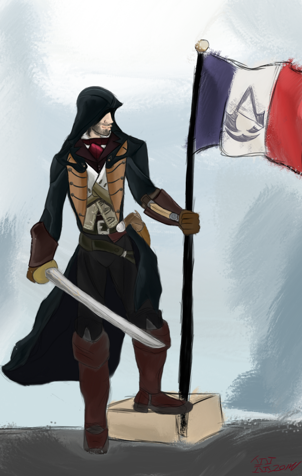
Well, it took longer then I expected it to, but I finally finished this bit of artwork. (Smile)")
This was a bit of art I put together to be used with my play-through video's of Assassin's Creed Unity. And I'm loving how it turned out! Definitely one of my better digital pieces.
*edit* Made a small improvement. Have a friend who is French, and he pointed out some punctuation typos I made. Specifically, the first E in egalite' shouldn't have an apostrophe. Technically it shouldn't have ANY, but the font I used had limited characters, and no support for é. So I had to make do.
I found a great video about photobashing from Cubebrush.com, and it really helped me when putting everything together.
*edit 2* Went through and decided to list all the sources I used for this image. It only seemed fair to try and narrow it down and give proper credit where it was due.
*edit 3* Fixed the brightness on one of the letters.
The base flag was a piece done by
The tattering and other wear was from
The logo is from the Assassin's Creed wiki page: assassinscreed.wikia.com/wiki/…
All the rest of the work and tying together was done by myself.
You can find the first of my video's using the picture starting here: www.youtube.com/watch?v=iP_V_W…
Related content


Comments: 14

Overall


Vision
Originality
Technique
Impact
This picture is really nice once it comes to the elements of design and the principles. Only a couple things can I find slightly wrong with it. First off I think the text in the middle of the AC symbol should've been smaller. I know you mightve wanted it all to be equal, since it is like the revolution and stuff. But it was too close to the symbol and my eye were drawn to that, Completely missing the text. So just a bit smaller, where its not close to touching.
Speaking of the AC symbol, you did really good on making that the dominant element. Like really good ^-^ just the text sorta blocked some of it too. I do lile how you put the text in the middle though. I like how you worked with the AC symbol like that.
Lastly the back ground.
It was a bit weird when I first saw the black behind it all, then I saw the coolness of it. I like how its all broken, if it wasnt then itd kill the whole theme of the picture.
EVERYTHING ELSE IS GREAT! I love the font and the shading. Really nice piece.
👍: 0 ⏩: 2


The Gravity Falls 1920s AU pic i did with my characters magpie345ab1.deviantart.com/ar… . I know its not perfect, but i would glady take your advice!
👍: 0 ⏩: 1


That was, indeed, the prevailing thought when I did this. XD
👍: 0 ⏩: 0

Ooh, very nice, I like the tattered effect.
I understand that your font(s) do not support acute-e (é), but did you consider moving the diacritic mark manually?
")
👍: 0 ⏩: 1
Lol, yep. It made sense.
To be honest, I thought about it at the time, but I actually thought the diacritic mark looked passable enough to just use as is. Plus those letters started life as a flat font I worked up... and I wasn't sure what fiddling with the placement would do to the metal effect. Guess I should have given it a little harder look.
But thank you anyway for the compliment. And even though I've let the game sit for a while, I highly recommend picking it up. It is fun, and the fact that the price has dropped for it since then is also a plus.

👍: 0 ⏩: 0

OHHH, chorry for takin' ages to fav dis... Stupid me. TT/////////////////////TT
HAHAHA, oh, mah amiguito! It's a really nice work.

👍: 0 ⏩: 1


Cool thing, albeit I heard critiques from our 'cousins' and some historians as the game is actually portrayed AGAINST the revolutionaires, and use clichés of the 'poor, poor royals' and all this...
👍: 0 ⏩: 0