HOME | DD
 comic-eeb — Princess Leia!

#liea #starwars #comiceeb #colorbattles #princessleia #starwarstheforceawakens
Published: 2016-01-18 05:08:00 +0000 UTC; Views: 14256; Favourites: 272; Downloads: 0
Redirect to original
Description
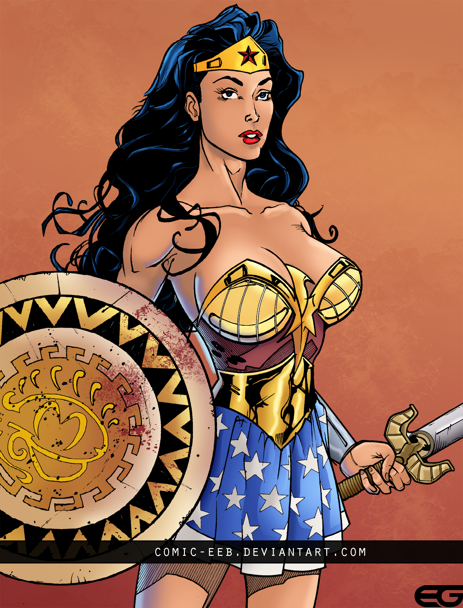
Heres my submission for the January 2016 Color Battle . this is my first shot at entering one of these so hopefully it goes well! i rally like this version of leia, and it was done greatly by Renatocamilo and Devgear!Pencils -
Inks -
Colors -
Related content


Comments: 31
👍: 0 ⏩: 0

👍: 0 ⏩: 0

👍: 0 ⏩: 0

👍: 0 ⏩: 0

👍: 1 ⏩: 0


Thank you! I had a look at your images as you requested a critique and the image I'd like to post about would be your Leia entry for BA. At first glance, I can see that you've chosen some nice base colours but there are some areas that could use work to make the overall image better. First look at as this version (not mine, but the artist is great) ivannamatilla.deviantart.com/a… I'll reference back to this image a few times. Sorry in advance for such a long post and any grammatical errors LOL
1. Yes, your base colours are good but could be better to help invigorate your focal point...You have to decide what is your focal point and make sure the rest of the image points the eye's that direction. How do you do that? Colour Theory, google the hell out of it. In a simply way to understand colour theory, use cool colours to push objects backwards and use warmer colours push objects forward, or reverse depending on what you want to do. With your Leia, my eye is most drawn to R2 but according to the line artist, you should be either drawn to her face, chest or crouch (not a fan of this kind of line art, but that is a different subject lol). The reason I'm pulled to R2 more so is because most of your image has a heavy yellow tone and only R2 has a cool colour nature, the slightest opposite attracts the strongest...even his red light is in the cool zone (almost magenta). Read up on colour theory, there is a ton of information on google, this will help you learn how to better strike a balance. Have a look at the link, Ivan uses a mix of warm and cool tones. The sky is warm but he used cool tones in the smoke that surrounds Leia, R2 and C3PO (even C3's silhouette colour hold is warm, because he should have some focus). The cool tones in the smoke are just enough that Ivan could use warmer, richer tones on Leia, to really push her forward. Also, make sure your colours coexist with each other within each character (Leia lips and panties (in your image) are totally separated from her and confusing).
2. Pro tip that I learned early on, NEVER USE BLACK! Never use black when colouring line art. When you use black, you are competing with line artist. You should never fade from your skin colour's highlight to the line art's black lines. It becomes muddy and nasty looking. In your image, you are using black under her neck, around the breast and legs, and around her knee cap. Use blues and purples as your shadow tones, warm v cool tones, it will push the rendering further.
3. You want rich colours in comic books, unless you are doing Walking Dead or very down in the dumps moody style book. Your highlights here look faded or washed...meaning to much white. I'm going to guess by assuming you are using Screen Mode in your brush work? That is fine but you have to understand how Screen mode works. Screen mode is trying to take any colour and move the tone towards pure white with each stroke. If you start with a base colour skin tone like in your image, which was milky to began with, you get the affect in your image, more milk (AKA washed out). However, that does not mean you shouldn't use Screen mode. Take the RGB colour code R80, G60, B60. This should give you a dark, desaturated looking red tone. Now fill an object with that colour, then go back into to your colour picker window again. Now instead of using the same dark red when doing the screen mode trick, change the colour to something more saturated than your base colour. In this case, R165, G25, B50. Now make your screen mode stroke, see how it pushes the colour lighter but not towards white? Again look at Ivan's image, rich full colours in the whole image, does not use whites or blacks but warm and cool tones.
4. Colour holds (line art colour) are important, you don't need them all the time in every image but you need to know how to use them. Your smoke rendering is good but you killed it with your colour hold orange/yellow tone. That doesn't make sense that the edge of smoke would be bright yellow to the reader. What you should try is picking a colour from within object, darker in nature. You generally want that line tone to be 50% less than the object's dark part of its colour.
5. One last thing, rim lighting. Your image suggests there is a strong blue tone coming from the left...but only some parts on Leia show this secondary lighting. Light does not pass through objects very well unless they are transparent. Notably, her breast some how gets the light. This is not possible with her arm cocked up with a cape draping over most of the arm and is holding a gun. Same with the other arm, no way secondary light gets there through her body like that. You can use the blue as you suggest, but make sure you pick direct that it is coming from and that all objects are receiving it correctly. R2 and the little mountain, the foreground smoke are missing it. Makes it look less believable, so be mindful. Plus, another PRO TIP I've come to learn from, less is more. You don't need to colour half the object (Such as drowned her shin with blue secondary lighting), do a small area along the edge, this will look way better. Look at the little bit Ivan did with Leia's face and left leg.
You are on the correct path but now you need to better understand...I'm always learning and asking questions...you should keep doing so too. Keep practicing, it will pay off big time. I think I read you were starting school and only have a small amount of free time after school...that you were going to watch TV...can't get better watching TV ")
👍: 0 ⏩: 1

Thank you so much!this is very helpful, i even screenshotted it to use as a reference! i do have a couple of questions though, if you dont mind.
from top to bottom:
okay so i use cool colors to push back and warm colors to bring forward, so why did ivan put warm colors on the sky? the should sky not have the focus right?
also, you said hat the colors should co-exist within a character, what do you mean? should the lips and the panties be warm colors too?
ivan has used a warm brown color for shadows, i have tried using cooler colors for shadows but it seems out of place and the colors dont fit well.it seems odd the their would be a blue/purple shadow?
why would their be no secondary lighting on the right arm wouldn't their be no lighting on the boob or the left thigh?
anyway thanks for the help!
👍: 0 ⏩: 1
No problem! First, look up colour theory
Ivan did use warm tones in the sky but he used some kind of cool in the smoke to separate Leia. He understands the rules and how to break them.
Easiest way thing to try, is create a new layer on top of your flat colors and fill it with blue (or whatever tone you want your overall image to be), the change the layer mode to Color. Then play with opacity so it is not full on blue tone. You'll see that your colours will still have that red or yellow tone but the added blue will make time come together. Its a trick but you'll see once you try a few different images. Have to get the base correct before rendering or it will not look right no matter how much rendering you do.
Browns are a form of cool because it has blue in it...read up on colour theory
I was mostly saying the blue rim light would not work because nothing in the image suggest a blue light. But if there was a blue light, I think I was mostly meant that the right arm would be blocking the light getting to her breast.
 (Smile)")
👍: 0 ⏩: 1
hey, sorry for the replying quickly, i though i should learn color theory before replying.
i learned how warm and cool colors can depict different planes, and also how they can put the focus on a character.
by using this knowledge is this what i should do:
make liea c3po and rd2d cooler ( beacause they are the main characters )
make the environment/surrounding warmer
also with the blue color layer trick should i do that with all of my images? and put it on the whole image?
one more question, if i want to make something cool, do i render normally and then add the blue color layer
or implement cooler colors in the rendering process?
by the time you reply i would probably understand color theory better, if not ill just learn it before replying back
thanks again for the help
👍: 0 ⏩: 1
Generally, you'll do the colour mode trick if you find that you are not getting the colours to sync. Like checking your work.
for the last question...LOL that is up to you. There are a million ways to get to where you want to go, you just have to pick the one that works best for you.
Are you wanting to work in comics or is this type of art work more of a hobby?
👍: 0 ⏩: 1
okay thanks!
and im doing it more as a hobby
👍: 0 ⏩: 0


thank you! means alot coming from such a great artist like yourself
👍: 0 ⏩: 0

Yes. She WAS this bad-assed.
Enhanced bust aside.
👍: 0 ⏩: 1


Sexy and dynamic, she's marvellos. The result of this colab is awesome, good job... ^^
👍: 0 ⏩: 1
hahah thanks so much! check out the other entries here: January 2016 Color Battle
👍: 0 ⏩: 1
Damn, that's more impressvei than I through, also good luck with your battle... ^^
👍: 0 ⏩: 1
thank you! hope i win!
")
👍: 0 ⏩: 0


thank you! i'm glad you like it!
👍: 0 ⏩: 0