HOME | DD
 commanderlewis — RIP Poster Final Version color
Published: 2007-08-17 15:38:01 +0000 UTC; Views: 1654; Favourites: 22; Downloads: 31
Redirect to original
Description
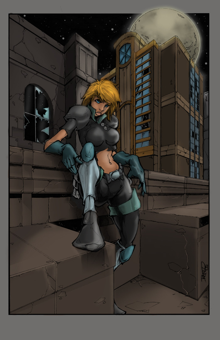
RIP Poster Final Version color:I kinda have a weakness for grayscale art lol...Because they look better when you apply colors to them....Now with this one the Buildings well i didn't need to add much details due to the fact that the artist alread had.
I'm very happy with the way this turned out.
Hope everybody will like this one.
suggestions and comments are always welcomed
Art lines: [link]
ARtist the talented
the red head version:
[link]
Related content


Comments: 16


thanks a lot! glad you liked it.
👍: 0 ⏩: 0


👍: 0 ⏩: 0

Good job. The architecture on the building under the moon, looks odd. But I see that's another artists doing.
So. Good colors through out. There could be some more black, since it is a night scene.
Still great coloring.
👍: 0 ⏩: 1
ye ai know i tried that and this looks better...when i added the darker tone..its hard to see the artlines etc on DA...but in a bigger resolution it looks better..thnaks for the comment.
👍: 0 ⏩: 1
Your welcome. Still looks great.
👍: 0 ⏩: 1
👍: 0 ⏩: 0

This is a great start. I think stronger shadows everywhere would help it look more like night.
👍: 0 ⏩: 1
you know i wa sthinking the same but i didn't want it to look to dark.
👍: 0 ⏩: 1
I understand that concern. I am paintinting a nightime scene (well mostly just a quick character paint) right now and it is hard to know how much light to use. Gradient light effects work best with a definite light source (gradient shadows are not very realistic--as you probably know), so to take out where the lights hit makes you loose effect. ... Still I think the ambient light in this is a little to light. Still it looks pretty good as is and I am sure it has already been a lot of work. I would probably call it done if I were you.
👍: 0 ⏩: 1
Yea i would. But if those methods don't work to your adventage, hen try this...create a new layer, set it to soft light lower the Op. and full the layer with white..it works well if and only if you have a good source of light and shadow. hope the nighttime scene pic comes out good enough. your using photoshop cs2 or any photoshop..because i'm not sure about elements or the tip i just gave will work in elements.
👍: 0 ⏩: 0

psst - she's a red-head
Looks great man - thanks for adding the hues!
 (Wink)")
👍: 0 ⏩: 1
lol..Oh thanks i was wondering what hair type she was. lol your welcome. and thanks you for allowing me to use this.
👍: 0 ⏩: 1
Aw no worries - If you love coloring the greys - I may send you the Kylie West pages then....since ALL of those are grey-scaled - and I'm sure Nic would love to see those in color.
👍: 0 ⏩: 1
yea i would be honored! thanks!
👍: 0 ⏩: 0