HOME | DD
 computerologist — computerologist 2k4 ID

Published: 2004-04-28 11:54:24 +0000 UTC; Views: 1806; Favourites: 12; Downloads: 446
Redirect to original
Description
just wanted to update to something that more reflected my current direction.


 commenting really isn't necessary on this


Related content
Comments: 32

Your stuff is getting painterly. Interesting synergy...
👍: 0 ⏩: 0

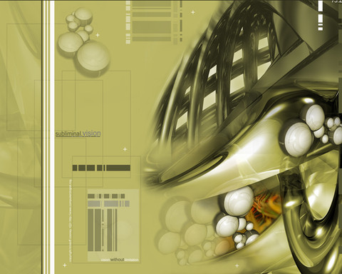
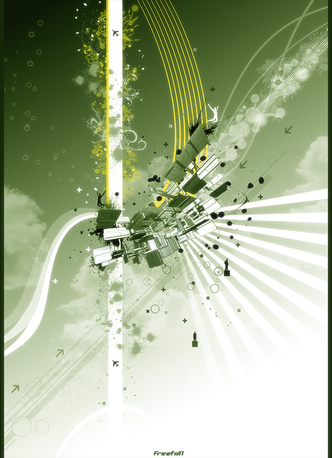
u know what the first thing i thought.. i thought... interesting shade of green, and i like it. for some reason u don't really see that colour of green in that amount often.... or maybe i'm just rambling in my 3am state... yeah, probably
- apparently neurotic and her psychology
👍: 0 ⏩: 0

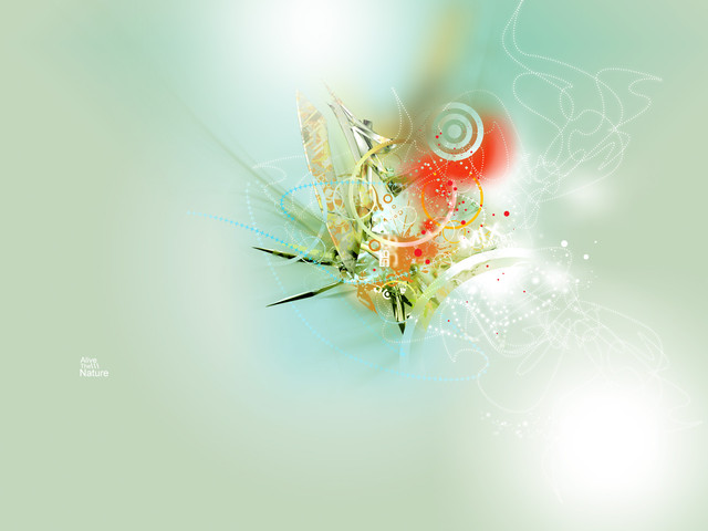
i love your work not just because of the amount of detail involved in every piece, but the stunning use of color. in almost all of your pieces, the color is what always strikes me as being cutting edge and just eye grabbing. i love the color scheme in this; great work as always kristoff
👍: 0 ⏩: 0

BIGGER!! I WANT TO SEE THEM LITTLE DETAILS!! It's massive looking!!
👍: 0 ⏩: 0

cool job but you know .. *takes out the font-o-vacuum-cleaner*
👍: 0 ⏩: 0

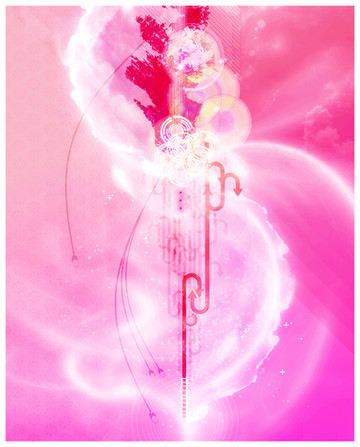
Some of the hardest colours to work with are green and pink - especially in the same piece. You've done extremely well with this one, and it compliments your already fantastic gallery.
👍: 0 ⏩: 0

Well, it's always hard to comment on these abstract technical things .. so I'll just say that it rather much reminds me of, well .. Fall, really. Sort of like a season. (Sort of.)
(Again, like I said, it's hard to comment on these things!)
Makes for a killer id, however. Looks sweet on 'yer front page.
👍: 0 ⏩: 0

As per usual you work is outstanding. Great, love it.
👍: 0 ⏩: 0

it isnt necessary but i just wanted to say that id like to see the "WITHOUT" stand out more....i dont think the capital letters do it enough justice.
other than that - keep it up. I like your new direction. has a more urban vector type look to it - cept massively more detailed. the old stuff was getting tired on devart
👍: 0 ⏩: 0

but thats very nice...so i cant forget to comment here
👍: 0 ⏩: 0

i like these neon flashback not so much seen colours they really blend and contrast well..I think we should blow it up and hang in a room one day
i agree w/ dsypare about being in a gallery somewhere
just draws you in
👍: 0 ⏩: 0

And what an excellant direction it is! 
What an amazing mix of colours.
👍: 0 ⏩: 0

This is nice, the colors are new to me, but I think should be more saturate.
Try that style from the top of the image. I think it'll be more interesting
👍: 0 ⏩: 0

Nice work
The colours are shapes are great
although, i think the text should be more included with the shapes, if you know what i mean
Still it's very nice
👍: 0 ⏩: 0

You know i love your work mate. Love the colours the contrast between the green background and red has nice tonel value. Very grungy style too reminds me a lot of David Carson. Nice concept great work
👍: 0 ⏩: 0

bwah. i'll comment anyway, but only because I really like it. The colors go together quite nicely reminds me of candy.
👍: 0 ⏩: 0

Really great colors in this one. Would be an outstanding poster, I'm thinking.
👍: 0 ⏩: 0

