HOME | DD
 computerologist — exec config

Published: 2003-03-14 04:59:38 +0000 UTC; Views: 6758; Favourites: 89; Downloads: 884
Redirect to original
Description
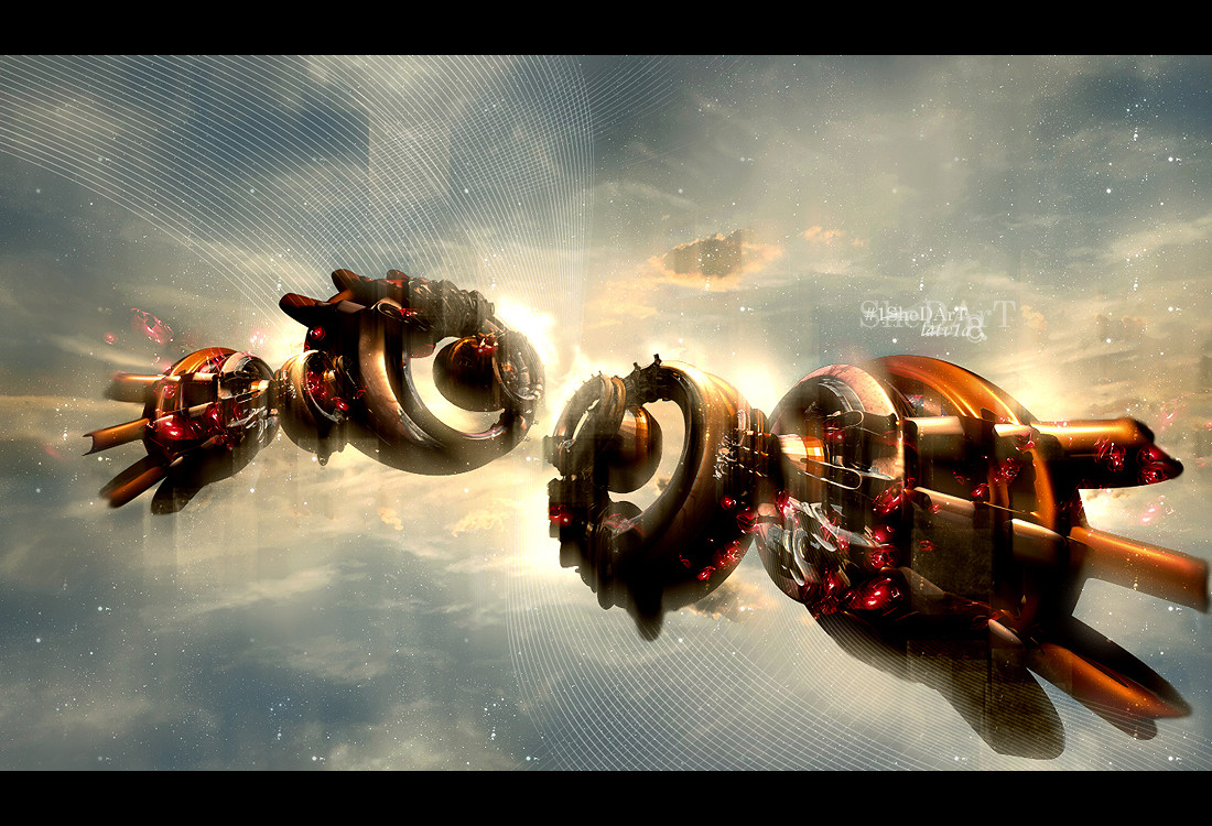
this is one of my latest releases for the new raster chapter 15,this is one of those pieces that i know a lot of you will dislike for a variety of reasons...but i also know some of you will like it... either way, thank you for taking the time too look. and if you haven't stopped over at raster yet....you should..there some amazing artwork this chapter
Related content


Comments: 152

great choose of colors
and design is not bad at all either  (Wink)")
 (Smile)")

👍: 0 ⏩: 0


this image is crazy! this is very motivational! +fav
👍: 0 ⏩: 0

o nice, this is beautiful... you're gallery's really given me a lot of inspiration and motivation. cheers on the good work over the past year. +devwatch, im sure ill be back to fav stuff in the weeks to come.
👍: 0 ⏩: 0


Excellent abstraction.. Your color scheme is stunning. *Returns with a
👍: 0 ⏩: 0


Very impressive work. You have a vision, the ability to take your imaginings and put them on-screen. Not many people can do that! I like the sliced-and-diced aspect of this. It reminds me of some of Autechre's early album covers. I like the sphere object in the image too, it's simple yet interesting. Cool stuff.

👍: 0 ⏩: 0

love the whole design scheme here..adds great depth to the image 2d wise, awesome choice of colors too..rare
👍: 0 ⏩: 0

very nice, i like it, although i think you went overboard w/ the virticle white lines... but tahts my opinion ")
👍: 0 ⏩: 0

I like the details and colors, but IMHO Those white lines are distraction
👍: 0 ⏩: 0


Awesome piece man, the colors just flow so nicely. Loving this, like I live everything else you create
👍: 0 ⏩: 0

I love this style and especially this piece
Keep up the great work
👍: 0 ⏩: 0

spotless - beautiful and clean work. nice use of a limited palette and very original slices; they really make the piece. +fav
👍: 0 ⏩: 0

cool typography man, i like the vector work here, and the image splices go well with the brushwork.cool......joel
👍: 0 ⏩: 0

Great work
love the colors and the distortions nice layout, typo and vectors
👍: 0 ⏩: 0

Woah! Cool!
I love the design and the colors!
Very different and impressive!
👍: 0 ⏩: 0

TELL me one REASON, just ONE reason why I could Dislike this one.
I'm demanding.
👍: 0 ⏩: 0

omg, extremely stylish and well designed, great choice of colors, so love it
👍: 0 ⏩: 0

Wow that is so funky man... Awesome completely awesome I love the colors and the style...
👍: 0 ⏩: 0


I love how you cutted this piece up...and the
feel of those 3d-thingees is just lovely..*peace
👍: 0 ⏩: 0

Very unique and intresting. I like how you've got the x with the thick lines giving pressure to the rest of the peice. Sort of bringing a heavy feel down to the rest of it. And the colors are a plus. And I also like the way you've used orange and the light green. What I think would have been real good is if you implimented your name etc inot the peice more. Simply by pushing it more towards the curve. I see you had the right idea. But it should have been pushed in more. Anyways I like this much.
👍: 0 ⏩: 0

very kool. though for some strange reason it makes me think of x-mas bells..
👍: 0 ⏩: 0

Great worl on this one. The whole composition holds together well and benefits from you r normal sublime approach to vector work.
I checked on the Raster web site, quite a collection of talent there, some great artists.
Looking forward to browsing through the back collection.
I am particularly fond of the colours you have used here.
👍: 0 ⏩: 0

Ahhhh, another fine piece from one of my favorite deviants! Your easy going, freeform ways of art astound me. Great work.
👍: 0 ⏩: 0

Jebus that looks sooo awesome ! ... like its all trippy .... and so much is going on ... I really like the colors too ... this would look really cool as a poster ...
👍: 0 ⏩: 0


This would make a kick ass wallpaper if it was the right size and dimensions.
👍: 0 ⏩: 0

wow damn wow.
thats like soo damn rad.
but you shouldnt mess up the render too much.
but nonetheless, its still a really good peice.
👍: 0 ⏩: 0

I like the render.
There are some nice shapes too.
👍: 0 ⏩: 0
I like the render.
There are some nice shapes too.
👍: 0 ⏩: 0

this is amazing. i don't know how you do this stuff - but it is simply wonderful
i love the color - and the composition rocks.
👍: 0 ⏩: 0

It's a beaut, although, it just dosen't seem like something you would do...
a softer side of olo...lol Love the colors...you the man!
👍: 0 ⏩: 0

wow wow, i love it, i mean its so good, i like the 3d and the abstract point of view, i love the orange and gray, the chopped part adds lots of character to it, kinda like the object is self destructing, or going out, etc.
anyway nice job on this one
👍: 0 ⏩: 0

I like the 3d and such .. but I think you overused the displacements a bit.
👍: 0 ⏩: 0


How did i miss this!?! No0o0o0o *dies* Heres my late 107 comment Very cool image
👍: 0 ⏩: 0


bomp bomp bomp bomp... dum du dum..
chrystals eeeey.. nice!
whatta, i´m commenting on DA, how long´s it been you think.. 3 months maybe... oh well, just want you to know im still alive, and oh.. this piece rawks.. (commercial hip hop spelling) mwwaahahha.. good job!
👍: 0 ⏩: 0

well heres my late 100 + comment
and well ya know I like it
first I thought it had a valentine look, then computer jewels.....
and now well it just looks good, abstract goodness I say.
never bias
👍: 0 ⏩: 0

Like it is not a strong enough word.....that is beyond superb.
👍: 0 ⏩: 0

| Next =>