HOME | DD
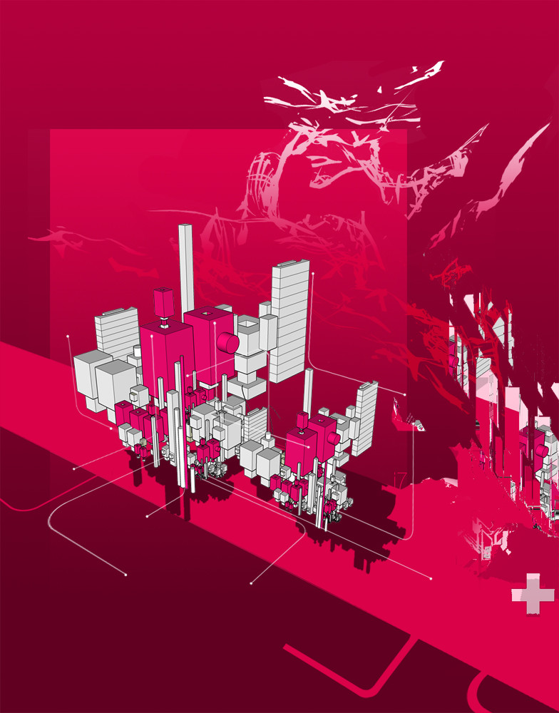
 computerologist — denial of structure

Published: 2004-03-31 15:20:08 +0000 UTC; Views: 8042; Favourites: 84; Downloads: 4930
Redirect to original
Description
i was in a minimalist abstract mood (Smile)")
thank you for looking, hope you enjoy it.
if its not the right size..shout..i'll make you one that is.
Related content


Comments: 95


")

Awesome, looks terrific on my desktop
👍: 0 ⏩: 0

Fav on this one, simple and beautiful work...graceful is a good word for it
👍: 0 ⏩: 0


similar to your last.. i like the minimalistic thing, but i dont like the big red box. the neutral background is quite nice. good stuff, man.
👍: 0 ⏩: 0

Wow. I get to change my desktop a second time in a month.
Incredible work buddy. Always a pleasure to see new work from you.
👍: 0 ⏩: 0

Very nice. Great colors, I love the render, and the speckels in the background r kewl. I like the pointer too, makes me think its my active desktop or something, I can fool people muahahhaha!
P.S. You're wallpapers are usually big enough
👍: 0 ⏩: 0

jesus wept--makes me think of skinny puppy
industrial bug...speaks much
love it babe
👍: 0 ⏩: 0

I love everything cept that red box but its still a nice pic.
👍: 0 ⏩: 0

You always seek to amaze me with your wonderful work. I love the clean fresh sense to this, the red choice of colours is perfect. I like the way it stands out the way if feels its stickin out from the screen on some parts. Very simple indeed, wonderful work
👍: 0 ⏩: 0

im sure you know what i think of it bro.....gonna try and work it into my next windows scheme

👍: 0 ⏩: 0

Convicted with skill that is only desirable to me. Bravo.
👍: 0 ⏩: 0

Good one once again. The composition is just yummy and the colors are fabelous as always.
👍: 0 ⏩: 0

I like this wallpaper - it is a bit different from other wallpapers on DA. I have one thing to suggest - REMOVE the red square! it destroys everything!
👍: 0 ⏩: 0

I agree with wirestyle on the text aspect of this one. But the overall abstract feel is really glowing on this one!
👍: 0 ⏩: 0


outstanding work... the shapes are soo gracile and the colors are soo in harmony ^_^ masterpiece!
👍: 0 ⏩: 0

great work on this, i love it, my new wallpaper, and a 
👍: 0 ⏩: 0

nice and stylish, i dig the work on the typo and colors..
👍: 0 ⏩: 0

Looks like the one and only ` computerologist is back on track again! I'm really glad to see you back, man!
This wallpaper is a very nice addition to all of your previous works. As usual, what we have here is the great combination of digital abstraction, minimalism, some 3D shapes and vectors. All these components are obligatory features of a popular wallpapers, like those that you and +ekud , for example, have in your galleries. This one goes to my desktop right now. Thanks a lot for making this awesome wallpaper, ` computerologist !
👍: 0 ⏩: 0

i love it the simpleness of it and the colors, but that red square, it takes up all my attention. I can't stop looking at it. maybe you should make it smaller or put text on it. make it flow with the rest of the piece. But maybe that’s what u want, I don’t like people telling me to change something when that was my intention. But I like it either way. Nice work
👍: 0 ⏩: 0


 (Cool)")


why did you put that red box on it!?!? It realy doesnt seem to belong there and just screws up the render... The render is sooo cool and u just put a red rectangle on it... doh doh doh!
👍: 0 ⏩: 0

Simply amazing. I can think of nothing else to say. I love the structure and layout and the colors are great. I'm esp. feelin' the minimalist approace.
👍: 0 ⏩: 0

Along the same track as the previous one, eh? Well i like this one SO much better. It has wonderful colors and form. i would use it if i wasn't so sure that little cursor on it would confuse the hell out of anyone else using the computer

👍: 0 ⏩: 0

It's purely subjective of course, but I personally find the red box a tad over-powering (is *that* the denial you're talking about?). The rest is sensational tho. Nice to see you pushing the envelope.
👍: 0 ⏩: 0

I love the combination of smooth colours with the harshness of the wire-render.
These two combos seem to really work well in this.
Great job.
👍: 0 ⏩: 0

Great colors. I love the block of red there in the middle.
👍: 0 ⏩: 0

a wonderful choice of colours and a really nice realisation !!!!!! ^^

👍: 0 ⏩: 0


You know I like minimalism  (Wink)")

👍: 0 ⏩: 0

awesome render, love the wireframe material
the red box looks very professional.
my new desk
👍: 0 ⏩: 0

very interesting concept, amazing 3d work - i just have my doubts about that red box, think it´s a little bit distracting ...
nevertheless u created a great wallpaper
👍: 0 ⏩: 0


Looks very nice man. Cool colors and I think that big red box works very well in this piece.
Good job!
Peace outz...
👍: 0 ⏩: 0


im faving it just because you added the grey bar on the left edge, hahaha
nice one, good coposition and colour usage
👍: 0 ⏩: 0

love that colours and composition. awesome work here...
👍: 0 ⏩: 0

anyone can resize it unless they want a dual screen version
anyway its really nice, maybe putting the title at the bottom right of the red box would have been nice, overall its fresh and stylish, good work :]
👍: 0 ⏩: 0
<= Prev |