HOME | DD
 computerologist — reactor wall version

Published: 2003-06-14 14:39:09 +0000 UTC; Views: 1411; Favourites: 6; Downloads: 312
Redirect to original
Description
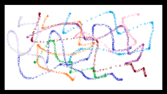
i guess it has been a while that i have released anything in a wallpaper versionthis one has been on my monitor at the office for about a few weeks now. if you would like to see the original version take a stroll on over to instance and also take a look at some of the other wonderful stuff in the new release.
don't try and read too much into it...or try and figure out what it is supposed to be. it isn't meant to be anything more than something interesting and something you might like to use as a wallpaper. if you like it ..great..if not...that's fine as well.
Related content


Comments: 52

Yup, I like it! Wish I could think of something more intelligent than that to say, but there it is
 (Wink)")
👍: 0 ⏩: 0

oooh - very cool. i love the colors, and the bars on the right side.
👍: 0 ⏩: 0

Ah its been so long since I've seen such awesome work from you olo. Its awesome I love the liquid fire look of it, those melted orbs almost look like molton lava eyes. Well I finally got cable so I'll be surfing on here a hell of a lot more. Its awesome to see you back man
As always for your thirst.
👍: 0 ⏩: 0

god i'd love to see that printed up nice and glossy
👍: 0 ⏩: 0

AMAZING!!!
Another +fav!!!!!!!^_^
Love the colors, the 2D, the 3D....everything!! Great work!!
👍: 0 ⏩: 0


just wow. yet again, i can't really express how impressed i am with your work.
I love your style, the colours... everything
👍: 0 ⏩: 0


the traslucent bars becoming more opaque seem to add an interesting visual effect...i like.
lil bit different, lil bit familiar...
👍: 0 ⏩: 0


its nice..but soemthing doesnt feel right
D;
maybe the saturation of the streams of light ..
i dunno
👍: 0 ⏩: 0

Well, I must say that I don't really like the bars on the left side at all. They just seem like they don't fit this at all, or that they don't belong on a wallpaper. I do however like the text block that has "reactor-scape", etc. and I love the colors in it.
Just my .
👍: 0 ⏩: 0

interesting composition and good balance of color. simply a great work!
👍: 0 ⏩: 0


just in time for summer heat - it made me warm just looking at it!!!
👍: 0 ⏩: 0

I really like this but the white bars are kinda like weird ... still nice work ... the colors are great !
👍: 0 ⏩: 0

firey goodness eh? They say that we associate faces with things, and I swear in the thumbnail I saw a odd face.
yes, ya know I like it ; with its red a glow--shiney sparks/ flames
and all those interesting elements
groove
👍: 0 ⏩: 0


Not really diggin' those big boxes, but everything else is just fab
👍: 0 ⏩: 0

Beautiful but I find the objects on the right slightly dodged too much. Great job overall though.
👍: 0 ⏩: 0


i like the lighting in the background of this. the 2d work is well done too. keep it up!
👍: 0 ⏩: 0

horizontal bars fading downward should definately be smaller -- they really stick out and detract from.....well what has now become the background. Id say fade the vertical bar. 2d in the bottom right is nice.
Now that i think about it id make the horizontal bars not "normal" but like "soft light" or something -- to highlight and accent the background, but not cover it up.
I do love the background and i have no idea how you did it -- you still have that over all of us!
👍: 0 ⏩: 0

Bro, the colors are OUT OF CONTROL!!!!! nice bg, its on my dual monitors RIGHT NOW!!!! thanks bud... cheers
👍: 0 ⏩: 0

Wow, I really like this one. I think it makes a cool wall. I'm not too sure of the gradient bars on the left tho. olo, think you could make me one without 'em? I wanna use this as my wall. Alright hot stuff, take care.
👍: 0 ⏩: 0


i like..but seems a bit too chaotic for my wallpaper.
👍: 0 ⏩: 0

I agree with blueballs, the white bars are overdone, hehe, they should be smaller and not that bulky in that position. Seems like it has less 2Ds, unlike your previous works~
But this is nice, the colors are warm. I can feel movement behind the bars
👍: 0 ⏩: 0

Yes, awesome as wallpaper version aswell. But just because it is so big in wallpaper size, the rectangles at the left/center are a bit too big, maybe if they were smaller on the wallpaper version it would be better. But awesome nontheless.
👍: 0 ⏩: 0

Beautiful color man! I love the "fire like" properties of this piece.
The typo is good, and the "reactor" title matches the image well.
Great work as always.
👍: 0 ⏩: 0


Unlike ~delicious I do like the typography in the red rectangle. It's simple and breaks away from the defined shapes in the rest of the wallpaper.
I am really liking the right part of this wallpaper, the background looks great. The left part on the other hand is just a bit too busy to use it as a wallpaper, if you have icons enabled. I don't, but I am sure others do. I'd definitely use if it if I wasn't so attached to my current one
Overall it's a very nice wallpaper, great work
👍: 0 ⏩: 0

i don't like the typography in that red rectangle. it's just ugly IMHO
i think the kristoff etc text should be smaller and the reactor-scape needs to be in a new font, bad.
other than that, i love the color scheme here and the other subtle (but good) 2d additions you have.
you're just rusty, make more!
👍: 0 ⏩: 0


well, if this isnt the best piece i've seen all day then i dont know what is!!
this looks really good, but i'm not too sure about the big vertical white line, though. but otherwise, brilliance!!
the left really does look like a person thats burning up. well it looks like that to me anywho...
👍: 0 ⏩: 0

i don't read into anything worth a damn.
but i read into this weather and it says i'm gonna be bored at work today.
btw.
👍: 0 ⏩: 0

im still not sure how you do your typography Im jealous, envious
lol
its ok though, because im also glad you have a God-blessed gift to make wonderful imagery
im sure your happy about i too
👍: 0 ⏩: 0


that is a wonderful... thing
i'm in awe
favourite it will be
it's complicated and pretty
just like a human
👍: 0 ⏩: 0

this is a wonderful job! you havent released one of these in a while.
i really like teh colors, the contrast, and the composition. the only thing that kind of bothers me is the big white vertical line there in the middle. other than that. its an excellent piece of work
👍: 0 ⏩: 0

Amazing design scheme and color choice. The left kind of looks like a person wearing a coat. Excellent work overall
👍: 0 ⏩: 0

i'm not sure it suits my desktop...but the colours are nice, and it's a slightly unusual design...nice
^. .^
= ' =
👍: 0 ⏩: 0

I didnt like the small icon of this but I liked it once I opened up full version. Im with blueballs though on the thick bars, other then that, its really nice.
👍: 0 ⏩: 0

Very neat, however, I don't like those white bars across it, they are to big and take away from the image in my opinion.
👍: 0 ⏩: 0
| Next =>