HOME | DD
 computerologist — systematik evolution

Published: 2004-04-07 03:31:25 +0000 UTC; Views: 1936; Favourites: 30; Downloads: 736
Redirect to original
Description
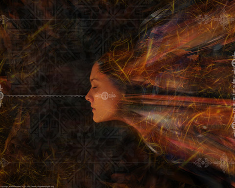
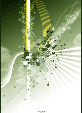
dark...hard...painful to look at? maybe... and maybe that's why i like it


similar in style to the last few i've been doing. new renders..new colours...you'll either like it or you won't, either way..glad you came by and glad you stopped to look at it


thanks
Related content
Comments: 69

i dunno but i thought of wheat. then feathers. then ribbon.

- apparently neurotic and her psychology
👍: 0 ⏩: 0

some of your stuff man seriously takes my breath away. Awsome stuff, no better than awsome....cant think of a word.
👍: 0 ⏩: 0

First reaction: Awesome! Great colors, love the grid and slight sort of aliased distortion in some places.
After looking at it for a while: It definately has the 'computerologist' touch but to be honest I personally really don't think this is as refreshing or innovative as a lot of your other works.
👍: 0 ⏩: 0

interesting new style. looks like some venus flytrap gone wrong ;]
👍: 0 ⏩: 0

love it .. but I seriously cant stand the grid .. sorry :S
👍: 0 ⏩: 0

best one yet man, nice colors used here, and those >>'s have been used in every single one so far, haven't they? 
👍: 0 ⏩: 0

*stares at the image and be at awe for a few minutes while slowly thepoet's jaw drops and starts to drool*
👍: 0 ⏩: 0

That yellow gives the eye a nice starting point. It reaches right out and grabs you.
Looks great.
👍: 0 ⏩: 0

excellent 2d work and a nice render, but perhaps the top right corner is too empty? I like it though
👍: 0 ⏩: 0

I have to say that your latest stuff are a refreshing change from the usual kind of renders.
This one is particularly nice.
👍: 0 ⏩: 0

I really like the mesh look to it.
It gives it some life and isn't as dark as you think.
The vertical line is also very appealing as it balances things.
👍: 0 ⏩: 0

okay..saw the journal entry, and i know you arent doing this stuff for us. but damn, man..
that is hot.
i like this much better than the others youve done recently. the grey designed background kicks ass, and the foreground textures are very sweet. plus, the horrid box has been chopped, and the lines are very cool..in fact, i have no problem whatsoever with the boxes, it just adds to the piece. reminds me of hazmat signs..caution: evolution in progress.
excellent. a lovely blend of the mechanical, the (un)natural and the crisp mountain taste of fresh columbian coffee. okay, maybe not the last bit..but the colors are superb. that over-ripe banana yellow! very yummy, my friend. very yummy..
👍: 0 ⏩: 0

lol its so chaotic and... wireframey! I think it poked me. I'm bleeding. Help, somebody... I'm dying
👍: 0 ⏩: 0

i love how the yellow 3d looks and 'feels' real... so incredible. the harshness is a great addition. nice work, very nice
👍: 0 ⏩: 0

dang dude this looks pretty damn pimp ... great work !
👍: 0 ⏩: 0

weird .. why's it showing up on my devwatch if it's from 2001? lol .. though I never commented it so here I'll go.
I like it.. it's catchy and that is what those abstract threedee thingies should be I guess. You see them everywhere these days (most of all on posters for techno events here in Belgium) and only those with an additional "artistical" touch to it actually catch your attention and that's what this one does, too; perhaps even only for the harsh contrast.
btw - if I'm not mistaken, your an electronic music fan right? I've mixed up some records the other night. If you're interested you'll find a download link in my journal and feel free to comment
👍: 0 ⏩: 0

shit yeah man - its got those awesome burnt colors in the image - like a badass hornet. One of the mean hornets you dont wanna mess with. For being such an abstract piece - it really conveys a sense of power and swiftness - kind of like looking at the new mclaren even tho it isnt moving. You just feel like you should back away or you might lose a limb. I love the grey grid in the background - and all the different yellow bands grab you from each corner of the piece and pull you straight down into the center. Well composed - well colored - just overall well done. Constistantly blow me away. Keep it up man.
👍: 0 ⏩: 0

looks like a plant sometimes 
👍: 0 ⏩: 0

very nice piece but i think it could of done without the grid.
👍: 0 ⏩: 0

Craazy. I love the dynamic composition and great great color pallette. It's a kick in the face. I enjoy some of the simplicity and rest areas of the background, but maybe even more happening in the forground would create more excitement.
That yellow...! wham!
👍: 0 ⏩: 0

I can't imagine anyone not liking this. The darkness and colors are actually two of the appealing characteristics here. Nice shapes and render as always.
Well done.
*trying to figure out how I can use this and still display Eventuality*
👍: 0 ⏩: 0

Oh, I think it lacks the intensity and vigorousness like your Eventuality 
👍: 0 ⏩: 0

yeah I've noticed you've been using darker colors more recently, and more complex shapes. Lots of shadowing too. I like it alot for its complexity. But the one thing I think takes away from it is the rectangular shape to the right of it. I think you could have pulled this off great even without it.
lately these pieces have a secretive air about them *raises her brow*
kris have a secret?
👍: 0 ⏩: 0

wow, what stunning colours. love that fine grid over the whole piece.
👍: 0 ⏩: 0

When I first viewed this piece, I thought: "Damn, that yellow block, its in the way, no its skew, no, maybe its perfect, no, maybe it *is* skew, oh oh darn, that block pisses me off, but darn I like it. What the hell..."
Then I realised, that is what Art is! Art is, imo, supposed to evoke a dialectic in the mind. Art is supposed to awake some feeling or emotion or thought, not always just "oh, its pretty". So, I dont know what you really meant to say when you made this, but it made my day.
Thank you for making this.
👍: 0 ⏩: 0

i like this orange colors..they looks stylish on grey background!
👍: 0 ⏩: 0

wow! Awesome!!!
PS: Added you to my inspiration section of my journal.
👍: 0 ⏩: 0

i like it! the colours are great together...great work
👍: 0 ⏩: 0

Very nice.
I really like the gold/yellow colours and the wireframe render.
Personally, I would think it'd be better if the background was black and the large wireframe render wasn't there.
Still, a really good piece.
👍: 0 ⏩: 0

Great work again man, love the sketchy dirty feel to it, the wiremesh background is very nice too. Youl like these boxes and arrows don't you, ive noticed these in you last work
👍: 0 ⏩: 0
| Next =>

