HOME | DD
 Concept-X — Coffee Studios l a y o u t

Published: 2006-11-29 20:23:04 +0000 UTC; Views: 5785; Favourites: 21; Downloads: 279
Redirect to original
Description
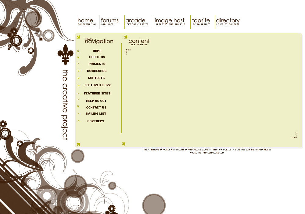
Layout for made up company Coffee Studios, Also logo made by myself, quite happy with this layout, please comment or makes it all worth the effort
Regards,
Related content


Comments: 22


Thanks, ill write a tutorial one day
 (Wink)")
👍: 0 ⏩: 0
Wow looking back on this, i actually really like it, but damn why the hell did i put that green splodge and welcome writing there, does not look good...
Re-design coming soon maybe....?
 (Smile)")
👍: 0 ⏩: 0


liking this quite alot, fresh style n i think green always works with these designs, i like the news area,
what i dislike are the stars, completly out of style to rest of design, and just look odd
good job mate
👍: 0 ⏩: 0


Just the way its designed, Thanks
👍: 0 ⏩: 0


I think you should involve more features of coffee within the design, it would help to make the design more orginal and appealing too.
The nav is plain, I would personally redo that part although the organisation is pritty good. The other thing is that the main content area seems repetive and boring, I just think that you need some variation in there, somthing to make parts stand out. More colour ")
Overall, not bad.
👍: 0 ⏩: 0


I like it alot, but green and brown dont mix well together in my opinion, perhaps just choose one of the two?
👍: 0 ⏩: 1
True, i made the logo before hand in a brown colour and never got round to changing the colour for this layout so just imagine it in your heads for now lol
👍: 0 ⏩: 0