HOME | DD

cooley
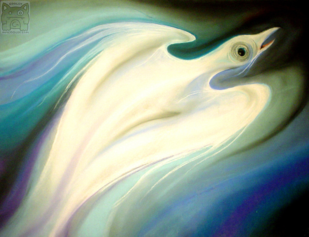
Personal Project - Sorrow

Published: 2005-10-14 01:20:03 +0000 UTC; Views: 11994; Favourites: 400; Downloads: 1314
Redirect to original
Description

Thank you oedalis for the Daily Deviation Award!


iamcooley.com | Commission Info
Facebook | Patreon | Art Stream | Tumblr | Twitter | Weasyl


Prints of my art/photography (ranging from 8x10 to 30x40, and available in fine art fibre, metallic paper, and aluminum sheets) are available on iamcooley.com

© Copyright 2015 Cooley

Related content
Comments: 177

cooley In reply to ??? [2012-09-22 23:20:17 +0000 UTC]

Thank you!

👍: 0 ⏩: 1

Blacksand459 In reply to cooley [2012-09-23 01:00:22 +0000 UTC]

You're welcome!

👍: 0 ⏩: 0

UnnaturalDisaster [2012-04-20 18:36:44 +0000 UTC]

I adore this! It truly does look bereft!

👍: 0 ⏩: 1

cooley In reply to UnnaturalDisaster [2012-04-20 20:26:44 +0000 UTC]

Thank you

👍: 0 ⏩: 0

Angie-Pictures [2011-06-06 18:26:54 +0000 UTC]

Beautiful work. Congratulations to the DD.

👍: 0 ⏩: 0

ImperialDestroyer [2008-10-01 12:51:59 +0000 UTC]

Hm... Maybe you may want to work on an emotion 'eace'?

Just a suggestion. No offence. Luv ur work.


-Peace.

👍: 0 ⏩: 1

cooley In reply to ImperialDestroyer [2008-10-01 15:31:52 +0000 UTC]

Peace would be a good one, though I haven't had time to work with pastels in over a year :/

👍: 0 ⏩: 1

ImperialDestroyer In reply to cooley [2008-10-03 12:02:21 +0000 UTC]

Cool. Rock on!

👍: 0 ⏩: 0

OceanFaerieQuean [2008-01-26 22:29:54 +0000 UTC]

that is really nice. it looks so soft and smooth, it just flows across the screen

👍: 0 ⏩: 0

dablazze [2008-01-05 09:20:31 +0000 UTC]

nice work ^^

👍: 0 ⏩: 0

MrHellz [2007-11-05 02:05:04 +0000 UTC]

👍: 0 ⏩: 0

DarkIgnis [2007-10-29 04:41:14 +0000 UTC]

awwwww sorrow! something i know! ^_^..... but i like this piece! its wonderful!

👍: 0 ⏩: 0

Blitz32 [2007-10-28 15:37:36 +0000 UTC]

Beautiful colors and blending Cooley!
Even more so since it is traditional art. The way the figure flows really brings a lot of emotion to the picture, nice job!

👍: 0 ⏩: 0

neon-is-my-baby [2007-10-25 02:20:42 +0000 UTC]

Nicely Done ^^ Congrats on the Daily Deviation~

Lovely Colours they blend well

👍: 0 ⏩: 0

Kiyasumeni [2007-10-24 10:26:38 +0000 UTC]

wow that is very impressive. I really like the colors you chose: I don't think I would have thought of these colors for 'sorrow', but it really works in this piece! I think it's the combination of the colors and the flowing motion. great work!

👍: 0 ⏩: 0

Astarin [2007-10-24 09:34:45 +0000 UTC]

I dont have time to comment on every one of these just yet But I think the expressions and emotions of each of these are great, there eyes are created perfectly in order to enhance each mood and the colours, you've also made a great choice with the colour and how to create different moods using the same flowing line ^^ Very nice

👍: 0 ⏩: 1

cooley In reply to Astarin [2007-10-28 23:55:56 +0000 UTC]

You are by no means required to comment on all of them. But I appreciate that you are commenting on any!

👍: 0 ⏩: 0

OutcastSpace [2007-10-24 07:12:10 +0000 UTC]

This is definitely my favorite of the group. All of them are very nice. Beautiful color choice and combination for this one.

👍: 0 ⏩: 1

cooley In reply to OutcastSpace [2007-10-24 18:00:10 +0000 UTC]

Thank you - this is also my favorite

👍: 0 ⏩: 0

scrii [2007-10-24 06:24:43 +0000 UTC]

I think this is my favourite... the flowing colours, as well as the use of blue, is amazing! I really love how you've portrayed all of these... fantastic.

👍: 0 ⏩: 0

FeralityIllustration [2007-10-24 04:29:55 +0000 UTC]

Amazing! You portrayed the emotion so perfectly. Is either the original or prints available for purchase?

👍: 0 ⏩: 1

cooley In reply to FeralityIllustration [2007-10-24 18:01:47 +0000 UTC]

Thank you for your interest The original is in bad shape and on very thin paper. Because it's part of a set I would not likely sell any of them, sorry. As for prints, I'd be interested in doing so, but I need to find a larger digital version first. As it is now, this is the largest image I have. Unfortunately this is one of my older pieces I created/photographed before I really understood the importance of archiving.

👍: 0 ⏩: 1

FeralityIllustration In reply to cooley [2007-10-25 02:24:46 +0000 UTC]

Oh, alright. Congratulations on the creation of a wonderful piece, all the same though.

👍: 0 ⏩: 0

gunslingergal [2007-10-24 04:24:35 +0000 UTC]

Very nice.the colors go well with the sorrow part,it kinda has a lonely feeling to it.

👍: 0 ⏩: 0

SargeantSweety [2007-10-24 03:34:49 +0000 UTC]

oo damn those were pastels? they look more like waterpaints OO awefully gorgeous

👍: 0 ⏩: 1

cooley In reply to SargeantSweety [2007-10-24 04:01:26 +0000 UTC]

Yep, all are pastels except for "Fear."

👍: 0 ⏩: 1

SargeantSweety In reply to cooley [2007-10-24 08:39:29 +0000 UTC]

oo jeebus dude they really looked painted lol
Sorrow is definitly my favorite ^^ i LOVE how the colors blended together .....

👍: 0 ⏩: 1

cooley In reply to SargeantSweety [2007-10-24 18:02:06 +0000 UTC]

Thanks! I prefer pastel over any other traditional media.

👍: 0 ⏩: 1

SargeantSweety In reply to cooley [2007-10-24 21:29:30 +0000 UTC]

welcome X3
i can definitly see why lol ^^

👍: 0 ⏩: 0

seigneurbacon [2007-10-24 02:10:05 +0000 UTC]

I love the flow on that one!

👍: 0 ⏩: 0

Autumn-Moonlight [2007-09-12 12:11:46 +0000 UTC]

beautiful! I love its flowing nature and the colours that you have used to create a sombre atmosphere

👍: 0 ⏩: 0

hod-binah [2007-03-13 09:52:13 +0000 UTC]

more than beautiful..

👍: 0 ⏩: 1

cooley In reply to hod-binah [2007-03-28 16:59:02 +0000 UTC]

Thank you kindly

👍: 0 ⏩: 0

LittleRu [2007-01-20 11:10:03 +0000 UTC]

Thats brilliant! Pastels are such a gearat medium, aren't they! *favs*!

👍: 0 ⏩: 1

cooley In reply to LittleRu [2007-01-20 20:06:05 +0000 UTC]

Thank you for the fav and comment

👍: 0 ⏩: 0

BA-HA [2006-12-21 07:09:14 +0000 UTC]

this is amazing! love it!!!

👍: 0 ⏩: 0

Black-Hibiscus [2006-10-31 07:56:36 +0000 UTC]

Simply stunning!

👍: 0 ⏩: 0

oceansky [2006-10-02 04:25:31 +0000 UTC]

wow i love how the colors blended together...well done...

👍: 0 ⏩: 0

gdpr-1892216 [2006-09-02 08:24:57 +0000 UTC]

I like the feel of movement a lot! The bird actually looks a little like northern lights This would look great on my wall, the colors match nicely

👍: 0 ⏩: 0

LilaMascara [2006-04-13 07:20:46 +0000 UTC]

wow
great artwork
The colours are sooooo great

👍: 0 ⏩: 0

CuttingMouses [2006-04-12 08:27:55 +0000 UTC]

That's very impressive. You've mixed all the colors the right way just to manage with the shadows and the background.

Studning piece, this really deserved that Daily Deviantion.

👍: 0 ⏩: 0

KaiStarr [2006-01-24 05:21:52 +0000 UTC]

Lovely. I really like the motion in these images.

👍: 0 ⏩: 1

cooley In reply to KaiStarr [2006-01-24 07:11:01 +0000 UTC]

Thank you Kai.

👍: 0 ⏩: 0

Tunneler [2006-01-20 16:54:31 +0000 UTC]

beautiful both the image and the feel to it. great piece

👍: 0 ⏩: 0

N7Dovahkiir [2006-01-17 13:07:00 +0000 UTC]

Very beautiful. The colors are neat and smooth.

Nice work

👍: 0 ⏩: 0

NebularForest [2006-01-15 00:57:41 +0000 UTC]

That's...great is the only word I can really think of. It glows like it's really illuminated. You really depicted the emotion well.

👍: 0 ⏩: 0

dnmn89 [2006-01-15 00:11:48 +0000 UTC]

I like it but, I dont really get the feeling of sorrow from it

👍: 0 ⏩: 0

c0o0okie [2006-01-14 11:05:27 +0000 UTC]

i really like the colors and how they flow with the bird

👍: 0 ⏩: 0

humanskin [2006-01-14 09:53:05 +0000 UTC]

very nice!! though i think "sorrow" fits the fear painting and "fear" fits this one... it's the freaked out expression on the bird.

👍: 0 ⏩: 0

woobiee [2006-01-14 02:51:04 +0000 UTC]

very nicely done. the shading is quite good.

👍: 0 ⏩: 0


| Next =>