HOME | DD
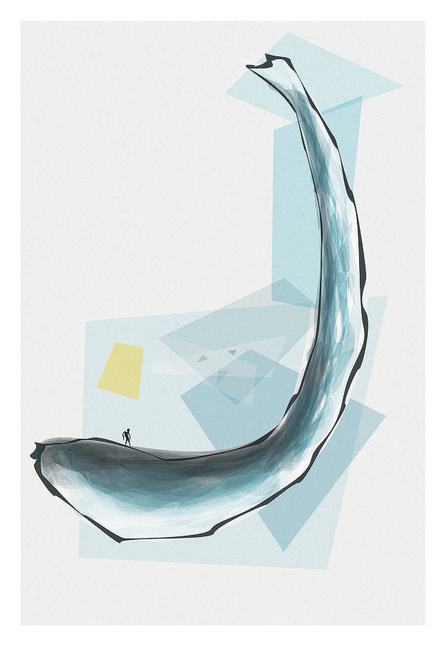
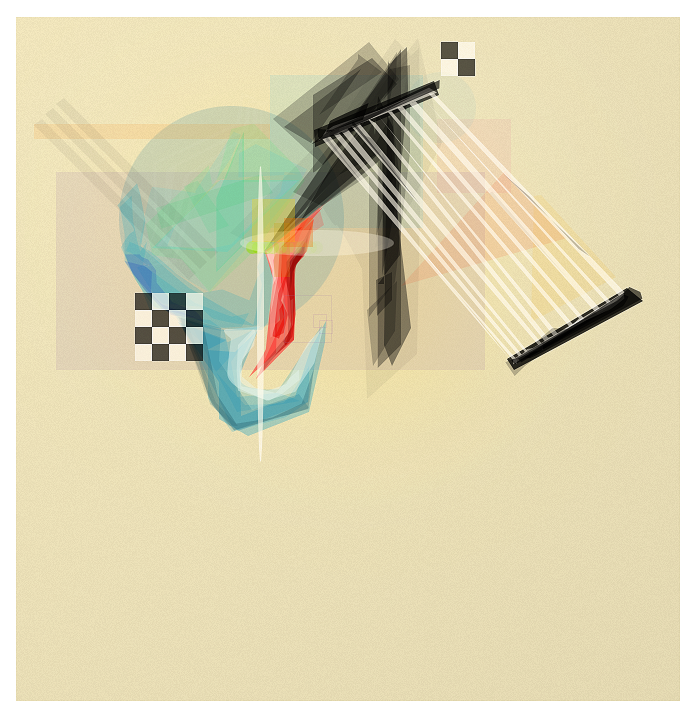
 Corez — Number 7
Published: 2008-05-01 21:04:43 +0000 UTC; Views: 580; Favourites: 4; Downloads: 11
Redirect to original
Description
7 reminds me of the color yellow. Which reminds me of bananas.Related content


Comments: 19


I like it. It's another of those pen tool abstracts, right?
👍: 0 ⏩: 1
")

Awesomeness
I like how it is monochromatic blue with a splash of yellow.
👍: 0 ⏩: 1

Thanks, the yellow is meant to break the focus on the blue.
 (Smile)")
👍: 0 ⏩: 0

As far as I know, haltone is the difference bewteen light and dark colors.
But anyway, it's nice and I see the banana too. xD
But very nice and yes, your style is very unique, I like it.
👍: 0 ⏩: 1
Thanks Alc. I guess that's what halftone is. :S
👍: 0 ⏩: 1

I like it....
Though.... don't know if you tried to do this but by having just that one yellow box.. all the focus is drawn to it =X
but this is.. interesting lol.
*favs*
👍: 0 ⏩: 1
Lol, you're right. o.O
But, thanks Amor.
👍: 0 ⏩: 1
")

*copies and pastes from PV*
Lmao dude, I kid you not, even before I read your comments on dA, I thought that was a banana.
An oddly shaped banana, but it to me was recognisable, which is a great thing.
I'm not a fan of halftones, but you've used a nice colour for yours, and so they don't stand out too much. They stand out enough to be seen, but not enough to be overpowering, which is a good thing.
Nothing much to say on the rest though tbh, I actually like your weird style, it's a unique style, and unique these days is rare.
👍: 0 ⏩: 1
Halftone?
And thanks, appreciate it. ;]
👍: 0 ⏩: 1
Yeah, its definitely got a halftone pattern on xD
👍: 0 ⏩: 1
Halftones...
Original Image: [link]
Line Halftone: [link]
Round Halftone: [link]
Square Halftone: [link]
Now, in PSP, it has a proper Halftone settings bit, so you can adjust settings to what you want (choose colours, angle, belnd mode etc), in other programs, I think you would simply just use a pattern.
So yeah, yours has a halftone
👍: 0 ⏩: 1
Oh, yeah just square patterns in PS. I wanted to give it a traditional canvas feel.
👍: 0 ⏩: 0
