HOME | DD
 Corgbyte — Kipper

Published: 2015-12-07 18:49:23 +0000 UTC; Views: 217; Favourites: 3; Downloads: 0
Redirect to original
Description
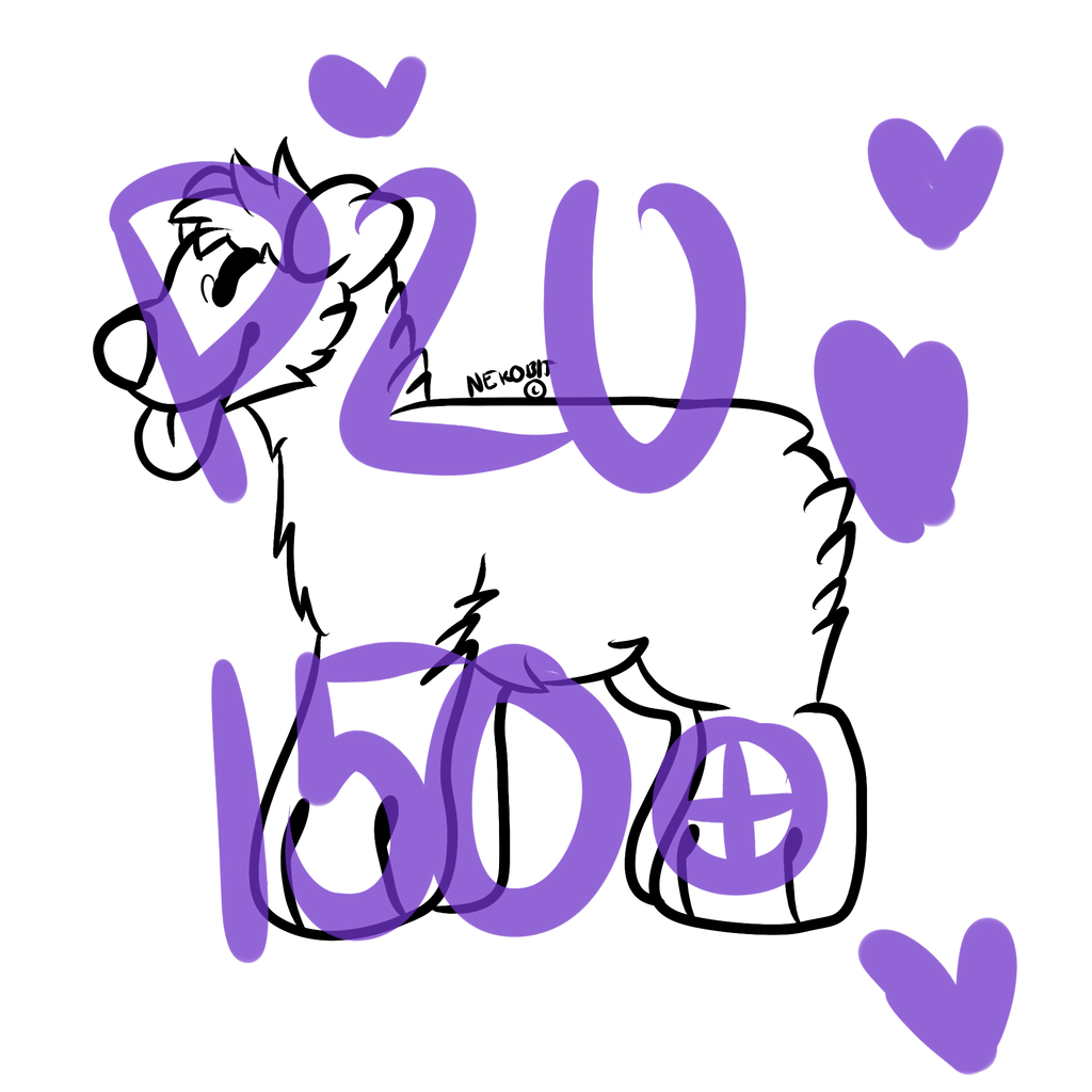
my reinwoofRelated content


Comments: 6

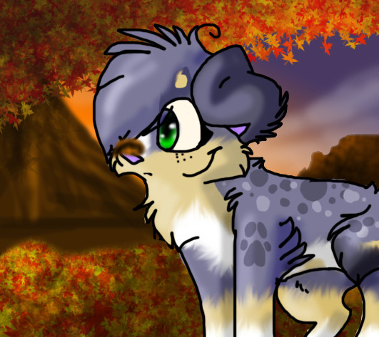
i use paint tool sai too, and what i notice you could try to find new brushes for different textures, like one for hair, fur, grass, smooth, rough. In that would you seem to use a basic pen, instead you could use a brush or a combo so it would make a more realistic fluffy look (personal opinion). The shadowing is pretty good and light source is clear, and the anatomy looks good. For the outlines u could try to smudge them so that there would be no clear lines (personal style opinion) The eye could have the eye area more detailed, would make it more smooth looking in the face. a good work overall
 (Smile)")
👍: 0 ⏩: 0

Heya I found my way here through your link in the forums so I'm going to go ahead and give a line of critique/concern, okay?
First and foremost I think it's a lovely picture, but the one things that I immediately spot that's awkward is the placement of your highlights on the fur.
you must understand that a highlight / specular can never ever ever be IN or directly AGAINST the shadowy part of an object. (*Le classical picture of a ball: s-media-cache-ak0.pinimg.com/7… )
This gives me the impression you've learned to shade your drawings without thinking of the actual light and how it would behave everywhere. That being said, the Hard Light used for the highlights works really well on that brown fur so that's definitly a good thing. Next time around, place them more in the actual direction your light comes from and I suppose it'll be all good.
One other thing is that with the cellshading of the character, you didn't follow through with the fur texture like you did when you placed those brushstrokes in that lovely hazel midtone. If the shadow layer is still intact and not yet merged to anything else, I'd use an eraser or a smudge brush and push that shadow back in strokes, so you get a more realistic shading of that pelt surface, because the very simpliefied, round edges really don't work for me.
Eyeball - same story as the highlight bit up there - I can see you highlighted the eyeball itself correctly, though with a highlight that's not yet crisp, bright and small enough to actually suggest a glossy wet surface (like eyes typically are). When rendering materials, bear in mind that the more slick and wet something is, the more reflective it will be and so the light hitting that surface will create a SMALL, BRIGHT and CRISPly outlined specular/highlight. If it is fuzzy, matte, and or dry, the highlight will be LARGE, FAINT, and FUZZY.
The white dots you placed inside the pupil of the eye are perfect for the task, but it's another reason why I know you draw from a force of habit or because you borrow from other art and less out of understanding how light behaves.
Now, I very well know light theory is a lot and often difficult material, but light is, and I'm not even exagerrating, EVERYTHING. Everything we see looks the way it does because of how light bounces off of it and onto our retinas, so if you understand light you can basically re-create anything on your canvas to a satisfactory degree of realism. It's worth looking into some time.
👍: 0 ⏩: 1

corgbyte.deviantart.com/art/Sl…
Tried improving , I hope it looks much better . Added shadows , highlights and reflective light .
👍: 0 ⏩: 0

I would have to agree with what Riverrockstables said. And for the spot most of them look a little transparent for me and the antlers are kinda crowded...perhaps I need to see that from another angle though to see how the antlers appear. But I do think this is a very cute design.
👍: 0 ⏩: 0

First off, I want to say the design is amazing and the shading is much better than what I've seen before and what I could do.
At first glance, I don't see any large conformation issues other than the belly being a bit large? Im not familiar with this breed so I am unsure.
The fur is beautifully done, along with the placement of the shadows and highlights from my experience.
I would add more definition t the large bare parts, like the side, shoulder, hip, and stomache. Compared to the rest of the reinwoof, it is bland and not shaded. If that makes sense?
It seems as if you didn't finish the closest leg, the white isn't shaded or highlighted and the fur isn't either. You did very well on the black, black is one of the hardess and you did it right about perfect.
The last thing I'd say would be the black rings around the legs. They look as if you did the reinwoof and then went back over and put a line of black. I would add more shadows and highlights to the black rings.
Otherthan that, its amazing! <3
👍: 0 ⏩: 1
Thank youuu , very chubby reinwoof .I'll add more shadows
👍: 0 ⏩: 0