HOME | DD
 CorneliaYoder — Vertigo

Published: 2006-12-05 06:16:27 +0000 UTC; Views: 1817; Favourites: 36; Downloads: 81
Redirect to original
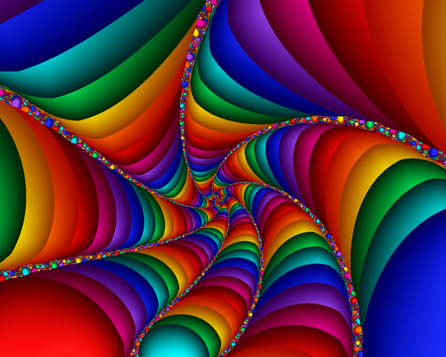
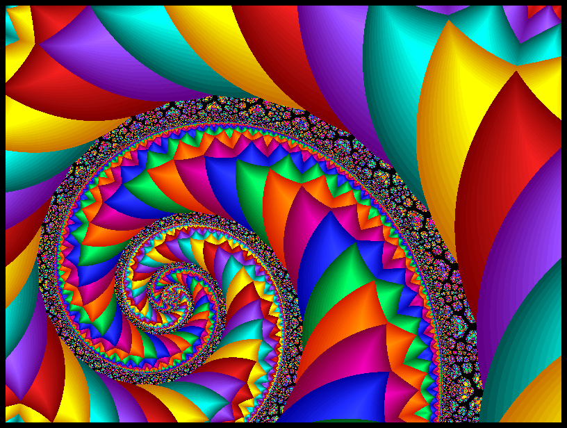
Description
This is my entry in the Minimalist contest at ImagersFractalDDs. It consists of two layers, made in UF 4.03. One layer is the shape and color of the towers, the other is the white mist sweeping down them. I get dizzy just looking down into it (Smile)") )
)
Related content


Comments: 27

Nicely titled lol...for i have vertigo...Nice rainbow colors and black/gray...
I like it!!
👍: 0 ⏩: 1

Thanks, monkeypunk! I also felt it when I looked deeply into the image, hence the title
👍: 0 ⏩: 1


Thank you, Anna! Glad you like it
👍: 0 ⏩: 0

This is quite beautiful 
👍: 0 ⏩: 1
Thanks, clotilda! Glad you like it
👍: 0 ⏩: 1
You're welcome

👍: 0 ⏩: 0

wow! this is one of my favourites! I think you will do well in the contest!
👍: 0 ⏩: 1
Thank you, sensij, you're very kind
👍: 0 ⏩: 0

oh this is so very "maximalist" if there is such a term ")
👍: 0 ⏩: 1
Funny that no one thinks it's minimalist. It's a very simple formula, ucl, and the second layer is merely the white mist. All the rest is one shape with a single color gradient.
Anyway, glad you like it
👍: 0 ⏩: 1
minimalism is about the appereance, not the technical aspects.. I have no idea what kind of a formula you used for this
👍: 0 ⏩: 0

There's too many elements in it to call it minimalist, more into psychedelic. Either way, the design looks beautiful - like rainbow-colored leaves floating down.
👍: 0 ⏩: 1
Thanks, arethusafellini, glad you like it
👍: 0 ⏩: 0
Shimaira [2006-12-05 17:40:09 +0000 UTC]
Very pretty with nice blending ^^ But just as zoom98 sais, its not really minimals... Atleast I think so (too)
Its way to pretty for a minimalism and too complex ^^ *I like the complex ones
 (Wink)")
👍: 0 ⏩: 1
Well, I like it and it meets the rules. But no matter, it's just a very simple pretty one, and I like it, too
👍: 0 ⏩: 0


Thank you, one-tough-one!!
👍: 0 ⏩: 1

Very nice, although I would hardly call it minimalist in that it has two layers instead of one, and has a very obvious complex element to it. But then again, it isn't my contest, and it has nice colors, so

👍: 0 ⏩: 1

Thanks! Glad you like it
👍: 0 ⏩: 0