HOME | DD
 CostaDesign — Unique Systems
by-nc-nd
CostaDesign — Unique Systems
by-nc-nd

Published: 2008-08-07 05:31:24 +0000 UTC; Views: 6712; Favourites: 51; Downloads: 0
Redirect to original
Description
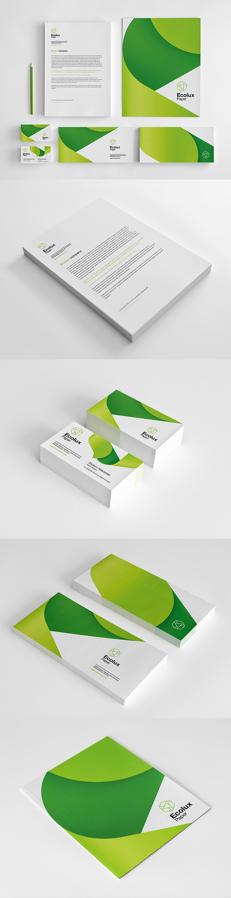
Client:Unique Systems (Robson Fernandes)
Brand:
Simplicity, power, energy, elegance, technology...
------
©2009 - Thiago Costa. All rights reserved
[link]
Related content


Comments: 42


 (Smile)")
")


thanks!
and hey, you have a great gallery
compliments
👍: 0 ⏩: 1


brigadão!
é uma honra receber elogios de caras bons como vc
👍: 0 ⏩: 0

Hey! thanks
I used the original Gill Sans
👍: 0 ⏩: 0


Unfortunately the watermark bothers me a lot when trying to view / judge this deviation... However when ignoring that fact, it seems to me as a very nice presentation, and a fairly nice, very professional logotype, however I don't quite sense the uniqueness which the name implies.
👍: 0 ⏩: 1
Yeah, the watermark always sucks, but we need to use in some cases!
about the uniqueness in the type:
I didn't tried to make something UNIQUE, Im not Leonardo da Vinci, my objective here is make something simple and objective, the confection of UNIQUE typography or symbol is not the primary goal in that work, would be redundant...
The "unique" idea will be implicit in the work of the company, in the prints and products, even in the word, but not in the logo
by the way, when someone make something unique, 2 weeks later isn't unique anymore hehe
Thanks for your feedback, man!
👍: 0 ⏩: 1
So very true, and I'm aware uniqueness isn't exactly the goal you've strived for, however I must say there would be something entriguing in having a very unique logotype to illustrate the uniqueness of the portfolio.
Never the less a very professional, clean and crisp ")
👍: 0 ⏩: 1
hahaha, thats true, man!
Well, I try to illustrate my portfolio, not with unique logotypes, but intelligent ones and a little bit of originality, and I always use a "almost unique" grid system!
today, the only thing is unique is our DNA lol
anyways, many thanks for your feedback, Andreas, always help
👍: 0 ⏩: 0

o mais incrível é que TUDO que você faz, fica perfeito, e todos esses comentários provam que eu não digo isso só porque sou sua namorada e te amo :$ você é, de verdade, o melhor designer do mundo! te amo e tenho muito orgulho de você, meu bebê :$

👍: 0 ⏩: 1
aaaaaaah, não, não sou o melhor designer do mundo :$ mas vou fazer de tudo pra isso
até pq, minha fonte de inspiraçao eh vc, e isso faz com que eu seja cada dia melhor...
👍: 0 ⏩: 0
Yeah, its a custom Gill Sans!
you can find the original font at [link]
👍: 0 ⏩: 1

cool! i do have gill sans! thanks for the tip!
👍: 0 ⏩: 0

 (Wink)")

hey! long time no see eh?
good to see you back!
👍: 0 ⏩: 1

Good work - I like the highlight on the 'Q' and the colour choice works well.
Could you please tell me the font you used?
👍: 0 ⏩: 1
Of course, man, its a custom Gill Sans, I made some little modifications, but still the great Gill Sans
you can find the original font at [link]
thanks for your feedback!
👍: 0 ⏩: 1
Thanks very much for the link!
👍: 0 ⏩: 1

