HOME | DD
 craftsbyblue — Makoto - Character Design
by-nc-nd
craftsbyblue — Makoto - Character Design
by-nc-nd
#characterdesign #characterreference #drawingpractice #originalcharacter #worldbuilding #proportionstudy
Published: 2019-10-29 02:12:13 +0000 UTC; Views: 501; Favourites: 38; Downloads: 0
Redirect to original
Description
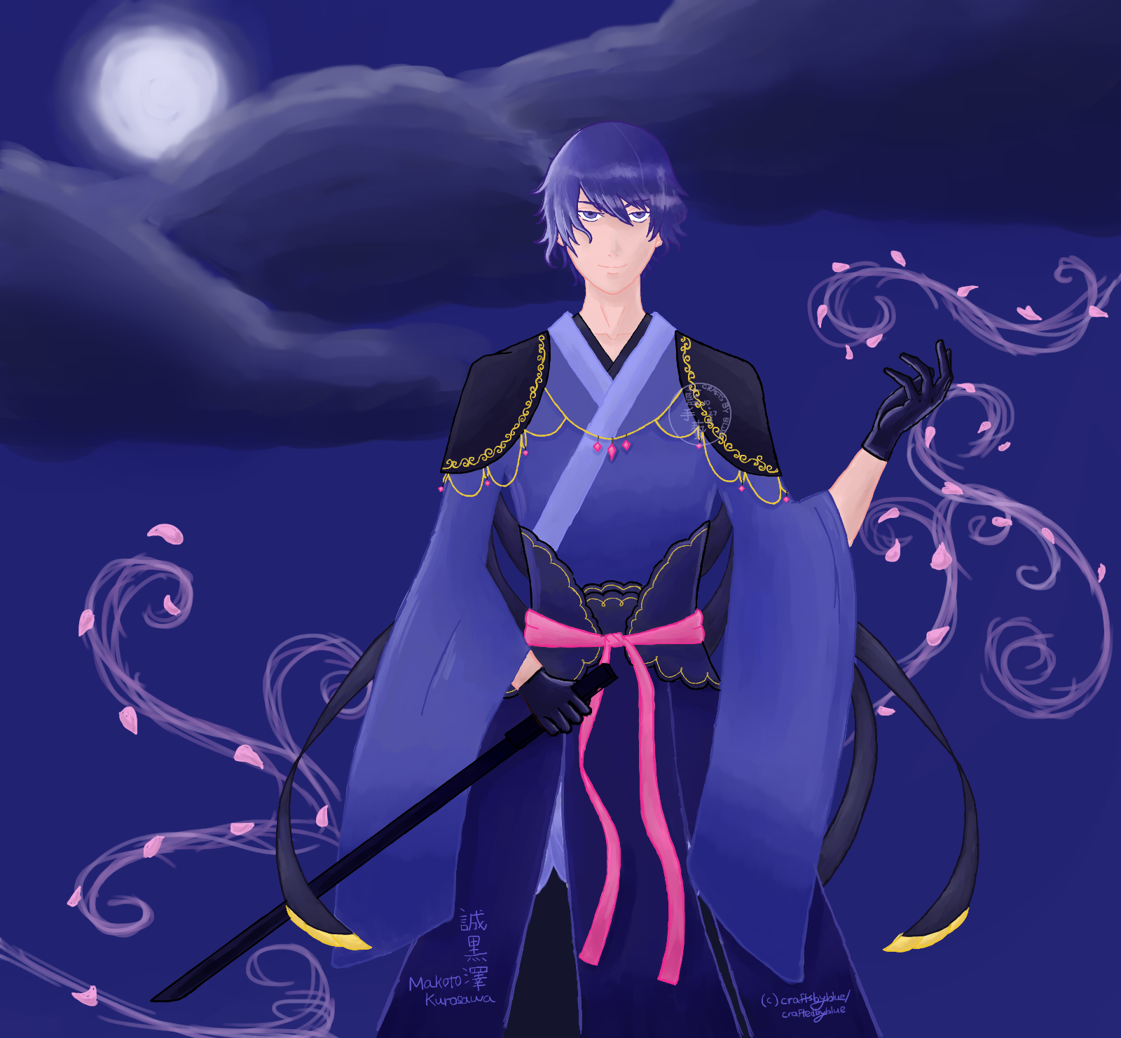
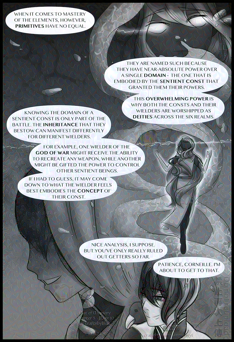
Makoto Kurosawa (誠 黒澤). More information about him can be found here: Out of Memory - Part I .
More about this character:
Time: At least 20 hours. It's not something that I'm focusing on right now, but I didn't want to leave the background blank. Hence the hasty sketch.
Tutorial Credit: Sakimichan - Anatomy 101 Proportion Voice Over Tutorial
Reference Credit: Asierromero
(c) craftsbyblue (DeviantArt), aka. craftedbyblue (Instagram). You are not permitted to copy, remake, sell, or take credit for any of my works. Works inspired by my original characters and stories must include proper credit and a link to either my DeviantArt account, craftsbyblue, or Instagram account, craftedbyblue. Selling fan works of my intellectual property is prohibited without written permission and a licensing agreement.
Related content


Comments: 47

👍: 1 ⏩: 1

Thank you so much! Really glad you like it
👍: 0 ⏩: 1
👍: 1 ⏩: 1
👍: 0 ⏩: 1
👍: 1 ⏩: 0

Not sure how often you'd have to use something like age-shifting on your mates
👍: 0 ⏩: 1
With each age group comes a different set of advantages ^^
👍: 0 ⏩: 1
I dunno what advantage seniors and kids have aside from discounts >.>
👍: 0 ⏩: 1
It's about perception as well, which determines how others treat you - ex. kids are perceived as more innocent, seniors as wiser.
👍: 0 ⏩: 1
I'm still not seeing how those stereotypes help in espionage or combat situations
👍: 0 ⏩: 1
For one, people don't typically expect small children to be able to do...lots of things (fight, hack, understand complex concepts, etc.) ^^
👍: 0 ⏩: 1
They don't expect them to be able to look after themselves either >.>
👍: 0 ⏩: 1
so if they're seen approaching anywhere important people will be all like "hey hun are you lost? let's get you back to your mama"
👍: 0 ⏩: 1
Certain important people will have lots of young fans, so finding that one kid would be hard
👍: 0 ⏩: 1
True, but those young people wouldn't exactly be allowed anywhere important, you know?
👍: 0 ⏩: 1
Depends on where you define as 'important' and that depends on the objective
👍: 0 ⏩: 1
I imagine most people in possession of something important would be aware of how to keep it safe
👍: 0 ⏩: 1
Under normal conditions, perhaps ^^
👍: 0 ⏩: 0

Hello!
I know I am late to the party, but I Hope you'll forgive me!
I like how he has turned out, actually (and that's not just because I love the colour blue.) He's a figure that has a lot of presence and cuts a long shadow before him. The little details on his clothes are very nicely done, too! The background is simple, but atmospheric. And it fits him really nicely!
Now... how to make him better?
Well, for starters, his hair is a little flat. Here are some "How to draw anime-style hair" tutorials that might be helpful:
Drawing Anime Hair: Bangs
Cell shading anime hair
How to Draw Anime Hair Styles
Drawing Anime: Straight Hair and Ponytails
As for his clothing, it's helpful to see how large sleeves fall when the hands are up. There are tutorials about that as well, but I would just go and look at reference photos for them. (Hey, didn't I just write a tutorial about that earlier?)
And the last thing I wanted to point out was the caplet he was wearing. It looks like it branches out into something almost geometrical behind him. It's a strange set-up, I think. If it's something magical, then it's unlikely to have these pieces that float forward towards the front of the camera. And if it's something that's made of cloth... it shouldn't be able to criss-cross like that. I'd love to see the back of him to figure this part out!
Over all, though, I think you're doing a great job with him. I'd love to see more from you!
Best of luck! 
👍: 0 ⏩: 1
Hi 


I'm really glad that you like how he turned out, and that you like the details and background (& yay for blue  (Wink)")
To be honest, I purposely glossed over the details of the clothing/shading in favor of getting the character design out (otherwise I would take forty to sixty hours to complete the piece) . I expected that there would be quite a few mistakes, and I agree with your suggestions - I plan on addressing them after I have a better grasp on anatomy and posing (hopefully/ideally, I'll slowly improve on all these aspects with each successive piece)
For references, I've been sticking to public domain/free to use photos for the time being, that has limited my options a bit (I might purchase stock photos in the future, but not for such an early practice piece). Until then, I might rely more on tutorials for areas such as the sleeves
Thank you again, I'll try my best 
👍: 0 ⏩: 1
Thank you so very much for your kind understanding!
I really love how both of the turned out. And hey, yay for blue!
Aah, yeah, that would make sense. (I spend a lot of time on my work, too. Personal works tend to take longer and a lot of time I just lose track myself. I wouldn’t be surprised at the “60 hours” time mark.) I hope the resources I’ve sent you were in some ways helpful!
Before you can afford buying stock photos, there are several people who offer stock photos for free. @ senshistock has a lot of reference photos and they are mostly free to use. Besides, if you have friends and family who can help, you can always pose them (or yourself) and take all the photos you want. I still stare at my own hands when drawing hands!
I hope this helps!
👍: 0 ⏩: 1
Thank you so much again  (Smile)")
Same, when I start writing especially, time just flies! The total time taken on a description can easily surpass the time spent on some of my most complex jewelry pieces. Maybe a timer would help 
These resources are definitely helpful
This helps a lot, thank you again
👍: 0 ⏩: 1
You're more than welcome!
I like how they turned out, too. They are getting better all the time!
I had given up on the timer idea. It's way too depressing to really time myself. It tells me how much time I have spent on a piece... and that's a long time, usually. I like my lackadaisy estimates. ")
I am hoping the stocks will help. But hey, worse comes to worse... pose them yourself if the poses are easier. If it's action-packed or physiologically difficult (like flying through the air), then it's definitely a good idea to get a professional's help. Otherwise... grab a camera and grab a friend!
Cheers!
👍: 0 ⏩: 1

I’m really glad you think so
True... maybe I will stick to timing my crafting. It can be discouraging to know how long I’ve spent on a drawing.
They will
👍: 0 ⏩: 1
Nothing wrong with the Black/red combo! I love them, too. You can do a whole lot with some really classy colour combos. Blue and white do give people the kind of angelic, regal look, but black-and-red can be very imposing, too.
Maybe that's a good idea. Time some, but not all. I don't time my drawings, either. But I really, really, really don't time most of the other crafts that I do that's not related to paper. It's just too hard to time.
There we go! Practice with what you've got first. We'll deal with the hard stuff later!
👍: 0 ⏩: 1
Agreed
It is indeed hard to time, especially when one gets into the zone
Yes
👍: 0 ⏩: 1
Here's a secret. I bought a pack of "basic colour" card stocks a long time ago. I thought I could use them all up in no time. But... obviously, the answer is no. I ended up using mostly black and red. Every other colour... well... I use them whenever I can. Sometimes simpler really is better! (Rin, obviously, didn't get the memo...
You're right about the pricing, too. A lot of the time it's hard to even earn a minimum wage on crafting because of the time we spent on each piece. I try to keep an eye on my timing but I fail miserably most of the time. Which means... I really should be the last person who takes on a commission, isn't it?
Go, us, go!!!
👍: 0 ⏩: 1
Hehe, I tried to learn from my wire lessons and only got paper in my favorite colors
Indeed it is. Not to mention, I suspect successful crafters are able to subsidize their prices because of their sale volumes, which makes it harder for everyone else. It’s a tough market, that’s for sure.
I think high quality warrants a high price, and reasonable buyers are aware of that. If you did open commissions, your paper cuts should be priced at hundreds of dollars each.
Either way, we are lucky to not need them. I’ve closed my commissions 
👍: 0 ⏩: 1
Yeah... pop colours make sense in a lot of ways, and you can see how often I actually do a full-coloured piece these days (almost never). You can't really blame me for that choice.
A lot of white-based characters have silver/blue as their basic colour scheme. Rin and Weiss are basically using the same scheme, but so do a lot of other characters. It's a go-to for a lot of people to convey a certain message visually. And it's held up nicely over the ages.
No one is going to buy my stuff for a hundred bucks! (Heck, I am not going to buy my own stuff for a hundred bucks!
Congratulations on closing your commissions! Yay!
👍: 0 ⏩: 1
I don't blame you at all...I'd do the same, I would not buy an extra color just to make one character's piece pop out a little bit more
Agreed, it holds out very nicely - and silver/blue + with black/red accents go really well together (with the latter colors sometimes increasing in proportion based on character development)
I would
Agreed, boosting one's self-confidence through commissions is not the best choice...and driving one's prices down for the sake of getting more customers is most likely going to backfire. In addition, prices are heavily driven by brand name. Having a strong, reputable brand also creates a cycle where the seller can afford to advertise/have sales -> more people are drawn to the shop -> more people buy. I think that's part of the reason why it's so hard for new sellers to break into the market - people are more inclined to go with what they know/what is known to be good than take a risk.
Indeed, I am very thankful as well, to not have to participate in this
Thank you so much 
👍: 0 ⏩: 1
Exactly! I've been using and re-using the same pack of paper scraps that a friend gave me for my birthday for ages. And I am still nowhere near done with them. And I wouldn't change it for the world.
There are just some colour combos that speaks really loudly together. And they are usually the go to colours for character designs. In many cases when there are multiple main characters, one of them would have a warm colour combo (like black/red) and the other one would have a cold combo (like blue/silver). It's just one of those tried, tested and true set ups that many artists (even the professionals!) use.
Thank you!
Brand power goes a long way. That's also why a lot of artists go into fan art at the beginning in order to help them build their own brands. By piggy-backing on a well-known IP, you are essentially trying to give yourself more exposure and more interest. It might backfire, just as you've mentioned. But for someone who is really using their art as a business model, it might be a viable move, at least right at the beginning. What commissions aren't good for, however, is a confidence booster. It's just a bad idea on so many fronts.
So, once again: Congratulations on taking the business side out of the art!
👍: 0 ⏩: 1
That’s the awesome part about paper - you can use the materials for a very long time
It’s a tried and true set up for sure, as it’s an effective way of “show, not tell” - giving new viewers a visual bio is one way to get them interested
You are welcome
Agreed, confidence needs to come from within, not through commissions and sales
Thank you again
👍: 0 ⏩: 0

Great colour use! I love how you used so many blue-purpleish colours and it all works together
👍: 0 ⏩: 1
Thank you so much!
I am really glad you think all the colors work together
👍: 0 ⏩: 1
ah that makes everything easier
👍: 0 ⏩: 1


