HOME | DD
 craftsbyblue — Twisted Adoration
by-nc-nd
craftsbyblue — Twisted Adoration
by-nc-nd

#skull #villain #anime #coffin #digital #drawing #fanart #funeral #grimreaper #kuroshitsuji #manga #photoshop #shinigami #twisted #undertaker #whitehair #blackbutler #painttoolsai #sotoba
Published: 2016-05-28 05:31:15 +0000 UTC; Views: 1483; Favourites: 70; Downloads: 0
Redirect to original
Description
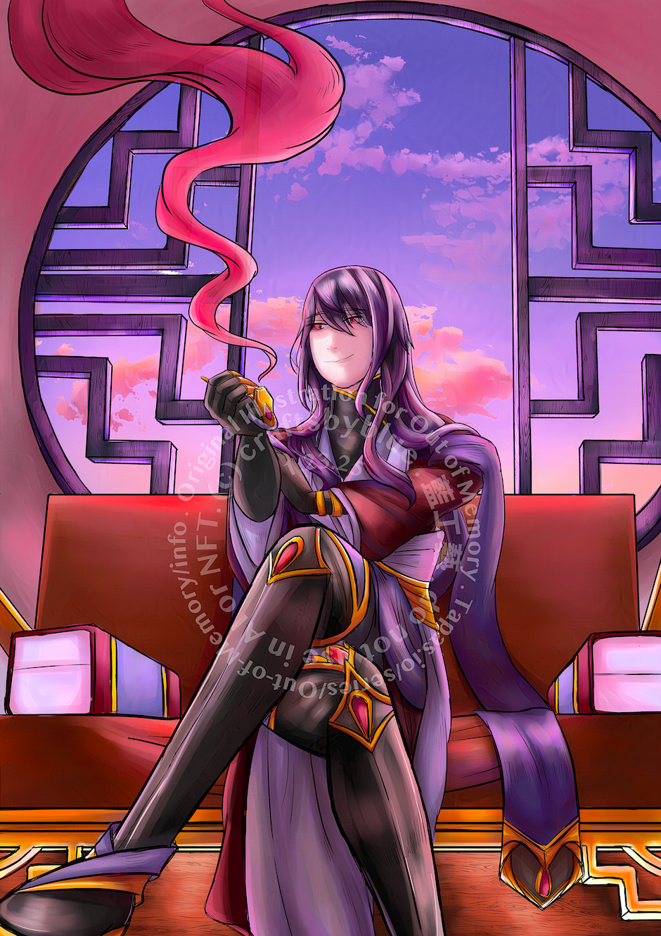
I am not accepting orders for fan art or fan characters unless the copyright holder's permission is included with the request. Please see my commission info for more details."You've never thought about it? There might be an interesting development lurking behind the ending credits."
It's been two years since I last drew something substantial, so I decided to draw Undertaker as he's been my favorite character for a little over a year. This piece took around 40 hours from start to finish. I used several references for the anatomy, while trying to keep his features similar to the manga version. Critiques are welcome.
Related content


Comments: 60

👍: 0 ⏩: 1

👍: 1 ⏩: 0

From comment tag! My tag-word was "brash", so I chose this piece because it was such a change of pace from the rest of your gallery, one may even call your decision "brash".
That, and this was your newest digital art piece, and since I know nothing about jewelry, I retreated to safety here.
Sorry this was a bit late, but I'll make it worth the time, I promise!
I like the way you've made him very recognizable. All of the little details are here, from his pearls to his nails to his piercings. The basics are all set very well here and the anatomy is great. And your non-invasive watermark is the type of watermark I can get behind. My favorite part of this has got to be the skull. It's well illustrated, anatomically correct, and visually interesting with all its cracks and imperfections. The hand holding it looks good as well...
... Although the knuckles could stand to be more defined. Adding to that, I believe the wrinkles in the clothes are decent, but can be better placed. For instance, the wrinkles on his sleeves are just sort of all over the place, rather than folding over itself in natural ways. Look at pictures of flowing fabrics, such as this or this . And having each fold outlined in that gritty, opaque white just doesn't have the same effect I think you were going for. It doesn't look very... Good. As though the lighting of the fabric is telling me it's a different fabric from what the shading is telling me. More consistency in your lighting and shading should help here, as well as a general clean-up of the way you seem to shade. It's a bit dirty and unkempt, which doesn't at all go with your more elegant linework and style.
The rest of your piece suffers from this as well, as the shading isn't really defined. I can't tell where a light source is coming from, if anywhere. He doesn't have any sort of shadow against the background either so there's really no interactivity between the character and your background. The coffin itself is a bit of an optical illusion. Because there's no shading in it, I can't tell if I'm looking into it while it's open, or looking at the back of it while it's flipped over. By that I mean it's hard to tell if the outlines around the inside of the coffin (the pseudo-hexagonal lines above the Undertaker's head) are supposed to indicate that it's hollowed out or jutting toward the viewer. It's a bit hard to explain, if I'm honest, so if you feel I didn't explain it well enough or need some clarification feel free to let me know.
As the Undertaker, I expected a bigger, more expressive smile, so what I have is a bit underwhelming. I feel like, overall, the character could use some more texture (fabric on the clothes, more defined strands of hair -- you tried this, I see it, but it's very faint and could stand out more and perhaps bigger eyes. Finally, I think the lack of a focal point anywhere in this piece hinders it quite a lot. If the Undertaker's head had been placed more in the center, rather than the coffine in the background, we could've been drawn to his brightly colored eyes. But right now, we're kinda focused on nothing in particular.
Overall, a solid piece with some flaws that need to be addressed. I like the personality in his hair, how the stands seem to fall however they please around his shoulders. It adds a little something extra to the piece. The background could use some TLC and extra attention, as it's lacking, but is overall illustrated well. Your biggest weaknesses seem to be the backgrounds, as well as shading and lighting, but everything else you seem to have a decent grasp on. Great work on this!
The next person in the tagline is and your tag-word is "Scholarly". Have fun!

👍: 0 ⏩: 2
Thanks so much for thoroughly commenting on this piece! I'm really glad that you spoke in detail about both the technical parts of the drawing, as well as how true it stays to the character - your critique is one of the nicest ones I've received recently 
It's interesting that you associated this piece with brashness, since I actually started out drawing (eons ago) and then made the leap to crafting over a decade later - to be fair, my gallery doesn't have evidence of that xD. No worries about being late, your critique was definitely worth reading  (Wink)")
Your points are all valid and specific, I really appreciate it - to be honest, I don't quite "get" how lighting works (the way that wirework comes to me easily), which is partly why I have so much trouble with the lighting and shading. The shading on this one was basically guesswork, and I'm glad that you mentioned that as a point of improvement - somehow, it's one of the aspects that I can't easily learn from looking at references or tutorials. Your links really help as well, thank you!
👍: 0 ⏩: 1
No problem, friend! I'm glad I could help some! ^^ Don't worry about being unable to learn lighting from tutorials. I can't either. DX I've tried and tried, but the only way I've been able to learn how lighting works so far has been through trial and error. It's tough! Especially when you have multiple characters whose shadows are all over each other... *shudder* XD Just gotta learn what method works for you!
👍: 0 ⏩: 1
Strangely, I was under the impression that other artists just "got it" when it came to lighting. Trial and error sounds a lot less intimidating (and also cheaper than trial and error in crafting xD). Ah, multiple characters . Thank you again, your advice has really helped
👍: 0 ⏩: 0

Im to comment on tour gallary correct.
👍: 0 ⏩: 1

bluediscord will comment on your gallery and give you a new tag-word, and you will comment on SamuelSama 's gallery, finishing the tagline.
👍: 0 ⏩: 1


Beautiful! I love the hair a lot ")
👍: 0 ⏩: 1

Hi there! I'm Mae over from ProjectComment , and I'm here today to share some of my impressions with you about your work as well as any tips I may know to help you along with future pieces. I chose yours because the thumbnail really caught my eye, and up close it's even more awesome!
My first impression of your work was that it was of a character somewhat related to death or destruction contemplating some deeper mystery about the world. I haven't seen Black Butler, but my husband loves it, and he thought this was a really good rendition of this character. I love the attention to detail you paid with the necklaces and on the skull - using refs definitely paid off there! 
With the great attention to detail on the drawing, I feel as though the coloring should have the same level of detail. However, some parts of the painting, especially the hair/skin, are a bit lacking and ultimately take away more than they add. The lack of a strong light source is a part of this, and it causes a lack of overall focus in the piece - with such a dark topic as death, I bet that a strong light source with deep shadows would look really awesome! Like this, for instance: photoflex.com/images/uploads/B…
Take a look at the image on the right vs. the one on the left. See how much more dramatic of a mood the strong shadows create? Something like that would be really awesome with this lineart, I think.
You should also take into consideration the composition of values in this piece. If you put this work on a grayscale filter or squint your eyes, it would look pretty same-y except for the hair and skin, which also contributes directly to the lack of focus. Here's a great tutorial on composition and value that really helped me as an artist (my sense of composition is awful XD). Check out the second page's tips especially; it will blow your mind! www.creativebloq.com/digital-a…
Please remember that nothing I've said here is meant to detract from the great work you've done here or hurt you. I think you're a wonderful artist with a ton of great work already in your gallery! Let me know if anything I've said here is unclear or if you have any other questions, and I"ll be glad to help out however I can. Keep being awesome, and have a great day!
-Mae
👍: 0 ⏩: 1
Hi! Thank you very much, I really appreciate your critique and suggestions
Your impression of this piece is spot on, and I'm glad that the two of you like it!
Agreed with your suggestions, I've been avoiding using strong lights and shadows since I don't feel like I could pull them off (hence, I should probably be studying lighting more), but you are absolutely right that a strong light source and shadows would enhance and be more suitable for this piece. Really appreciate the tutorial as well, before I couldn't explain in words why certain pieces stood out more than others but the tutorial articulates it perfectly! Thank you again 
👍: 0 ⏩: 1
No problem, friend! Glad to help
It really helped me to just do small (talking 200x300) value and lighting studies using real photos
And ikr!? Knowing how to establish depth through value and composition has really made all the difference for me  (Smile)")
👍: 0 ⏩: 1
Doing small pieces sounds like an awesome idea, I think I'll go with smaller pieces as well; did you draw directly from life, or use photo references when you first started practicing with value and lighting?
I can see the trick applied very well in your drawings, it really does help establish depth
👍: 0 ⏩: 1
Thank you!
A lot of art teachers and profs will tell you that practicing from life is better (and it is in some ways ... photos tend to distort perspective and colors sometimes), but sometimes life drawing just isn't practical, and that's where photos come in handy. I like using photos to reference lighting in certain backgrounds, for instance, and real life drawing for more in-depth studies.
What I've done before is to set up some still lifes with the items lying around in my home and then change up the lighting conditions - for example, I would first position a still life in front of a lighted window for a study of natural light, then wait until nighttime and use a bright lamp to cast deep shadows and try painting that. Or even just closing the curtain to use the ambient lighting around my home, since we artists like to use that type of lighting in certain situations. I bet you could even change out the bulb in your lamp for a colored one - now wouldn't that be interesting!
Basically, just experiment with it and take note of how different lighting conditions affect the shapes and colors of shadows and highlights on objects. What's really important is to be reflective and really think about how light interacts with various surfaces and shapes, because once you get it, you can apply it without reference in your imaginative work.
Let me know if that makes sense! XD
👍: 0 ⏩: 1
You are welcome
What you said makes total sense, thank you very much for taking the time to write this, and for all your awesome and helpful advice 
👍: 0 ⏩: 1
No problem! I'm glad to help
👍: 0 ⏩: 1

Nie work on this! I love the pose and the general subject, but goodness I'm envious of how you can draw folds in clothes! They're simple but really nicely done and really add a lot. Great drawing, hopefully you'll do more in the future!
👍: 0 ⏩: 1
Thank you very much!
The folds were tricky, since it was my first time drawing and shading cloth; I'm really glad you like them!
Hopefully I can get another drawing done this summer
👍: 0 ⏩: 1
It looks much better than many of my attempts to draw and shade cloth creases that's for sure, mine always come out looking a bit weird
")
👍: 0 ⏩: 1
Do you use custom brushes in Photoshop? Those can really help for drawing a variety of textures, like cloth
👍: 0 ⏩: 1
For cloth texture I tend to use a variety of fabric texture overlays and warp them to match the contours that I require (custom brushes I tend to reserve for things like fire, smoke, mud, fur, scales and other natural textures, usually I use those in scenery). I was actually talking more about drawing the lineart for cloth (I'm fine with texturing cloth), it's so hard to know where to put all the lines in for folds for maximum effect, without cluttering all the linework with lines
👍: 0 ⏩: 1
Ah I see; it is indeed difficult to figure out where to put the fold lines, even with refs since slight variations can cause large differences in the folds >.>! For this piece, I looked at some manga panels to try to ground the fold placements, since the character dresses slightly differently from an actual undertaker.
What tool are you using for warping?
👍: 0 ⏩: 1
Sometimes it's good to study yourself (or others) and see where clothes folds fall and where the shadows and highlights land. I often use my own custom action figures as a reference for clothes in my own art, the problem with those really is the fabric is much more rigid and doesn't fall as naturally as a bigger set of clothes would. Just compare the clothes on a human to the clothes on, for example, a Barbie doll (other similar dolls with fabric clothes available).
Back when I used Elements as my primary software, I used to use the Fix Camera Distortion command to warp a texture, which let's be honest was a bit primitive but it still worked somewhat. Now upgraded to Photoshop CC, I use the Transform commands Skew, Perspective, Distort and Warp (which one I use depends on how I need to shape a texture layer, but I mostly use Perspective and Warp)
👍: 0 ⏩: 1
Great advice, thank you
Thank you
👍: 0 ⏩: 0

'Alas, poor Yorick! I knew him, Horatio, a fellow of infinite jest, of most excellent fancy. He hath bore me on his back a thousand times, and now how abhorr'd in my imagination it is!' Okay, Shakespeare references aside, I do not know anything about Black Butler so I am not entirely sure of the context of this but I will try anyway. I like this piece, it is rather interesting. I am intrigued by the idea of it. He is holding a skull and looking at it with a rather ambiguous facial expression. I cannot tell if it is sadness, fondness, amusement, or a whole lot of other emotions. However, this is exactly what makes the piece interesting to me. Makes me want to know what this character is thinking even though I do not know anything about him. The clothing folds look nice, they drape on the body in a natural manner. There is one slight thing that could possibly be changed. There is a lock of hair draped on his shoulder that I am not sure where it is coming from and it seems significantly longer than the rest of his hair. Though I also do not know if that is just something that the character has which I am not aware of. Keep up the good work
ProjectComment
👍: 0 ⏩: 1
Thank you very much for critiquing this piece!
Hehe, this piece was partly inspired by Hamlet so your reference fits well~
I appreciate that you described what about this piece appealed to you - all of the emotions you listed fit the character quite well, it's pretty spot on
Thank you again!
👍: 0 ⏩: 1
You're welcome! You are definitely right about showing more of the longer strands of the hair. It would have helped a lot I thing. Also I'm surprised I got the emotions spot on honestly. I'm happy to have helped
👍: 0 ⏩: 1

Very well drawn, love how you shaded the coat, great job. Thank you for submitting to the group, much appreciated.
👍: 0 ⏩: 1
Thank you very much
👍: 0 ⏩: 1
You are very welcome.
👍: 0 ⏩: 0

I volunteer as Hugging tribute!
👍: 0 ⏩: 1
Feel free
No guarantees that nothing suspicious is waiting just outside the frame xD
👍: 0 ⏩: 1

hehe reminds me of the play. "alas poor Yorik. I knew him well"
well done
👍: 0 ⏩: 1
Thank you! Hehe that was part of the inspiration for this
👍: 0 ⏩: 1
you're welcome. I don't know why but every time I see this type of image, I think of that. either that quote or "to be or not to be" I can't remember which play those quotes are from
👍: 0 ⏩: 1
It's from Hamlet
That makes sense, as the play and pose is very famous~
👍: 0 ⏩: 1
Hamlet. I keep forgetting that's the one. When I was in school I read Romeo and Juillet as well as MacBeth
👍: 0 ⏩: 1
I read Romeo and Juliet while in school as well, didn't get to Macbeth though! Would you recommend it?
👍: 0 ⏩: 1
MacBeth is one of the least complicated ones out there
👍: 0 ⏩: 1
| Next =>