HOME | DD
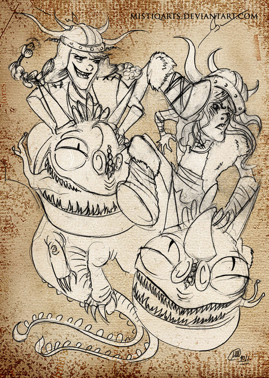
 CraigArndt — Ruffnut likes crazy

Published: 2010-04-14 19:26:02 +0000 UTC; Views: 4049; Favourites: 203; Downloads: 172
Redirect to original
Description
Here is my color version of the line work I posted yesterday! I like how this one turned out.I saw How to Train Your Dragon and loved it.
It's a really good story, great design, and I think Dreamworks did a great job adapting it and cleaning the book up to be accessible to a wider audience. Everyone loves to slam adaptations for not being as good as the book but I think HTTYD is a good example how an adaptation can be really great when it's not just a simple copy/paste.
Related content


Comments: 7


I completely agree with you about the book to movie adaptation. I think they did a splendid job and if they had just done a copy-paste it would not have been as interesting and I doubt it would be as popular as it is. The book's audience was young boys but it seems that a majority of fans for the movie are teenager-young adult women (or they're the most vocal for their love of it) but it really reaches everyone. To be fair I think a lot of people were not aware of the books before the movie and that a lot of the new fans who are gung-ho for the movie might be disappointed when they go to read the book (simply because they'll probably assume it's a copy-paste).
Haha oops, didn't mean to make that so long. I love the colors in here, I think it's just a really warm picture and the way the second head and the rest of the background is done just gives this free-motion sort of feeling. I also just adore the expression on Ruffnut's face. I'm also insanely pleased that you wrote her name! In Viking-ness! Oh god I just rolled a critical fail on my linguistics knowledge check. I apologize. I also love this.
👍: 0 ⏩: 0

Astrid is the love-interest but she's stil cute
👍: 0 ⏩: 0

I saw the line art of this, and I must say, that I love the color version as well. The very poster-esque and graphical quality of it.
👍: 0 ⏩: 0
