HOME | DD
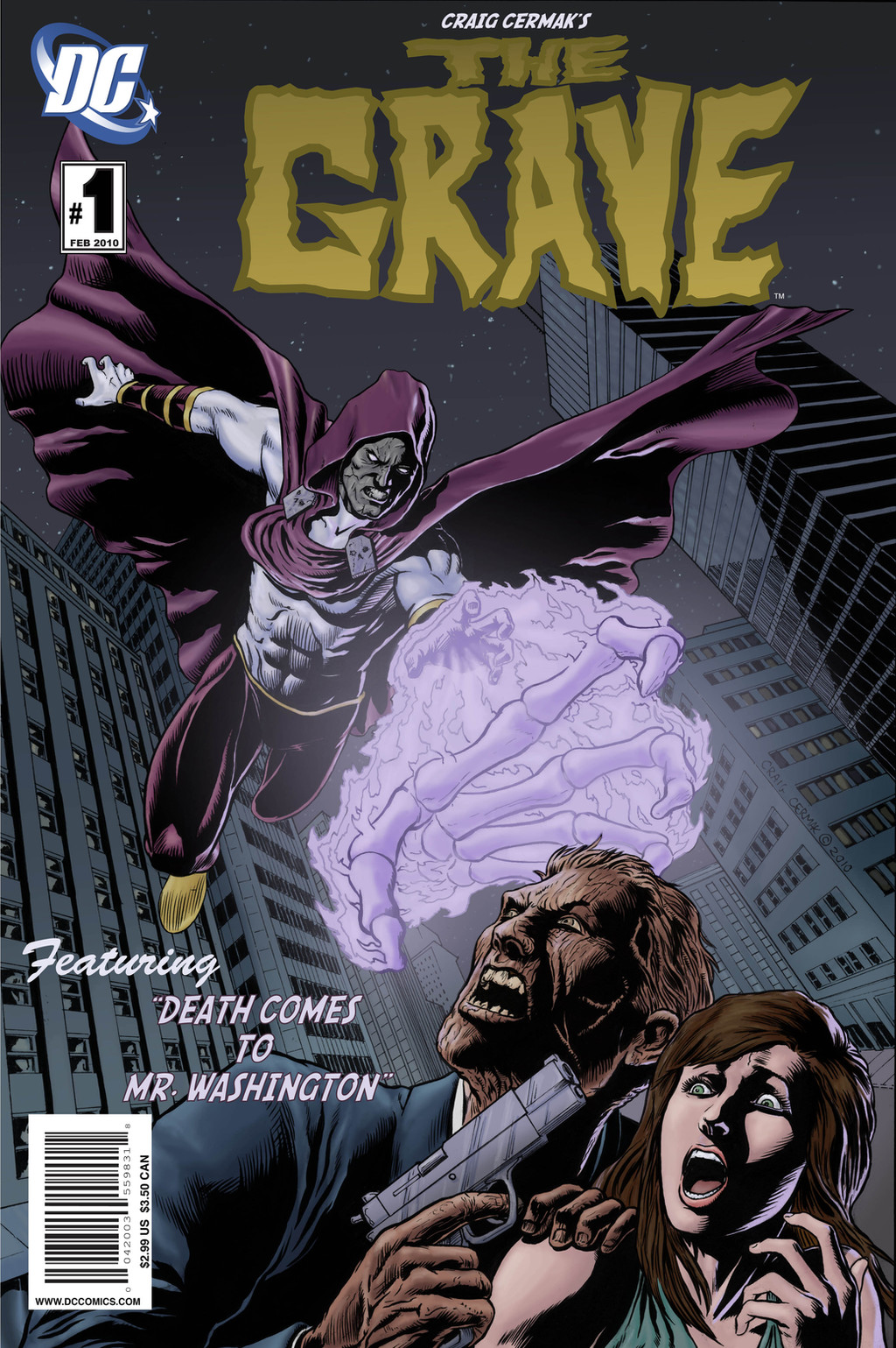
 craigcermak — The Grave Issue 1 Cover Final
Published: 2010-02-11 02:33:45 +0000 UTC; Views: 1167; Favourites: 19; Downloads: 36
Redirect to original
Description
ALRIGHT, the last step... logos and text. It was the most frustrating part for me, honestly. Yes, that's a DC logo, not comparing myself or anything, just there for the sake of having fun. Hey, I love DC, we all have our dreams, right? Anyway, hope people dig it.Related content


Comments: 24

Hah, never... it's just a "mock-up" cover, although I wish it were true!
👍: 0 ⏩: 1

lol i know what you mean!
👍: 0 ⏩: 0
The Grave, obviously, is all about high fives.
👍: 0 ⏩: 1

It's a really positive thing to be into, considering he seems like a pretty grim type of guy.
👍: 0 ⏩: 0
 (Wink) - ;)")

No problem, looking forward to your next submission!
👍: 0 ⏩: 0

really like your work. All elegant, and perspective, and anatomy and color
👍: 0 ⏩: 1

sweet!! I like it, and looks really cool with the logo and tittle hahahaha and fuck yeah dc is the main goal!!!! one suggestion if its cool with you, the tittle is really cool as far as the lettering, maybe a brighter color or an out line that would make it pop out more!!!! hehehehe sorry...
👍: 0 ⏩: 1
No no, don't be sorry! I except all forms of critiques, so thank you for your suggestion  (Smile) - :)")
👍: 0 ⏩: 0


I love the story title harkens back to the cheesy puns of the 60s/70s
👍: 0 ⏩: 1
Thanks! I love that stuff, and I really wish it was still around. I always forget the current story titles because they tend to take themselves too seriously. I've been reading the original Justice League series and the stories and titles they came up with were so engaging.
👍: 0 ⏩: 1
Yeah well everything was more about the writing even teh words per page were much more now soemtiems you can go pages without anything printed
👍: 0 ⏩: 0