HOME | DD
 crayon-chewer — Jirachi Color Practice
Published: 2010-11-04 05:44:54 +0000 UTC; Views: 6943; Favourites: 291; Downloads: 108
Redirect to original
Description
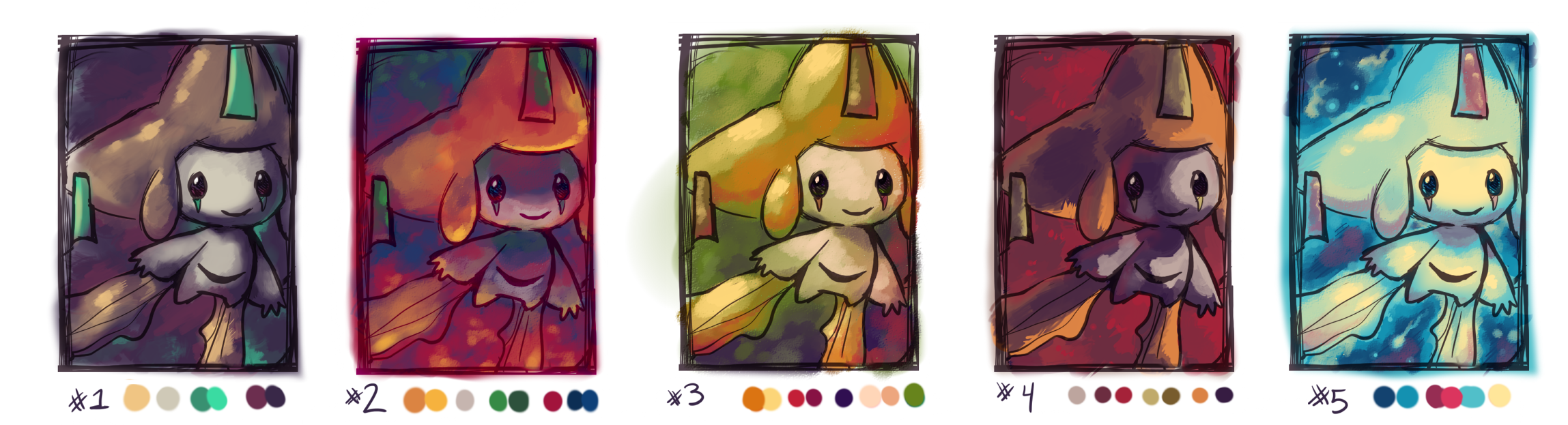
For anyone who hasn't seen it yet, 's Color Theory Tutorial is a MUST READ.=purplekecleon drew these Jirachis! She suggested color palettes to work with, so to really challenge myself, I practiced using them all. They looked normal at first, but they sure were unique combinations! I had fun using colors in ways I was uncomfortable with!
Which is your favorite and why? Also, this is not in scraps because I genuinely want some critique, comments, anything! I just want to improve.

Related content


Comments: 63

#2 #3 and #5 are my favorites!
#2 and #3 I have similar commets. I love the gradiential (Is that a word XD) contrast from Darkness to Light either giving it a greenery or magma feel
#5
The color in this one gives both that "Wish" and "Dream" Feeling. The Blue I can say is a great attract to the eye. The Glow and the stars for the background make Jirachi a good focal point!
👍: 0 ⏩: 1

If gradiential is not a word, it definitely should be! ALL OF OUR ART NEEDS TO BE MORE GRADIENTIAL.

👍: 0 ⏩: 0

#3 and #5 are probably my faves...
I like #1 as well, but it just doesn't work for the exercise you were doing.. There is not much "experimenting" in it..
#3 I really like, it is probably my fave. I could really picture Jirachi in a forest in the morning/noon with this one..
#5 I like because it is just soo different from what I am used to, yet it looks good. I also like that the background makes it look as if it was in space (which actually makes the colors have a little more sense too.. would be a nice setting for those colors haha)
#4 is probably my less fav of them all. Maybe because I do not really like how the shading was done.. That could be just me though haha
All in all great job with these and keep experimenting!
I hope to see what you do with PK's other sketch and pallet ideas
👍: 0 ⏩: 1
Yeah, #1 was probably the "safest" color combination. It was a good start, but I really like how the colors got stronger and more intense as I went on! #5 is my favorite; I really like bright colors and stars, so it worked perfectly!
Thank you for your feedback!
 (Wink)")
")
👍: 0 ⏩: 0

I like all of them but numer 4 is my favorite. I love how dramatic/ intense the shadows are.
👍: 0 ⏩: 0

I love 2 and 4 the most. These came out so well, and I'm glad you enjoyed the tutorial :3 #2 feels really warm, and I like where you used the colors. 4 has a similar feel. I do like bits of 5, mainly the bg, and the pale yellow for Jirachi, although it feels like there's too much light blue on the body itself? If that makes sense. But that may just be me.
👍: 0 ⏩: 1
Ahhh, the one that helped to put it all together!
I had the most fun with #5, but I think I see what you mean! It was a bit more difficult with just one yellow, and you're right! If it weren't for the lineart, that amount of blue on the body would make it blend into Jirachi's crown and ribbons! I should have kept the blue exclusively for the ribbons and crown, and more of the red for the body. Thanks for pointing that out!
👍: 0 ⏩: 0

#1 is my favorite, because I'm a sucker for the original colors... but I'm drawn to #2 and #5 quite a bit as well.
#2 to me seems almost fierce, like Jirachi is in a volcano or something, because of the spots of red, yellow, and orange. It has a nice feel to it I think.
#5 I like so much because it seems mystical, like Jirachi is just waking up from its long sleep in a crystal cavern. The brighter colors contrast it to the other versions of this drawing, so it's eye catching too.
I really like how the shadows and source of light changes for each one, that way they all have their own unique atmospheres. It makes me want to imagine what kind of scenes would be taking place in these.
And as always, your coloring is great! I enjoy your art, it's so pleasing to look at.

👍: 0 ⏩: 1
The first one was the easiest for me to do. It was a nice start because I got to start with original and more familiar colors, then as I moved on, that's when I got a bit more daring and varied.
And I know what you mean about the unique atmospheres! It sure was fun trying to imagine the different settings Jirachi could be in.
Thank you so much for your comments! This exercise was very good practice! I definitely need to do more things like this!
👍: 0 ⏩: 1
I'd love to see more, these are all so great and unique!
👍: 0 ⏩: 0

I love the last two, especially the very last one! The coloring is very interesting.
👍: 0 ⏩: 0
