HOME | DD
 CrazyDwarf — Grayfox bot ninja
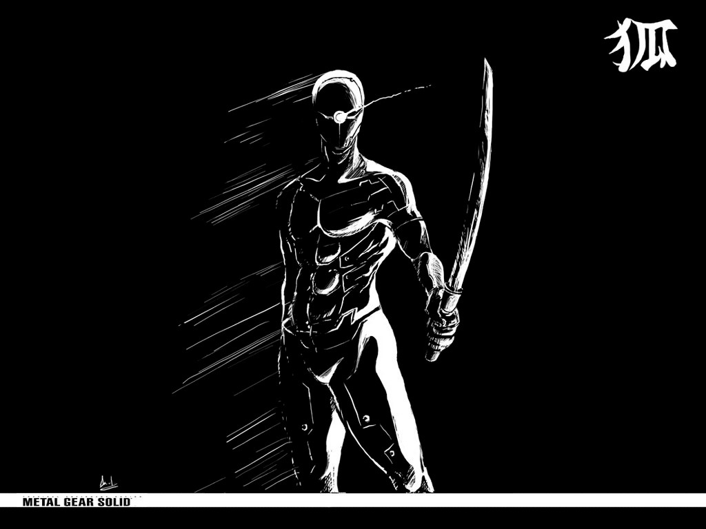
Published: 2005-07-14 06:49:29 +0000 UTC; Views: 7155; Favourites: 50; Downloads: 1598
Redirect to original
Description
Another Wallpaper...oh, man, I think you can change your wallpaper every day with my all wallpapers of Metal Gear, eh? Fine, I did it cuz I wanna do something in high contrast... this shit looks like a negative, not in high contrast....over-shit...I think I'll make other draw to fix it...Photoshop 7
a lot of minutes...
Related content


Comments: 36

I like the light coming out of the "eye" altought the sword looks like its make out of wood,like a samurai practise sword.
")
👍: 0 ⏩: 1
")

thanks. ^ __^
wow, one question... did you find it in MGS, Mech-Inc or my own gallery?
👍: 0 ⏩: 1

I found it through ~Mech-Inc
 (Smile)")
👍: 0 ⏩: 1
ow, thanks ^___^. Are you one of members of this club?
👍: 0 ⏩: 1
Nope, just found the club and your piece through a night of random searching,
Btw I really like ur whole gallery, keep up the good work on it
👍: 0 ⏩: 1

Did you do that from scrathc?
Or did you manip a picture?
👍: 0 ⏩: 2
I paint it in Photoshop 7.0 without references ^___^ (I hate them >.< (Wink)")
Thanks a lot for your c&c ^^
👍: 0 ⏩: 1
If you did it without reference, then it seems you have a good memory of the character. But why do you hate references?
👍: 0 ⏩: 1
I hate references cuz I'm a pro rpg book character designer and majority of designers and illustrators are addicted in references >.< I don't want to become the same thing ^_________^.
👍: 0 ⏩: 0
I paint it in Photoshop 7.0 without references ^___^ (I hate them >.<
Thanks a lot for your c&c ^^
👍: 0 ⏩: 0

aww man.
Ninja is my absolute favourite character of all time.
this also reminds me of a piece that i created a while back.
check it out if you would like ! -----> [link]
👍: 0 ⏩: 1

parece mesmo q está em negativo... mas ficou muito bom mesmo assim!!! gostei!!! ^^
👍: 0 ⏩: 0


hehehe, I' glad I didn't desapoint ^___^
👍: 0 ⏩: 1


hummm ele ta legal, mas ta um pouco rechonchudo.
👍: 0 ⏩: 2
De nada!! uhuhuhuh amigo e p/ essas coisas!!
👍: 0 ⏩: 0
Eita, agora que você falou, eu achei as pernas dele meio desproporcionais em relação ao corpo (por isso que deu essa sensação de "gordinho"). Valeu pela dica e vou tentar consertar isso numa futura postagem. (hehehe, acabei assistindo tanto os Movies de Twin Snakes com o Grayfox que acabei deixando ocara mais tora do que ele já é...).
Valeu ^___^.
👍: 0 ⏩: 0

o contraste naum ficou um traste (haha, q piadinha infame! foi mal)
ficou muito bom!! na verdade, esse contraste ficou muito interessante...
bela pose!!!!!!!!!!!!!!
👍: 0 ⏩: 0


Yo! está bem simples mas ficou legal pacas aeh ^~^/
Eu acho que a espada dele é mais famosa que ele hehehe

")
👍: 0 ⏩: 0


^___^ thanks! I love the graphic style and I'm always trying do this.
👍: 0 ⏩: 0

I like this... I have been thinking about getting back to my roots in comic art too. I just don't know if I am good enough digitally yet.
👍: 0 ⏩: 1
I think you good enough in digital skills. Lately, your post are much better than before ^___^. Get back to your comic art, please ^________________^, you'll make us happy *__*!
👍: 0 ⏩: 0


Kwaaaaaaah! Que rôbo gostoso! LMAO!
Poxa, arrasou no alto contraste, Mel!
Não tenho muito o que dizer...vai para o meu fave com certeza! ^^
👍: 0 ⏩: 1
Valeu...bom ainda acho que está mais pra inversão que pra altop contraste porque as sombras dão a impressão de negatico, não de sombra, entende, mano? Mas se vc diz isso, que faz alto contraste, então, fico um pouco mais tranquila...
eu fiz outro desenho em alto contraste direto no PC e acho que esse teve um resultado melhor, mas não vou postar por aqui não (")
valeuz!
👍: 0 ⏩: 0