HOME | DD
 CrazyDwarf — MGS pageXX

Published: 2005-07-27 03:46:28 +0000 UTC; Views: 3628; Favourites: 41; Downloads: 641
Redirect to original
Description
PS 7.04 hours
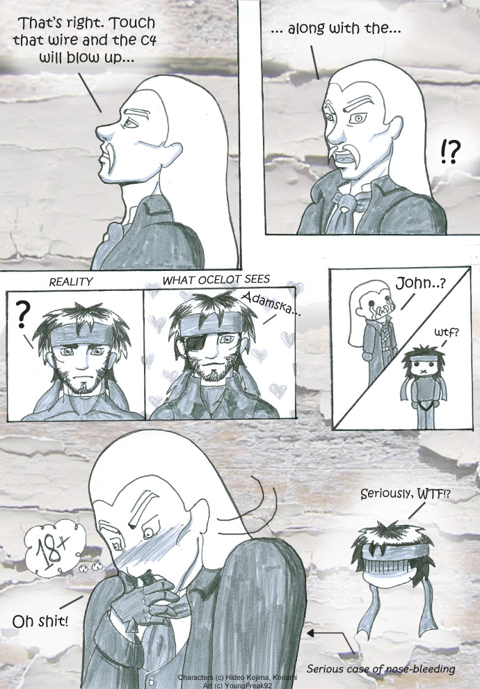
Testing a new comic style.
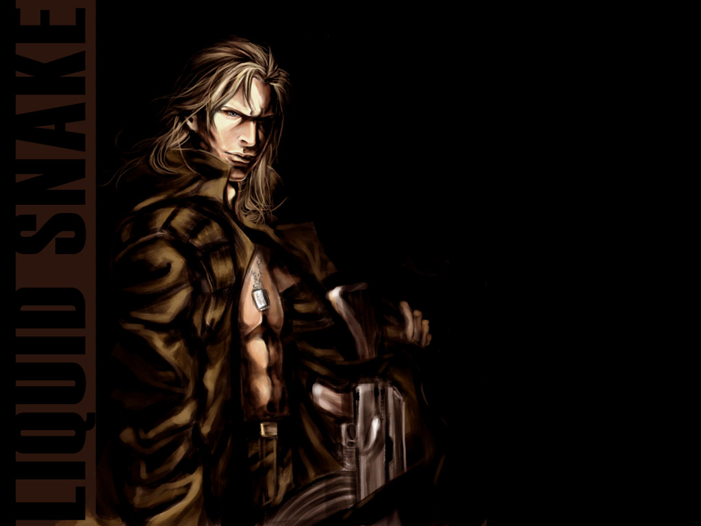
Metal Gear is a trrademark of Kojima Productions/Konami JPN
Related content


Comments: 87

It's ok, reading left to right but you just need to warn me on it cos when I first read it it was confusing (I pretty much read the Eastern way on comics/manga) but yeah, must remember that your manga is left to right!!! LOL
👍: 0 ⏩: 1

wow!!! *_____*
q lindooooooooooooooooo!!!!! merece até entrar nos favoritos!!! ^______^
gostei!!! isso pq é só teste... *____*
bjinhus!!! =***
👍: 0 ⏩: 1

I think the comic must has a bit of both, style and substance. Since comics are a such of "static animation", the narrative (storytelling) has to the one of most important thing, and, to me of course, the second priority is the atmosphere you want to pass.
That my page test here I thought it a bit static (with charas statics because color) but as I haven't a script and only a colors and drawings idea, I made it ^__^.
👍: 0 ⏩: 0

It looks like you've chosen a predominantly manga style. (close to fist of the north star and HTK's manga style). But before style, probably want to work on flow for comiking. I'm no expert, by far, and my experience is pretty limited, but from the short space of time I've been self-learning, I took a decent amount of time working on layout after squandering too much time on style. Basically, prioritise whatever you think is more important, style or substance?
But I do catch your drift. I think that manga is a little overused, and there's a lot of european styles that I'm really impressed by.
👍: 0 ⏩: 0
Avatar-do-Grafite [2005-07-31 05:26:00 +0000 UTC]
Legal!
Não sou fã de Metal Gear (nem sei quem são esses ai na página...), mas gostei muito do teu trabalho...
Só acho que uma HQ toda nesse estilo deve dar um trabalho enlouquecedor....
Mas achei muito bom!
Boa escolha de cores, bom sombreamento (talvés um pouco claro demais...) e excelentes escolhas de ângulos!
Congratulações!
👍: 0 ⏩: 1
4 horas para fazer uma página ^___^ fiz direto no Pc, por isso foi mais rápido. Como faço páginas em P&B também nessa velocidaded, ficou na mesma.
As páginas estão um pouco claras porque me baseei na atmosfera do jogo (que são exatamante essas cores. Peguei umas referências e fiz um color swatch (lista de cores) no Photoshop).
Obrigada ^__^
👍: 0 ⏩: 1
Avatar-do-Grafite In reply to CrazyDwarf [2005-08-01 00:37:21 +0000 UTC]
Sempre achei que o jogo tivesse um clima mais dark... Mas como eu disse, não entendo muito de MG...
Bom, se o tempo de escecução de uma página dessa qualidade e uma em P&B (que ficam ótimas; Eu até prefiro, mas eu sou exceção) levam o mesmo tempo, fica com estas!
Congratulações renovadas!
👍: 0 ⏩: 1
Hehhehe, não é excessão não, eu tb prefiro P&B. Por mim, jamais teria saido do estilo, mas como as pessoas preferem colorido, nós como desenhistas atendemosa a maioria, certo ^__^?
obrigadfa de novo
👍: 0 ⏩: 1
Avatar-do-Grafite In reply to CrazyDwarf [2005-08-06 05:29:20 +0000 UTC]
Ah, não entro muito nessa.
Se eu fosse pela maioria, desenhava mangá a muito tempo! Mas me mantenho irredutível do meu estilo bastardo americano-europeu e vou encontrando meu espaço. Sei que estou em extinção, mas não mudo meu estilo por pressão. Se não gostam aqui, ali adiante alguém gosta.
Diabos, é impossivel agradar a todos mesmo! Agrade uns poucos e se divirta no processo, ou não vale à pena continuar!
Mas, por estranho que seja (para mim; E creia, o é!), eu gosto do teu estilo colorido tanto quanto gostei do que fizesnte em P&B. E também gostei do teu estilo de mangá, mesmo não gostando do estilo no geral.
Mas assim são as coisas...
👍: 0 ⏩: 1
sim, é impossível agradar a todos, por isso que existe público alvo ^_^. fico contente que tenha gostado do meu estilo de mangá. a maioria do meu público é constituído por pessoas que não lêem muito mangá. sim, é verdade, se não puder fazer algo que se divirta, não faça. Esse foi um motivo de eu ter permanecido num trraço de mangá mais voltado para games. gosto disso, cresci vendo isso ^___^
👍: 0 ⏩: 1
Avatar-do-Grafite In reply to CrazyDwarf [2005-08-07 23:58:15 +0000 UTC]
Assim é a vida!
E continue com esse estilo, ou mude pra qualquer outro, mas sempre se divertindo no processo!
Acho que é isso que me atrai no teu traço; Dá pra sentir que tu estas gostando muito do que estás desenhando!
E vivam os games por propiciarem ótimos desenhistas (que provavelmente influenciarão as próximas gerações de gamers ou desenhistas.... Isso é tudo [sempre e cada vez mais] cíclico)!
👍: 0 ⏩: 0

 (Smile)")
nice work
")
👍: 0 ⏩: 1
^__^ all made in Pjotoshop, but I catch some references from 3D to do it.
thanks
👍: 0 ⏩: 0

I like the consistency of the facial structure on your main figure. Keep it coming.
👍: 0 ⏩: 0


i think ur 3rd panel was the weakest (mainly with the perspective) and the rendering wasn't as solid as the others. the other panels were really good on the other hand. if u ask me ur expmrt-ion with style is coming out loose (kinda reminds me what i went through)
👍: 0 ⏩: 1
This odd stairs in this place is in second floor...it's a existent background from game. But I admit the 3rd panel isn't so good ^^.
Thanks for your comment
👍: 0 ⏩: 0

Muito bom!
Isso está o samba do crioulo doido!

👍: 0 ⏩: 0

É bom. Acomodação faz muito mal.
Outro favorito.
👍: 0 ⏩: 0

Cool! I am happy to hear you are trying new styles.

👍: 0 ⏩: 1

Cool coloring tek.
if i might sugjest :
the white hair are not so cool , too fat i guess. try to work on "silouhette" ( shape) of the global head ( with variable size brush ),
and the contrast with the cool face rendering u ve got will be perfe( that s me very own and personnel point of view).
Anyway cool work.
👍: 0 ⏩: 1
^__^ thanks for your suggestion...but one thing..."fat" ^__^?
I understand about the differents sizes in the brush to be used on this, but my laziness doesn't allow it *_____________________*.
By the way, thanks again.
👍: 0 ⏩: 0

actually i think you should continue with this style instead of manga. because i think manga is overrated. and this looks like actual screens from the game. damn. and still it's so simply put together!

👍: 0 ⏩: 0

o.o wooow nice! téll me, what kind of brush tool do you used?
👍: 0 ⏩: 1
I used the standard brush with it opacity adjusted for the pressure of the tablet. This standard brush is similar to watercolor brush...as that painting is simple, I only used a brush.
^__^thanks
👍: 0 ⏩: 0


O ultimo quado o Raidem pararece GC ^^, costei pacas dessa pg test

👍: 0 ⏩: 0

nuussa!!! q fodástico!!!!!
tah muuuito massa... gostei da iluminação!!!!
maninha... um dia alcanço as puerinhas na sola do seu tenis!!!!!!!!!
👍: 0 ⏩: 0

Gostei muito, principalmente do segundo quadro, acho que devido a este mostrar os personagens em uma cena non-close, ficou bem trabalhado os detalhes..
Anyway ficou muito lindo!
👍: 0 ⏩: 0

OMIGOD!! This is... Splendid!! ")

👍: 0 ⏩: 0

T^T crazy dwarf jie,teach me to do hair T^T
👍: 0 ⏩: 1
Drawing hair is too simple, since you have a tablet T___T...
thanks a lot!
👍: 0 ⏩: 0

I'd definitely buy a comic done in a style like this... it's realistic, but impressionistic and stylized at the same time [much like Shinkawa's work, only easier to understand]. In any case, it's 3.89x10^7 times better than that weird ambiguous stuff they put in the official comic...

👍: 0 ⏩: 1
Wow, I'm happy you like this way . It's a honor! ^________^. Ashley Wood left the MGS comic a bit hard to understand, but I think he inspired in Shinkawa's art (well...you're right, their arts are hard to see). When I did this page, I wanted to do as similar as the CG art from the own game. I thought that would maintain the characteristics.
Thanks again ^_^
👍: 0 ⏩: 0
<= Prev |