HOME | DD
 crypticFallon — Felsteed

Published: 2011-03-14 02:09:59 +0000 UTC; Views: 1357; Favourites: 15; Downloads: 4
Redirect to original
Description
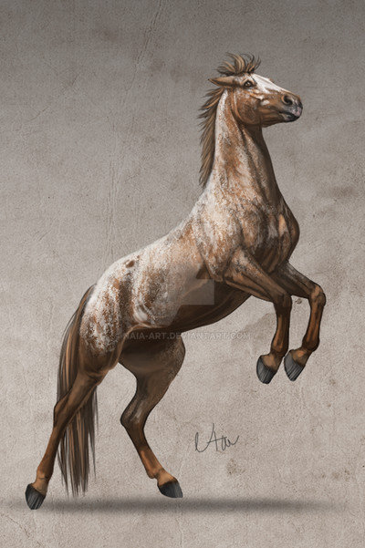
I was inspired by to try photomanips.This is my first one so don't be too harsh D: Any pointers would be appreciated though. It's suppose to be a felsteed from WoW.
Credits:
horse
background
fire
hair brushes
Related content


Comments: 12


Ugh, sorry for the bad spelling. It's almost 11pm here and I stayed up the past 2 nights.
👍: 0 ⏩: 0
Thsi was your first??? It looks WAY batter than my like 100th xP We used the same horse, and yours did hte stock justice as oppose to well...mine. See for yourself -_-
[link]
👍: 0 ⏩: 1

I've been using photoshop for a long time for drawing etc...so I guess that helped. I spent a long time with this changing/fixing things. I think yours looks great btw
👍: 0 ⏩: 1
Lol not really I guess so, I started out with experience in only traditional drawing. Of which I have a ton of WIP's I've never bothered to finish....
👍: 0 ⏩: 0


Mane and tail look good, though for the tail you should try more individual strokes. It really looks like you used a brush. That happened a lot to me when I first started too; pretty easy fix. It's still good though, you have a good grasp on color variance and shading of the hair. The fire effect is great, as well as the lighting. However, the coloring is slightly off; the horse is more purple than the orange tones of the background. That can be fixed by using a colorizing tool. Other than that the only thing I'd say is that you should either cut a bit closer to the horse or cut down on the halo lines if those were intentional. Overall, this is a VERY good first attempt, nice job.
👍: 0 ⏩: 1
Thanks. I'll keep that in mind for next time  (Smile)")
👍: 0 ⏩: 1
I see what you were trying to do. The difference between their images and yours are that theirs have varying widths in the halo lines. Also, their halo lines aren't just around the edge, they actually highlight areas inside the outline as well, such as in this [link] image. It looks like they use it to emphasize lighting, so it would be an element to use where the light is harsh, such as where the light of the flames casts on the horses coat and maybe not as much on the back and other areas with dark shadows, like in this [link] image. What I said before still stands; a very good first attempt.
👍: 0 ⏩: 1
It's my first try...I'm sure I'll do better next time...
👍: 0 ⏩: 1
You will. My first try was no where near this good, haha. Don't worry, a lot of people can't do this well after years of practice, let alone on their first try. Keep at it, this is a very good start.
👍: 0 ⏩: 0