HOME | DD
 crystaltiger52 — Can't Catch Me

Published: 2010-12-16 22:17:35 +0000 UTC; Views: 464; Favourites: 9; Downloads: 7
Redirect to original
Description
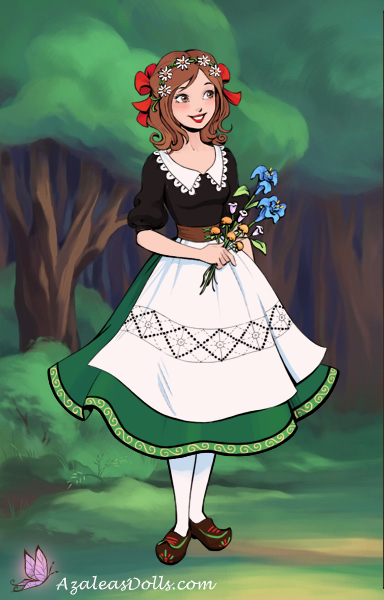
Ha. Her name is Ginger, because I am super good at naming stuff. *nods*Anyway, I was looking through my gallery and made the discovery that my work is very monochromatic and static. Every character I drew that was not fanart or a gift had pale skin, brown hair and brown eyes. Generally, they're not posed very interestingly, either.
So, my goal with this picture and the ones to follow it in this holiday series is to diversify my designs while still sticking to my own style and to practice more dynamic poses.
I would love feedback! Please don't be harsh about the background; I did put effort into it!
Related content


Comments: 15


Technique
I actually love the simplicity of the background. It helps to keep the attention on the character in the foreground. While the pose is dynamic, more so than your other pictures, her arms and legs seem a bit rubbery. Almost as if they're bending a bit unnaturally. I also like the fact that you went with a dark brown outline as opposed to a traditional black. The brown adds to the piece very much so. Overall, I really enjoy the theme and your motivation behind it and I think the name is very fitting...reminds me of Hansel and Gretel though.
👍: 0 ⏩: 1

Thanks for the critique! I wonder if the reason you feel the pose is unnaturally balanced is because it's supposed to be in motion, mid-stride. A pose like that could only be maintained through momentum.
I generally color my lineart, because I feel it really adds to the piece. So, if you look, you'll see that the lines aren't all dark brown, but generally just a shade darker than the element it's outlining. (i.e. the stockings)
👍: 0 ⏩: 1
Yeah, no prob!  (Smile)")
You should do a little animation of her running...imo
👍: 0 ⏩: 1
Oh heck. I probably will, now. You jerk. D: I have no time for such ideas!
")
👍: 0 ⏩: 1
lol :] You know you love me! You'll find time...I believe in you!!! You can do eet!
👍: 0 ⏩: 1
")

Awesome! I love how you drew her outfit including the cute little bow on her head.
👍: 0 ⏩: 1
Thank you! That was my favourite part of the drawing was planning the outfit! :3
👍: 0 ⏩: 1
np and I know what you mean! XD
👍: 0 ⏩: 0

i like the background ..very fairytale-like
👍: 0 ⏩: 1

I like it, cool idea and cool design. What really bugs me about it is the background. First of all, it would be nice to have more contrast between Ginger here in the foreground and everything else in the background. As things are I think her figure could read better where she intersects with darker parts of the background, particularly around the shoulder area and the back of her head. Second of all, I know you could have done a better job using perspective to get some more realistic recession of space, because I've seen you do really good perspective drawings before. If you apply linear perspective to what you have here, it looks like a giant gingerbread lady with a small dollhouse.
Don't get me wrong, I like it. The background just bugs me. Sorry if I sound harsh about the background, I just couldn't think of anything to critique about the figure/foreground!
👍: 0 ⏩: 1
Did you read my artist's comments at all?
👍: 0 ⏩: 1
yes...but like I said I couldn't think of anything to say about the figure. It's good! If I didn't say anything about the background I wouldn't have said much at all and I thought some kind of feedback would be better than no feedback. I'm sorry! *hides in a corner*
👍: 0 ⏩: 1
No problem. I understand. Thanks for the feedback.
👍: 0 ⏩: 0