HOME | DD
 ctrl-alt-delete — Time Flies
by-nc-nd
ctrl-alt-delete — Time Flies
by-nc-nd

Published: 2005-06-26 00:02:02 +0000 UTC; Views: 878; Favourites: 10; Downloads: 161
Redirect to original
Description
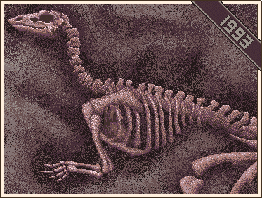
This is my first attempt at ANSI art. It's just experimental... nothing professional or anything.I may end up changing the title later on because I have a vector art image planned along the same concept, and I wanted to use the same title for it.
Related content


Comments: 19

")


Omg... look at all those little dots! 
Does "ANSI" stand for anything?
👍: 0 ⏩: 0

Maan.. Really cool work for "first attemp" keep drawin'!
👍: 0 ⏩: 0

Amy, Looking at this, You MUST try, MZX.
A spin off of ZZT
👍: 0 ⏩: 0

Interesting job.................well done...I am looking forward for another works as well........
👍: 0 ⏩: 0

Wow, zoomed in this piece really is something else. How the heck do you go about making something like this?
👍: 0 ⏩: 0


NIce first attempt. Next Time try combining the 8 foreground colors with the 16 background colors for some shading variations. YOu can also use f5 and f6 for blacks that are half and half for effectts. Overall I like the concept and it's old skool feel. Glad to see that some of the guys could inspire someone to try ansi!! We few artists still kick it around on efnet in #ans for any interest that may be.
skypager!
👍: 0 ⏩: 0

Nice work with your first ANSI, I hope you'll continue with the medium. Interesting use of shading, most ANSI artists don't use dithering but stick to different combinations of rastered colors. It's a matter of preference which style looks better, but I personally like ANSI a bit uneven, almost messy than with large amounts of solid color. The wings look really good the way you made them anyway.
👍: 0 ⏩: 0


That's really good for a first attempt! keep going at it. ANSi Rulz!
👍: 0 ⏩: 0


pixelblink [2005-06-26 02:37:37 +0000 UTC]
I really know so little about ANSI but I've always been intrigued by it. It's great to see you trying new things like this. A great design and the colours work for me  (Smile)")

👍: 0 ⏩: 0

You're into ANSI too? That's really great!
It looks like a good start. You took good profit of the limited colors and shading in ANSI. That dark yellow looks a little greenish, but that will always happen. You could start using a wider variety of blocks to make the curves less jagged, especially in those falling gears.
Which program did you use?

👍: 0 ⏩: 1

Pablo Draw
I think I first learned about it by reading the description of one of your images.
👍: 0 ⏩: 0


Wow, it kinda looks like a HUGE pixel art 
👍: 0 ⏩: 0

Ohh man... that's awesome.
I wish I could do ANSI art like that. Then maybe my video games would look prettier...
👍: 0 ⏩: 0