HOME | DD
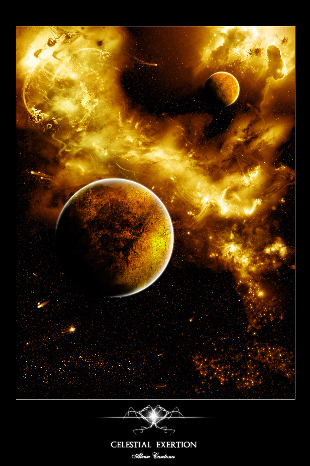
 cubicthree — SUNRISE by JPL

Published: 2002-10-20 14:51:09 +0000 UTC; Views: 14226; Favourites: 114; Downloads: 3611
Redirect to original
Description
MUST BE VIEWED AT 60-65 MONITOR BRIGHTNESS TO SEE ALL THE DETAIL.Sorry, I'll try to make it better for people with brightness of 50 next time. Also, this is sort of a remix of Before Mankind. I just had to because I fell in love with the colours.... I just had to.
_________________________________________
This started out as a completely different abstract image. However, I fell in love with these colours and something made me turn it into a space image. I did a little more with the stars this time, not sure if you'll like it though. I'm still in the process of making better stars.
Made in 3ds max 4 and photoshop 5.02
I love this piece, more so than the other one. Enjoy
Related content


Comments: 95

 (Smile)")

I was searching google for "3ds max velociraptor model" and it brought up this link. Interesting.
Great render
👍: 0 ⏩: 0

I love it! ")
A most excellent image, which is now my desktop wallpaper.

👍: 0 ⏩: 0


Wow. It looks absolutely amazing...I love the colours, and the little details.
👍: 0 ⏩: 0


Another of your walls added to my WP rotation on my Mac. Fantastic work.
👍: 0 ⏩: 0


I can see this is what that collab is made from, excellent work, the textures on the planets look great and combining it with the photosop work makes it look like a real space image.
👍: 0 ⏩: 0

.....omg.....i can't say anything else.....its simply .... awesome
👍: 0 ⏩: 0


*yawn* nice work...alot like the other 2 space pieces...2 planets, lots of stars. Something new would mos. def be in order. Mind you that you are one of the best space "illustrators" that I've seen besides Greg and some others. I'd plus fave this one but I already have Before Mankind. If you ask me..I'm pretty sure I could break down everything you used...
No harsh meaning in my explanation above...just stating.
PS - Nice Work...Very Nice Work....
👍: 0 ⏩: 0


I love the color sheme, and I think the camera angle is just as suitable as any other. The only slightly objectable thing I notice is the amount of shadow you added to the forground planet. In my opinion, I think more needs to be exposed but I do say, excellent job.
The clouds and background lighting are phenomenal. I read comments above regarding the lens flare, but to me that doesn't represent a camera, its an exagerated light thats being produced by one of the stars.
LOOKS GREAT MAN
👍: 0 ⏩: 0

MUCH BETTER! You [u]MUST[/u] Tell me how to do that grainy feeling in the stars. I just wanna improve my skill in APS so i can apply it to my other images.
The Space look is worn out but this is awesome. FAR FAR Superior to violation or any other space artist. You are slowly on the way to surpassing hameed and and becoming a very well known and respected artist like Per and others. I think your images get better with every image you do. Good job. That is all i can express with an Awesome image like this. ANd you sure as hell know that this is an instant FAV! If you can, please tell me on msn how to do that grainy feeling on the stars. I'd also really appreciate that. Thanks.
👍: 0 ⏩: 0


Bit late with my comment, but I see your piece had nor problem with reaching the daily favs afew days back. Congrats on that m8.
I really love how it all looks together, nice detial you got going and the colors are very nicely too, a new favorite addition indeed.
Do try to do something different though, like some people mentioned, and I now this sounds stupid by repeating it so late, and having you already agreed on that, but I do need to have something bad to say, not?
👍: 0 ⏩: 0

Awesome dude..Unbelieveable. Your going to surpass everyone if you keep it up! +fav
👍: 0 ⏩: 0


Looks a lot like something from [link]
Looks great. Way to go
👍: 0 ⏩: 0


Holy shit thats sooo fucking awsome GJ love teh colors and effect you get GJ +favs
👍: 0 ⏩: 0

Woooooaaahh!
*being sucked into the marvellous deep space picture*
👍: 0 ⏩: 0


thats so good. the colours the lines the contrast. its perfect
👍: 0 ⏩: 0

Nice. Needs a lot of work though. i think the background stars look a little too much like 'noise'. Also, the blurring of some of the lighting is not blended enough with the background, perhaps a little more of a gradual transition is required as opposed to just straight out masking it away. Since this isn't the most original concept (the galactic scene w/ lighting + planets etc) maybe add something new to the fray to distinguish it from other similar pieces. I'm sure this wasn't an exercise in originality so don't worry too much about that though.
The planet textures are obviously textures, i think some extra depth there (ie the clouds being slightly lower than the atmosphere) would be cool. The nebula is a little blurry, but i do like the more prominent stars that are dotted about the place. The typo is very cliche however
Good, but could be better.
👍: 0 ⏩: 0


Sweet...
and the filesize is ok... I for one use 1600x1200 res and I hate to scale 800x600 wallpapers to fit my screen...
👍: 0 ⏩: 0


cubic you da best! this is soooooooooooooooooo good!! though we all love to see some other camera view but regardless of phat dis is GOOD! LIKE!! HELL!!! GOD DAMN! I LOVE IT I LOVE IT I LOVE IT HM HUHMHUHMHUHMHUHMH!!!
👍: 0 ⏩: 0
WOW!! DEFINITELY COOL-THE-360-DEGREE!!!!
GOD DAMN THIS IS COOL!
👍: 0 ⏩: 0


very very greg martin ish :\
none the less very nice
👍: 0 ⏩: 0


Spectacularly Amazing. Good Job. Im gonna convince my computer teacher to teach me 3d max 5. hopefully ill get to that ability ^_^. thanks for sharing +fav
👍: 0 ⏩: 0

first off let me repeat nearly everyone. great work.
but there seems to be a problem at least i think it is a problem.
it deals with the two planets, they just appear to close together. I mean it
looks awesome, but in reality i dont think they could exist that close in space. for one thing the gravitational pull would cause them to not orbit properly.
and they would eventually collide with one another. (which would make an awesome sequal by the way).
but other than that awesome piece.
👍: 0 ⏩: 0

This is an extremely beautiful piece. I think I'll download it. +favs
👍: 0 ⏩: 0

| Next =>