HOME | DD
 Cushart — character design2
Published: 2010-04-13 16:56:11 +0000 UTC; Views: 45596; Favourites: 1406; Downloads: 1425
Redirect to original
Description
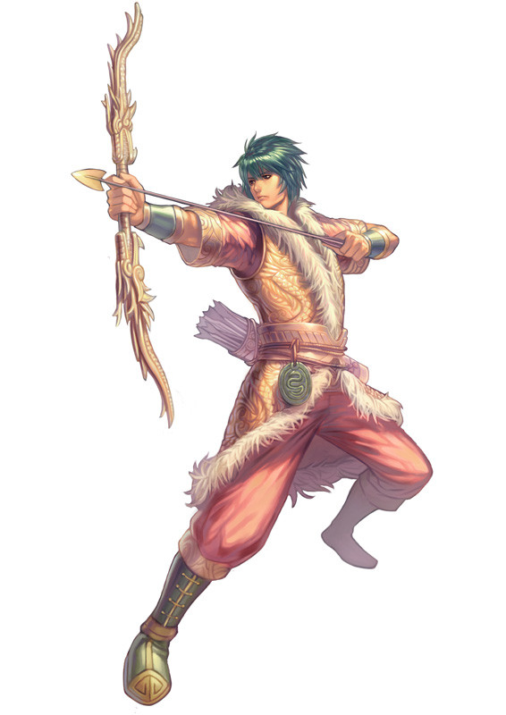
draw for a MMORPG "勇者之歌online" in TAIWANCheers
 (Smile)")
Related content


Comments: 46

I like the way his vest and bow keep a consistent theme, and the way the gold there complements his hair, boots, pendant and cuffs.
👍: 0 ⏩: 0


Vous n'auriez pas travaillé pour Ragnarok Online ?
👍: 0 ⏩: 0

Reminds me of Squall Leonhart from FFVII, but great work though..!
👍: 0 ⏩: 0

i have a question ")
is this really aaaaawsome work up there part of your job ?
i want to be capable of that !! *__*
👍: 0 ⏩: 0


I LOVE your style! that bow is spectacular... hmm I thought you might draw for an MMORPG... is it available in the US now or..?
👍: 0 ⏩: 0


you should go back and finish off the bow-string, but otherwise its still a perfect drawing!
👍: 0 ⏩: 0


I love the colors of this, the smooth, clean lines, the detail on his clothing and the bow. The overall picture is just so appealing to the eye!
👍: 0 ⏩: 0

I know this is kind of nit-picky, but he's not holding the bow correctly. The shaft of the arrow should rest on top of the index finger of the hand holding the bow, and should be pushing against the bow, which would be tilted away from it (to keep it from slipping off).
Also, the middle finger of the drawing hand should be level with the index finger of the same hand (since both are used to pull back the string) And when drawing, you pull to your jawbone, not to your chest.
Just wanted to point this out, since it's a professional work. It looks like you've already received similar comments and realized some mistakes though. xD
👍: 0 ⏩: 0


This is really lovely in so many ways; though I do have a few thoughts on the bow and the positioning of his forward hand. If it's not okay, please feel free to hide/remove this comment.
While the decoration of the bow is lovely, it's far too straight. A bow like that is meant to curve; the power of a bow lies in its flexibility, not as much in the string. With the bow that straight, it's unlikely he would be able to draw the arrow even half so far as he appears to have. The arrow in general looks to be a bit too long for that length of bow; I'm no expert but that's how it looks to me.
Also, the grip of his forward hand is just asking for the fletching on the arrow to cut into his fingers as it passes. Typically a bow has a notch just a bit higher than the grip, so that the arrow rests comfortably on it rather than coming into contact with the fingers. Using the index finger to pilot and steady the arrow until you fire is a typical technique, though I've seen people go without as well.
Beyond that, I really like this piece. The colours and stance are awesomely balanced, and his expression is so intent. The little details on his clothes and itemry really make the drawing pop.
👍: 0 ⏩: 2

Glad to see that I'm not the only artist to notice these things: [link] . I'd only add that the quiver should be pointed the other way, and if he really intends to shoot the arrow that he have the end of the arrow up to his anchor point ....
[link]
👍: 0 ⏩: 0


Wow, great stufff, but I want to see big armour ^^! Still, though, great piece!
👍: 0 ⏩: 0


awesome as usual... but where's the bow string?
👍: 0 ⏩: 2

its made of invisibl-oium... and the bow is 100% unobtainium. everyone makes them this way now.. that way you cant question its badassery.
👍: 0 ⏩: 1
was that supposed to be an insightful website for crosschecking the correct stance and usage of a Bow and arrow... if so i understand your desire to make a point, but i would also like to point out that this isnt a Technical drawing, and posting the same link numerous times to make a point is fairly disrespectful to the artist. @Cushart if you are reading this, nice drawing, and i wish you the best in you life as an artist, hopefully on day i can draw beautiful pieces like this one with an obvious flaw but still shines regardless. 11/10 ... (because numerical fractions scores are for the fail! and completely subjective)
👍: 0 ⏩: 1
Just because something isn't a 'technical' drawing doesn't mean that basic facts should be thrown out the window or ignored. I can understand wanting to focus on certain aspects that as an artist you happen to like, whether it be composition, design, fabric, ect. But to totally disregard basic facts like gravity, aerodynamics, or anatomy looks just plain lazy or forgetful and takes away from the work. If you are trying to depict something that you are unfamiliar with that has some basis in the real world wouldn't it be a good idea to do some research on the topic, or contact an expert on the subject, and get it right the first time?Using photo references is a good idea, using a photo reference of someone who doesn't know what they are doing is not. With the internet the way it is today, how can you not do a couple of simple searches to make sure of your facts before you start drawing? If given the task of depicting a sport fisherman, wouldn't you want him to be holding the right end of the rod and reel?
I never said the piece was bad, in fact it's quite good, but because of the 'obvious flaw' that even you noticed, it is not what it could be: even better. It would have been fine to have the error that we are talking about in a concept, but the work we are discussing was finished. Working on a concept is a time for the artist to figure out what works and what doesn't in their work. I posted the link to the artist to use if he wished, not to disrespect him, and to another artist who had the guts to actually point out a simple set of facts. I also provided the link to you because it depresses me to see so much lack of critical thought in praise or critique. If you're going to make a comment, at least make it interesting. Maybe some artists like to bask in the idol worship of others, and all the thoughtless butt-kissing that goes with it, but I don't think Cushart is one of those ...
👍: 0 ⏩: 1
Technically speaking the piece is flawed, i will give it that, but one must also understand that this is a Fantasy Piece. Our knowledge of bows and arrows have changed over the years. Not only that but Many artist depict a scene that is totally unfeasible, E.G. a small framed peson strong arming a .50, summoning monsters from no where and combat stances which literally are only for Flair. To mandate that all artists must use a reference piece in order to remain Accurate Stifles the artists creative element. Cushart may have wanted the picture to Apear Badass, or he may have wanted it to appear Flawed. We all noticed the String, but that only serves to justify that flaw. Take in the entire composition and try not to see the flaws, this isnt fanwhoring or objective complimentation, this is simply the fans trying to avoid the critical and comment on what they see are and extraordinary piece. i just took it as a slight bit disrespectful to post a "this is what you shoulda done" link all over the artist's picture, instead of simply pointing out that "hey, a looks a little off, if you would like i could send you a reference link for next time!" ... just saying, but then again who am i to judge my pageviews and art have all been crap in comparison, maybe i should work on my own faults instead of commenting on others...
TTFN Masterofpointillism, if you would like to continue this debate, please use the note system to avoid a flame war.
👍: 0 ⏩: 1
The factually incorrect shooting of the bow was all that troubled me about the piece, nothing else. Drawing an archer shooting a bow in an incorrect manner is not unlike a novelist writing historical fiction, but getting the dates and places wrong. The prose might be as beautiful crafted as Shakespeare's, but an observant reader would get hung-up on the inaccuracies of the historical facts, which would detract from the overall story. It's why writers are encouraged to write about what they know, and those that choose not to need to do their research and get it right, otherwise the overall composition, no matter what style is used, will suffer.
In the 'Lord of the Rings' movies Legolas makes some amazing, if not impossible shots with a bow and arrow, which can be explained by the fact that he is an elf and there is a suspension of belief or reality there. However, he still is holding and shooting the bow and arrow in the correct manner, otherwise it would be very hard for the viewer to suspend that reality. Imagine if the same character were doing behind-the-back shots or under-the-leg shots, people who don't even 'know' how to shoot a bow would have found that laughable and it would have been a distraction and detraction on the film as a whole. This was my point that I made to the artist and the only other artist that happened to have the guts, at the time of my posting, to actually say that he, too, saw the flaws. If you are going to draw an archer, get the basics right. If you are going to draw a swordsman, at least make sure they are holding the handle in the right manner, and not holding the pointy end, no matter how ludicrously big the sword maybe.
I did not "link all over the artist's picture", even so if you found my comments to be 'a bit disrespectful' that is your opinion and I have no control over your feelings. I try to make my comments factual and to the point, and not beat around a bush at what I'm trying to say. I also make my comments in public so that others may learn and hear what the artist himself/herself has to say about them. If someone wants a 'conversation' without anybody else getting into it they should either; 'note' that person, block all comments, or not start a conversation in public. If I came across two or more people having a conversation in public, and they were arguing about whether the sky was purple or yellow, I'd tell them it was blue without a second thought, because it is. And that's pretty much what I was doing with my comments, making sure that the uninformed were corrected with factual information.
👍: 0 ⏩: 1
Well played. Although I still beleive although it may appear that Under the leg shots a ludicrous and laughable there are people out there who probably could pull them off. Hell i have seen some amazing drawings that were made from people holding a pen with their feet, if i told them they were doing it wrong it would appear that i was the one mistaken, Basing a Character in a Factual sense does make sense and i applaude artists that stay Correct in their art, however that said. There are quite a few piece that really dont need Critique because there is a flaw. the flaws make the piece.. well in some regard, i would hate to see a completely flawed piece try and pass for art. the string may be "invisible" but my eyes still understood the premise. He may be holding the bow is a Uncooth manner, but again everyone has a different stance.... it is a Conception to the artist as to how he would like the flow.
I still think that although i have stated my ground, my side is that of a losing battle, so i concide to you. hopefully the next artist is just as kind in the way he allows a slight flame war / debate to insue. Good day and good luck!

👍: 0 ⏩: 0
Don't worry, a lot of artist on this site do not even get it right this far ...[link]
👍: 0 ⏩: 0

