HOME | DD

cutthekidsinhalf — Red Web Interface

Published: 2007-05-29 13:12:38 +0000 UTC; Views: 37254; Favourites: 214; Downloads: 0
Redirect to original
Description 
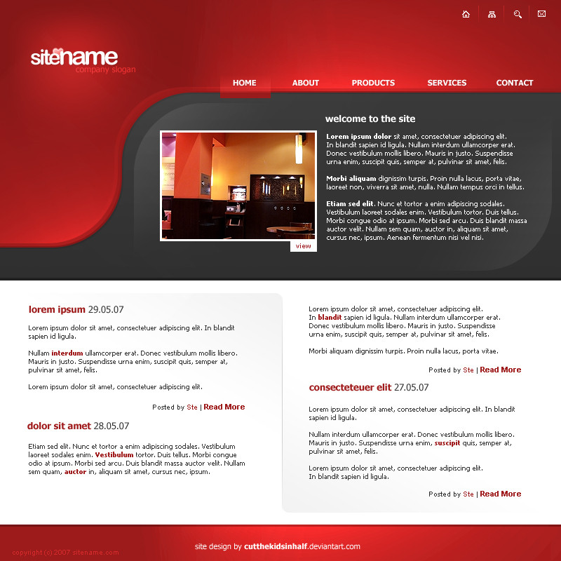
Havn't made a web template in a while. Wanted to make it clean and modern looking. That was the plan anyway.

Full view only.

Comments are very much welcome

*FOR SALE*
Related content
Comments: 66

ryanbdesigns [2010-12-13 17:33:54 +0000 UTC]

very nice, i love it

👍: 0 ⏩: 0

tahirraza [2010-11-29 10:18:31 +0000 UTC]

gr8 color theme

👍: 0 ⏩: 0

teyoliia [2010-08-02 20:27:47 +0000 UTC]

ah, that's realy nice and fresh lookin P:
nice color sheme also, i like it! :)

👍: 0 ⏩: 0

prapareus [2010-06-24 07:36:05 +0000 UTC]

nice job

👍: 0 ⏩: 1

cutthekidsinhalf In reply to prapareus [2010-06-25 12:57:20 +0000 UTC]

Thanks!

👍: 0 ⏩: 0

CJ-M [2010-05-23 00:55:36 +0000 UTC]

Woah! That just made my day!!!

I like the header, except the fact that it has a huge BLANK spot under the logo.
Maybe you should add, mabe a sidebar or something...

Either way, it looks great! It was just a recommendation. It's YOUR web design anyway.

👍: 0 ⏩: 1

cutthekidsinhalf In reply to CJ-M [2010-05-23 13:39:26 +0000 UTC]

Hey, thanks for the kind words. I agree with your comment. I did this a long time ago, but I still quite like the big blank spot (even though it may not be so appropriate for a corporate site!). Thanks for the comment.

👍: 0 ⏩: 0

BioSss [2009-06-10 19:26:49 +0000 UTC]

Do like the shapes of top line...
And the colors too ..

👍: 0 ⏩: 0

katewheeler [2009-03-17 13:29:09 +0000 UTC]

Nice design, I especially like the header.

👍: 0 ⏩: 0

raestarize [2008-12-03 06:29:44 +0000 UTC]

love the header!

👍: 0 ⏩: 0

anakfreak [2008-11-27 13:55:25 +0000 UTC]

very nice i like it

👍: 0 ⏩: 0

x00b [2008-08-03 09:24:02 +0000 UTC]

great work man, just wondering .. how can i get it

👍: 0 ⏩: 1

cutthekidsinhalf In reply to x00b [2008-08-03 11:21:15 +0000 UTC]

If you would like to buy it, send me a note and we can discuss it further.

👍: 0 ⏩: 0

ronaldo99 [2008-05-21 12:19:56 +0000 UTC]

i wanna buy T .. ,

👍: 0 ⏩: 0

gmathur19 [2008-03-28 09:51:46 +0000 UTC]

like the header..nice one..!

👍: 0 ⏩: 0

wesloo123 [2008-03-24 17:12:31 +0000 UTC]

verry nice

i like it

👍: 0 ⏩: 0

XLV [2008-03-05 22:08:00 +0000 UTC]

Woah! I love the tessellating column panels and the horizontal split layout/colours. Great work.

👍: 0 ⏩: 1

cutthekidsinhalf In reply to XLV [2008-03-06 17:17:56 +0000 UTC]

Thanks

👍: 0 ⏩: 0

MD-Style [2008-01-02 13:14:56 +0000 UTC]

I really like it... Simple, but the colours are amazing... KIU

👍: 0 ⏩: 0

pur1fy [2007-12-09 20:32:55 +0000 UTC]

Mega nice !

And bye the way, you threw me some ideas with this. Many many many many thanks.

👍: 0 ⏩: 0

ecks666 [2007-11-05 15:57:51 +0000 UTC]

nice and clean
and i liked tha idea of makin a gradient in place of buttons up
keep up

👍: 0 ⏩: 0

aldore [2007-11-04 21:15:54 +0000 UTC]

Totally it seems really good. Colours and lines pretty fine, but it is too plain. Anyway it is good work.

👍: 0 ⏩: 0

biag [2007-09-28 06:11:53 +0000 UTC]

It has a nice concept and very nice colours. But this can not be a professional web design. This would be virtually impossible to code as well as the fact that pro websites are laid out like a web site. But besides that it is very apealing.

👍: 0 ⏩: 1

cutthekidsinhalf In reply to biag [2007-09-28 17:26:03 +0000 UTC]

True it would be difficult to code but i don't think it would be impossible? Thanks for your comment

👍: 0 ⏩: 1

biag In reply to cutthekidsinhalf [2007-09-29 03:23:18 +0000 UTC]

Yes it would be actually, it is graphically very good but the way it is laid out... Like the gradients on the background would be impossible and a few little things. But overall a few tweaks and it could be possible to code. Nice job though. You have a good graphical taste.

👍: 0 ⏩: 1

mangatobbey In reply to biag [2007-10-14 23:10:51 +0000 UTC]

nah, it aint impossible m8 Just piece it up right and you may find a way to make ut work. But it will take som serious thinking though

Nice design m8!

Cheers from *mangatobbey

+fav on the way!

👍: 0 ⏩: 0

paede [2007-09-13 09:39:32 +0000 UTC]

Its great.

👍: 0 ⏩: 0

FZN09 [2007-08-24 12:51:15 +0000 UTC]

Really nice job

👍: 0 ⏩: 0

m-gfx [2007-07-03 23:43:34 +0000 UTC]

Love that Ste, The red is great!

👍: 0 ⏩: 0

chiqmontes [2007-07-02 11:48:19 +0000 UTC]

quite unique

👍: 0 ⏩: 0

Sacharus [2007-06-30 09:17:28 +0000 UTC]

lovely design .. kinda like the way i'd like my teams website to be.. nice one anyway, cheers!

👍: 0 ⏩: 0

OnnuR [2007-06-26 08:34:43 +0000 UTC]

thnx bro.

👍: 0 ⏩: 0

Bonecraker [2007-06-13 21:42:58 +0000 UTC]

Great man! Love the modern style

👍: 0 ⏩: 0

niponwar [2007-06-12 13:01:55 +0000 UTC]

looks nice, looks simple...

👍: 0 ⏩: 0

WebRules [2007-06-12 12:45:27 +0000 UTC]

gud one, nice colors and very attarctive

👍: 0 ⏩: 0

MCMaybach [2007-06-11 19:30:00 +0000 UTC]

very nice

👍: 0 ⏩: 1

cutthekidsinhalf In reply to MCMaybach [2007-06-12 10:55:40 +0000 UTC]

Thanks

👍: 0 ⏩: 0

Bloomy021 [2007-06-11 19:28:16 +0000 UTC]

really nice job

👍: 0 ⏩: 1

cutthekidsinhalf In reply to Bloomy021 [2007-06-12 10:55:11 +0000 UTC]

Thanks

👍: 0 ⏩: 0

elusive [2007-06-05 14:10:32 +0000 UTC]

Quite attractive

👍: 0 ⏩: 1

cutthekidsinhalf In reply to elusive [2007-06-05 22:41:48 +0000 UTC]

Cheers dude

👍: 0 ⏩: 0

Revann [2007-06-05 12:42:28 +0000 UTC]

It looks really cool dude,

👍: 0 ⏩: 1

cutthekidsinhalf In reply to Revann [2007-06-05 22:44:07 +0000 UTC]

Thanks

👍: 0 ⏩: 0

dnsbty [2007-05-31 14:54:38 +0000 UTC]

I really like it. It might be a little better if you went with the gray the whole way through, but I still like it really good right now.

👍: 0 ⏩: 0

Calabur [2007-05-30 19:46:32 +0000 UTC]

Looks good, but I'm not sure about the hover (presuming that's what it's meant to be), ruins the flow a bit.

👍: 0 ⏩: 0

jtobinj [2007-05-30 16:02:22 +0000 UTC]

Nice work. I think the text would look better one or two pixels larger; but thats just down to individual preference I guess

👍: 0 ⏩: 1

cutthekidsinhalf In reply to jtobinj [2007-05-30 16:52:59 +0000 UTC]

Yeah maybe the text is a bit small, i might make an updated version later. Thanks for the comment

👍: 0 ⏩: 0

termi1992 [2007-05-29 20:04:17 +0000 UTC]

looks very great

👍: 0 ⏩: 0

ritwikr [2007-05-29 19:31:55 +0000 UTC]

Love everything except the small font and the font type. Colours and everything else is fabulous.

Great work!

👍: 0 ⏩: 0

fxu5 [2007-05-29 17:27:19 +0000 UTC]

wow this looks rly cool

👍: 0 ⏩: 0


| Next =>