HOME | DD
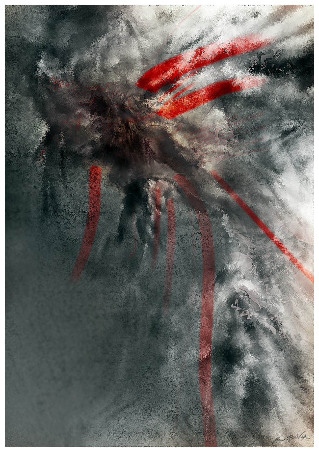
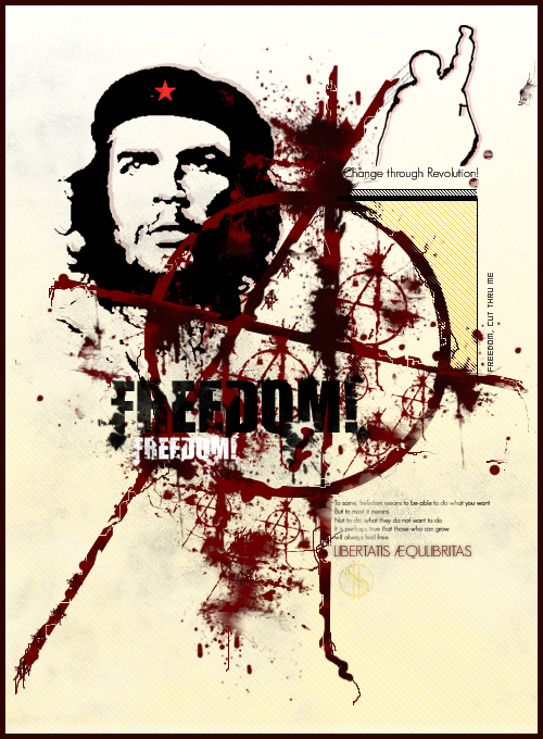
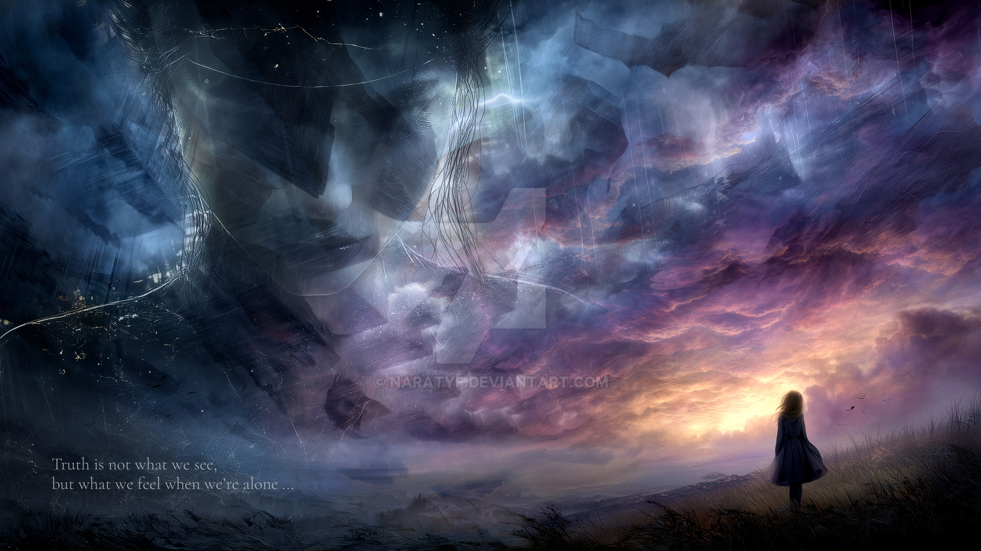
 CutThruMe — Sangreal
Published: 2006-03-06 11:41:09 +0000 UTC; Views: 963; Favourites: 20; Downloads: 218
Redirect to original
Description
xRelated content


Comments: 24

that is pretty damn cool, I think if you had used a wave filter on the red lines it would have added more to the dynamic of your piece. Great piece regardless though
👍: 0 ⏩: 1

Ey,never even considered it, I also notice just now, that I should have left out details in the lower right corner. Thanks for the feedback
 (Smile)")
👍: 0 ⏩: 0


I Really like this one!
Sangreal! Doesn't that mean "the grail?"
👍: 0 ⏩: 0

hah, i love the look and colors...and looks like a griffin' whose body got ripped open and those big red streaks represent the blood. that's how it is to me. i see the griffin' face in the upper left of the image. and in the middle where there's thin red lines...there seems to be like 3 figures inside that area, at least to me.
👍: 0 ⏩: 0

I've seen something similar in my dreams. Its absolutely terrifying.
👍: 0 ⏩: 1
indeed I have about a year and a half ago. So yeah thank for communicating the thought to art. You've trapped it in art forever.
👍: 0 ⏩: 0

i love the texture and the red fits in perfectly ^_^
👍: 0 ⏩: 0

very interesting. it reminds me either of a crashing sea or a dark stormy sky.
👍: 0 ⏩: 0
very interesting. it reminds me either of a crashing sea or a dark stormy sky.
👍: 0 ⏩: 0


Yea the red streaks, I think it's not working becuase of the unrealism, the rest of the peice can look realistic but the red streaks look completely fake. Nice try though, you're still talented
👍: 0 ⏩: 0

hum its a start, iono wa i dont like about it. I think its the red stripes...
👍: 0 ⏩: 0

Well, I like what I imagine I am seeing, a god coming through the clouds. But I can't get over the fact that it looks all pointillized. Somehow it feels simply too low in resolution to truly appreciate and understand, so it comes off more abstract ")
👍: 0 ⏩: 0


I like the red strokes....overal could use some more, but it looks good
👍: 0 ⏩: 0


