HOME | DD
 cyberkorn — Only Feeling
Published: 2006-08-11 22:56:56 +0000 UTC; Views: 1106; Favourites: 18; Downloads: 8
Redirect to original
Description
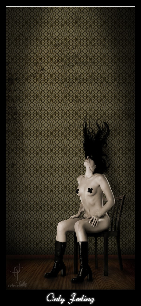
Girl and Textures Photocase.com*Fullview for details
*Porque nadie me dijo que el titulo estaba mal? ¬¬'
Related content


Comments: 31

Oh, que bien, muchas gracias por la ayuda

👍: 0 ⏩: 1

de nas, me encanta esta ^_^
👍: 0 ⏩: 0
Y ahora que se que sabes español (me pasa por no leer xd) Digo que está increible!
👍: 0 ⏩: 1
Muchas gracias por venir a ver
👍: 0 ⏩: 0

awesome, stunning photo!! also like the retro-ish touch, the colours .. its beautiful
the only thing distracting (to me) is that title , i think itsd too flashy!
- natasha
👍: 0 ⏩: 1
")
I´ve thinkig remove or not use anymore titles .
👍: 0 ⏩: 2
yeah... well i dunno, maybe in another letter type, or other colour (maybe grey-ish?)... its difficult.
titles on itself are cool, it gives a piece more depth or some meaning, you try to express something with your art usually, so a title is good. the only problem is how to emerge the title into the piece! umm i´m sorry i cant give you a better advise, but for sure the photograph is a beauty ")
- natasha
👍: 0 ⏩: 1
Wow, thank you for the advice
👍: 0 ⏩: 0
yeah... well i dunno, maybe in another letter type, or other colour (maybe grey-ish?)... its difficult.
titles on itself are cool, it gives a piece more depth or some meaning, you try to express something with your art usually, so a title is good. the only problem is how to emerge the title into the piece! umm i´m sorry i cant give you a better advise, but for sure the photograph is a beauty
- natasha
👍: 0 ⏩: 0


Oh basta compa jeje,
thanks

👍: 0 ⏩: 0


Y gracias Hertty Shula, ya voy a tratar de hacer mas fetish

👍: 0 ⏩: 0


Wow este trabajo te quedo grandioso  (Smile)")

👍: 0 ⏩: 1
Vaya que me quedo sencillo, le iba a poner tanta cosa que al final fui quitando mejor, y asi quedo, gracias por venir a ver
👍: 0 ⏩: 0

Como hiciste la letras con gota de agua en el diseño?
👍: 0 ⏩: 1
Solo bajas la transparencia de la fuente, es todo.
👍: 0 ⏩: 0


Gracias, aqui subiendo algo jeje.
👍: 0 ⏩: 0

woooooooooooooow sexy, nice stars on her nipples, i like the pose and i like the boots
👍: 0 ⏩: 0