HOME | DD
 cyberyt — Final mock-up for 'The Thing'

Published: 2005-01-29 15:37:08 +0000 UTC; Views: 1076; Favourites: 16; Downloads: 102
Redirect to original
Description
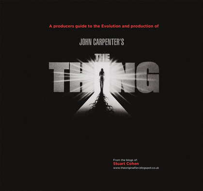
Poster/dvd design for the movie 'The Thing' by John Carpenter, ace film! [link]This is the last mock-up before i take it to computer. The first of which was this: [link]
Yes, none of this was made using a computer! The type was printed and then physically cut up and stuck using pritt stick, then rephotocopied several times to get the grain and noise, the hand is also a photocopy, of a copy, of a copy. Both copied onto Simulator paper (the tracing paper used by architects for building plans, the ink is blue on such plans, because blue, and simulator papaer, is very hard to photocopy ewll, little bit of history for you there!)
I know i like it, i know my lecturer doesn't, what do you think?
Oh, the blue will be blue, not this dodgy colour my scanner has decided to interpret it as.
And no, i can't be arsed to photoshop it right now.
Related content
Comments: 19

this looks excellent. i would like to see it as a poster
👍: 0 ⏩: 0

I think this is great, can't understand why your lecturer wouldn't either.
Kinda reminds of of the movie White Noise, I actually like the hand as over-exposed as it is. To me it makes it look like it's touching the inside of the screen as it were (Why it reminded me of White Noise), but that probably wasn't your intention. Still, I like it. I also noticed the sudden cut off at the top, looks a bit out of place. I really like this, nice work 
👍: 0 ⏩: 0

I think its fantastic. Subtle and gritty. No idea why your lecturer doesn't like it.
👍: 0 ⏩: 0

I agree with Lupius about the hand, perhaps less human in form. There is also of whiteblue-space at the bottom perhaps you could shift the whole thing down or fill it up. It's impresive and has shock value.
👍: 0 ⏩: 1

ah yes, they went for strike tags instead of del.
There is also of white blue-space.
👍: 0 ⏩: 1

and its for journals only, ////./././.\/,.<,\<,\<<<\\,<\\<\\\\\\
nevermind.
👍: 0 ⏩: 0

I think I will agree with DS about the negative space, but the more I look at it, the more I realise there's some bits of detail you can't crop out or whatever to make it better...
Nostrich's point about the text is also kinda good... and maybe fading the hand would make it stand out more...
It has a great overall effect, the graininess is very cool :3
👍: 0 ⏩: 0

I like this version much more than that other.
I've always loved that oldschool exacto-knife and glue graphic designs. a little more soul in them, not to knock the new style though, each has its own flair.
Very nice, can't wait to see more.
I might have to scrape together some money and have you do a design for my website.
👍: 0 ⏩: 0

i agree with nostrich. the text could do with a little more definition. Otherwise this is a great piece of work. I bet it took a lot longer to do the manual way, than it would have taken in photoshop
👍: 0 ⏩: 0

I like this, its simple. Not too cluttered. But yeah in my opinion the text could be a bit more defined. But still, its nice.
👍: 0 ⏩: 0

That's pretty awesome. I think maybe the text could do with a little more definition.
👍: 0 ⏩: 0

I think it's really good but there seems to be a little too much negative space... I'd try either increasing the type face or increasing the size of the hand and making it less bold and drawing attention from the title... maybe add a distorted face very faintly in the background like when you press your face into spandex or something like that!
The noise idea is very good though and I must say I generally like it, especially the colour as it adds to the atmosphere and the arctic nature of the film.
great work so far!
👍: 0 ⏩: 0

The colour is sufficient, it matches the cold artic climate of the film fine. I'm not sure about that bit at the top where the noise just cuts off, sort that out.
The Hand print is far to over exposed like I think it needs to be more subtle, generally though I think simply focusing on the hand wasn't too great. You could use the same idea but shrink it down capturing another hand and a face...I dunno how to suggest you do that...cover your face in blue paint then looking like you avatar slap it onto paper...but yeah kind of like a face from a slight side angle with an open mouth...to reflect the fucked up creature in one of the scenes...also...the other hand if you even contemplate this which I doubt you will but still this is what comments are for right? On the bus I printed the back of my hand onto the condensation of a window it had a pretty funky look...less than human...give it a go at least?
The logo looks far to cut out, make it more defined. Also perhaps you could have a fade from the bottom of an antartic landscape...not so it completely fucks up the picture just you know using the same methods as the desert of ice is something I think shouldn't be left out.
Cool enough anyway
👍: 0 ⏩: 0

Reminds me of some particular scenes in 'White Noise' where distorted, grainy hands press themselves up against the window of the television screen in reasonably shit-pant ways. I like this alot.
👍: 0 ⏩: 0

i think its ace, bolden up the type a little bit,the hue of the blue is really ace, got that inky feeling going on, but its lookin great
👍: 0 ⏩: 0


