HOME | DD
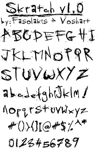
 D-V — Skratchy Font v1.0
Published: 2004-03-21 03:29:27 +0000 UTC; Views: 10568; Favourites: 53; Downloads: 6058
Redirect to original
Description
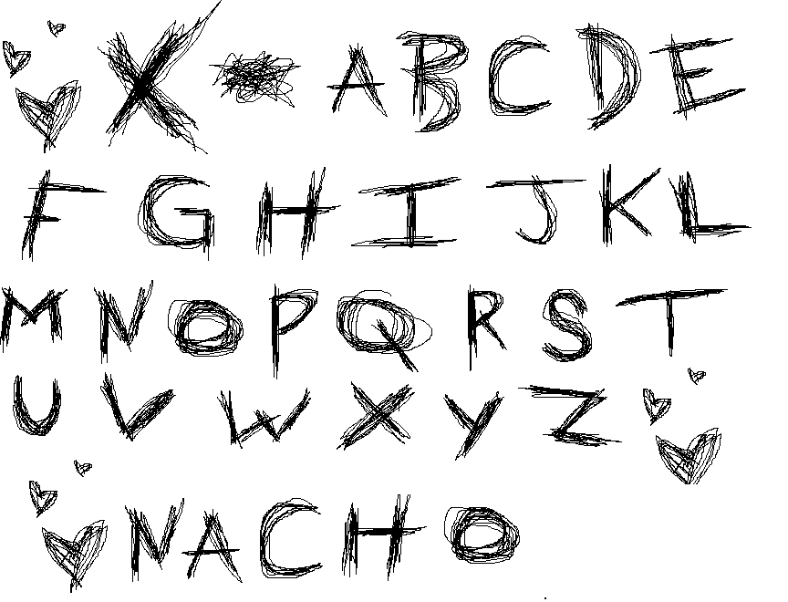
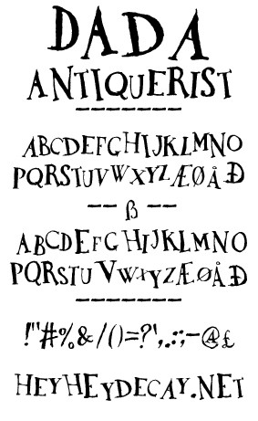
I needed a spooky/evil font. Since I couldn't find one on the AD-ridden Internet I decided to make my own.Font programming by *D-V . Characters by *thespook
This font is nearly bug-free just don't try using the funny looking letters (the ones you can’t access through your keyboard alone
") )
) If you use this font, drop *thespook a line and tell him thanks for such a wicked text.
Original image here : [link]
All fonts can be blown up infinitely without pixelation, they are all in vector form.
-EDIT-
Non-commercial use only. If you plan on using this in a publication please contact me first. The use in deviations is recommended.
Version 2.0 will be out soon.
Related content


Comments: 29

I know this is a very old uplaod but it sucks that I can't download it!! AGH!!
👍: 0 ⏩: 0


It doesn't work ;_; could you reupload it? Plzzz It' so amazing!!!
👍: 0 ⏩: 0


EEEEEEXCELLENT!! just what i've been looking for! verry Johnny The Homicidal Maniac/Noodle Boy...
now have to see if it fits the image.... 2thumbsUP!
👍: 0 ⏩: 1
bummer! can't seem to download it! it says 'file not found'.... how can i get this? finally found what i've been looking for and now i can't down it...
👍: 0 ⏩: 1

me too ")
this looks sooo good but links broken
👍: 0 ⏩: 0

cool font =]
i may use it in a banner.if i do i will comment/note you  (Wink)")
👍: 0 ⏩: 0

Rockin' font, you did an awersome job of coding 's work. I used this here: [link] Since you actually turned it into a font file, I felt you deserve some credit! Thanks!
👍: 0 ⏩: 0

")

 (Smile)")

it wont download for me

👍: 0 ⏩: 0


awesome work man. im glad someone actual makes a full font instead of just lowercase or uppercase letters. there are both and symbols and #s
")
👍: 0 ⏩: 0

This is great! i have to download it, but im not at my comp now. damnit. well,

👍: 0 ⏩: 0

hi, I like it a lot, I 've used it in my deviantID ,
just writing 'mulaktik' with this font
[a link to deviation and your name will be included
on 'Artist's Comment']
tell me if there's a problem, ok?
👍: 0 ⏩: 1

hi, I like it so much, I think I'll use it in my deviantID ,
if there's no problem.
just writing 'mulaktik' with this font
[a link to deviation and your name will be included
on 'Artist's Comment']
can I ?
👍: 0 ⏩: 0


wow, this is some cool font! I think It's gonna be very useful
congrats on creating this!

👍: 0 ⏩: 0

very sketchy very nice~
I'm currently on an assignment to create fonts too.. is there any rules in creating fonts?
👍: 0 ⏩: 1

well sure, usually in formal font there should be no overlapping of characters. the rest is pretty much dependant on style. consistency among letters is usually important (CAPS being the same height, same goes for lower case)
good luck and send me a link to the finished product.
👍: 0 ⏩: 0

Woop. I love this font.. its my new favorite. Good job to you both.. -runs to thespook's site- wooppp
👍: 0 ⏩: 0

Great work
all the character spacing and whatnot is right on the mark.
the only thing i could suggest (and if anything it only reflects on my orginal brush set) is that a ' is needed.
i whent to type I'm and i just got I m.
apart from that it was great to fianly type with those scratchy letters
ps. Fasolakis is a false name i use for the amusement of the greeks of DA


👍: 0 ⏩: 1
well it was one funky name, didn't realy questing it. 
uhh, thats why it is v1.0

👍: 0 ⏩: 1
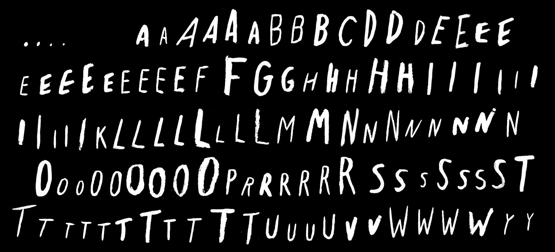
i'll sketch up those extra characters i missed soonish.
👍: 0 ⏩: 0