HOME | DD

d0rn β€” 
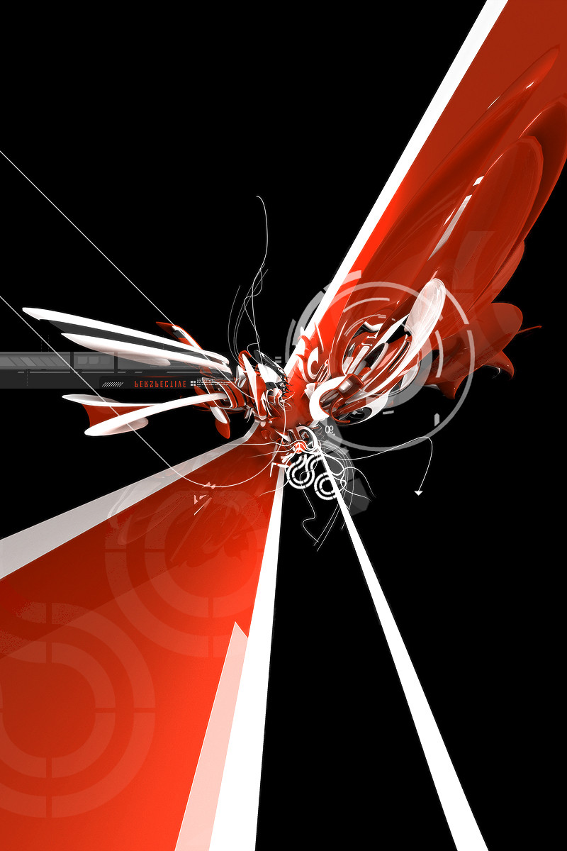
Letters are more than Words

Published: 2007-08-07 10:20:58 +0000 UTC; Views: 44843; Favourites: 933; Downloads: 3510
Redirect to original
Description Something rather simple ... working with typo and so on...
I think the title says it all
Related content
Comments: 253

nasroel [2011-01-27 14:38:51 +0000 UTC]

awsome. . .
How to render like this?

πŸ‘: 0 ⏩: 0

digitaldelightuk [2010-08-16 18:41:13 +0000 UTC]

Amazing!

πŸ‘: 0 ⏩: 0

vindustry [2010-07-04 18:55:27 +0000 UTC]

well done

πŸ‘: 0 ⏩: 0

feralzombie [2010-04-25 14:38:56 +0000 UTC]

Amazing

πŸ‘: 0 ⏩: 0

oliveremerson [2010-01-18 04:09:08 +0000 UTC]

sexy...

πŸ‘: 0 ⏩: 0

emodist [2009-09-30 00:24:25 +0000 UTC]

outstanding!

πŸ‘: 0 ⏩: 0

area105 [2009-09-28 12:31:52 +0000 UTC]

wow...interesting

πŸ‘: 0 ⏩: 0

engine1 [2009-08-07 05:13:42 +0000 UTC]

Beautiful. On the level of Dali.

πŸ‘: 0 ⏩: 0

crcunltd [2009-07-23 16:18:51 +0000 UTC]

sometimes they are a sentence

πŸ‘: 0 ⏩: 0

ScarletBits [2009-07-04 17:22:49 +0000 UTC]

Hey! Great Artwork, I picked it today for one of my featured blog posts: [link] , Keep it up!

πŸ‘: 0 ⏩: 0

raphee-o [2009-04-17 15:00:33 +0000 UTC]

hey what program did you use to make this?

πŸ‘: 0 ⏩: 0

XpapaleoX [2009-03-09 01:40:40 +0000 UTC]

that's incredible! The letters, composition, movement, everything

πŸ‘: 0 ⏩: 0

FaMz [2008-08-23 20:53:46 +0000 UTC]

Featured your piece in my journal [link]

Hope you have a great week

πŸ‘: 0 ⏩: 0

Tiimbo [2008-07-28 06:47:33 +0000 UTC]

hrm, that's quite cool

πŸ‘: 0 ⏩: 0

AirDesign06 [2008-07-19 16:37:41 +0000 UTC]

cool

πŸ‘: 0 ⏩: 0

FaMz [2008-06-29 21:40:37 +0000 UTC]

Featured your piece in my journal [link]

πŸ‘: 0 ⏩: 0

FaMz [2008-06-20 15:48:33 +0000 UTC]

this is very well put together and I love the blend of the colours

the text looks like a horse about to run off

πŸ‘: 0 ⏩: 0

or5 [2008-06-08 09:44:58 +0000 UTC]

wow, it's great work and visual!!!!

πŸ‘: 0 ⏩: 0

eesh1 [2008-06-07 15:17:29 +0000 UTC]

yes they are

πŸ‘: 0 ⏩: 0

DkDesignCentral [2008-05-02 20:52:56 +0000 UTC]

WOW!
great work mate!

πŸ‘: 0 ⏩: 0

tatemze [2008-03-27 10:37:12 +0000 UTC]

This is beautiful. it looks incredibly difficult to me, id love to do something like this for my final major at college, could you give me any pointers please? thanku

πŸ‘: 0 ⏩: 0

DesignYourMind [2008-03-18 10:45:49 +0000 UTC]

awesome i love it

πŸ‘: 0 ⏩: 1

d0rn In reply to DesignYourMind [2008-03-19 08:27:01 +0000 UTC]

thanks

πŸ‘: 0 ⏩: 0

doodle-lee-doo [2008-02-01 22:27:10 +0000 UTC]

Hab grad nach Typo gesucht, sehe n super Bild bei den besten in dieser Kategorie /nΓ€mlich dieses hier. Denke mir so: hhm, der Stil kommt mir doch irgendwie bekannt vor. Sieht doch nach d0rn aus. Stimmt.


Geiler Stil!

πŸ‘: 0 ⏩: 1

d0rn In reply to doodle-lee-doo [2008-02-04 11:32:40 +0000 UTC]

.. marke d0rn

πŸ‘: 0 ⏩: 0

benrulz [2008-02-01 06:43:16 +0000 UTC]

great stuff.... so exactly wich software do u use for doin 3d text and stuff...the design is beautiful....

πŸ‘: 0 ⏩: 1

d0rn In reply to benrulz [2008-02-04 11:32:03 +0000 UTC]

thanks am using cinema4d

πŸ‘: 0 ⏩: 0

TastesLikeArsenic [2008-01-30 20:37:50 +0000 UTC]

holy shit thats cool

πŸ‘: 0 ⏩: 1

d0rn In reply to TastesLikeArsenic [2008-02-04 11:33:42 +0000 UTC]

thanks

πŸ‘: 0 ⏩: 1

TastesLikeArsenic In reply to d0rn [2008-02-05 00:01:17 +0000 UTC]

no prob

πŸ‘: 0 ⏩: 0

Smudgie [2007-12-30 06:35:14 +0000 UTC]

Absolutely stunning!

πŸ‘: 0 ⏩: 1

d0rn In reply to Smudgie [2008-01-05 10:28:39 +0000 UTC]

thanks

πŸ‘: 0 ⏩: 0

KevinGerardDesign [2007-11-26 22:25:19 +0000 UTC]

great work

πŸ‘: 0 ⏩: 0

lostbooks [2007-11-23 05:34:06 +0000 UTC]

I am scouting for work for my Lost Book Club and Museum , and I think this piece would be a good fit. I wonder if you would grant us permission to post it in the club gallery for the amazement and edification of our small but growing audience. I thank you for considering this request.

Best Regards,
James Koehnline

Director/Curator, The Lost Book Club and Museum

πŸ‘: 0 ⏩: 1

d0rn In reply to lostbooks [2007-11-23 16:23:16 +0000 UTC]

sure, no problem. Just wondering what our club is about form what I have read so far sound very interesting.

πŸ‘: 0 ⏩: 0

vikas1307 [2007-10-24 18:57:41 +0000 UTC]

love it..

πŸ‘: 0 ⏩: 1

d0rn In reply to vikas1307 [2007-10-25 11:06:58 +0000 UTC]

glad you do so..

πŸ‘: 0 ⏩: 0

SJGSJG [2007-10-16 07:50:19 +0000 UTC]

πŸ‘: 0 ⏩: 1

d0rn In reply to SJGSJG [2007-10-18 07:23:30 +0000 UTC]

πŸ‘: 0 ⏩: 0

vega0ne [2007-10-13 15:48:05 +0000 UTC]

This is just utterly amazing. The composition is exceptional as well as the spare use of color. A favourite for sure!

πŸ‘: 0 ⏩: 1

d0rn In reply to vega0ne [2007-10-15 13:51:58 +0000 UTC]

thanks a bunch for your kind words ... du bist ja aus deutschland nutzt das englisch aus garnix ^

πŸ‘: 0 ⏩: 0

cranial-bore [2007-09-16 06:34:23 +0000 UTC]

Excellent work, love the light and energy. The reds also work well with the blue colour scheme.

Only negative bit to mind mind is the 'G' at top right, the purple and green colours coming through it disrupt the image IMO. Tint it blue for an easy fix.

Great stuff

πŸ‘: 0 ⏩: 1

d0rn In reply to cranial-bore [2007-09-28 17:58:08 +0000 UTC]

thanks for the suggstion

πŸ‘: 0 ⏩: 0

JaquelineMoreno [2007-08-29 15:58:37 +0000 UTC]

Hi... Fantastic its image...
which program you used?

πŸ‘: 0 ⏩: 0

FabF [2007-08-28 17:44:38 +0000 UTC]

Wonderful !

πŸ‘: 0 ⏩: 0

chaaabi [2007-08-17 10:02:01 +0000 UTC]

this is an excellent work.. this really amazing that i ed et! what program did you use for this?

πŸ‘: 0 ⏩: 1

d0rn In reply to chaaabi [2007-08-18 09:50:49 +0000 UTC]

thanks
used cinema4d

πŸ‘: 0 ⏩: 1

chaaabi In reply to d0rn [2007-08-18 11:14:34 +0000 UTC]

ah, i think i've never heard of that.. hehe.. thanks!

πŸ‘: 0 ⏩: 0

Neordian [2007-08-13 11:47:19 +0000 UTC]

Hmm, das Bild hat einen interessanten abmivalenten und sybmolischen Aussagecharakter!

πŸ‘: 0 ⏩: 0

marswar [2007-08-13 07:19:56 +0000 UTC]

cool ein implodierter korkenzieher

πŸ‘: 0 ⏩: 0


| Next =>