HOME | DD
 d1git — Aperture

Published: 2008-01-08 04:39:37 +0000 UTC; Views: 1036; Favourites: 12; Downloads: 30
Redirect to original
Description
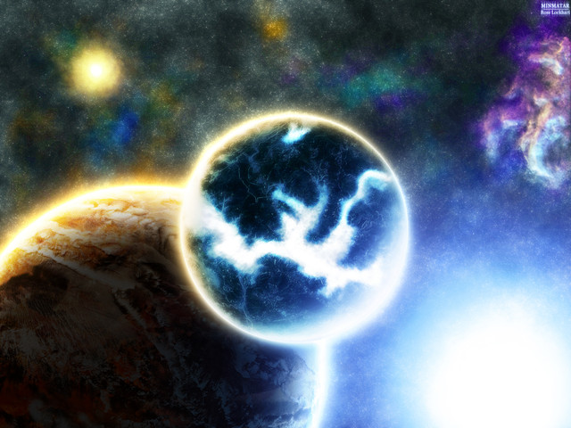
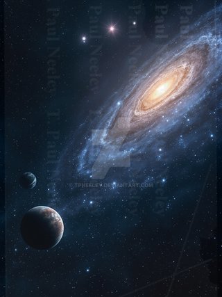
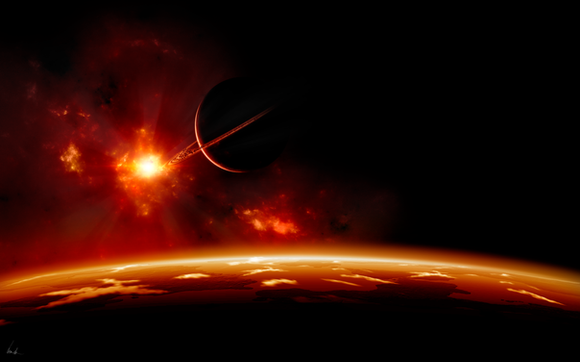
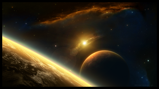
Started this off of an early version of =PlasmaX7 's [link] but really destroyed it over a few days to end up with this


 . First piece I've done in a long time, crits encouraged please


Credits to for multiple textures used in the planets' surfaces.
-Ross
Related content
Comments: 13

Love the surface of the big planet and the starfield is nicely done
Nice work
👍: 0 ⏩: 0

Texture of bigger planet is simply gorgeous!
Rest is too blurred to me :/
If it wasn't it'd be great work
If You feld offenced by this comment i'm sorry, it wasn't my intention.
👍: 0 ⏩: 0

Nice overall image however it looks slightly blurred and if your trying to get that effect then thats ok but i think it would look alot nicer if it was 'de blurred' to show the planets detail 
👍: 0 ⏩: 2

thanks 

👍: 0 ⏩: 1

shrinking it down retains and improves the quality?
👍: 0 ⏩: 0

sphere is right, although the large planet looks quite crisp, the moon is awfully blurry. And as I mentioned on SV, the neb. could be crisper, too. I realllly like it though..even for a
👍: 0 ⏩: 0

totally love the planet textures, good job
pretty hard to find something to critisize here
- but maybe try to add a little more depth and show some scale
just a suggestion though
👍: 0 ⏩: 0

very nice, im fond of teh soft look of this piece, has a calming sensation
quality is improveing greatly. could use a teensy bit more depth.
👍: 0 ⏩: 1

thanks 
👍: 0 ⏩: 1

Those beams actually kind of screw up the depth completely for me; because they are coming out at all different angles, and the suggestion is different lightsources, it all gets a bit confusing and hard to judge.
👍: 0 ⏩: 0

Looking good now, way better than the previous, like the colors.
👍: 0 ⏩: 1


👍: 0 ⏩: 0
