HOME | DD
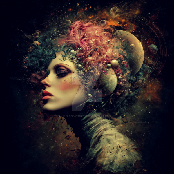
 da505 — Violet Rhapsody

#apstract #da505 #outofconfortzone #blackandwhite #contrast #experiment #rhapsody #violet
Published: 2017-12-02 20:58:00 +0000 UTC; Views: 2457; Favourites: 203; Downloads: 22
Redirect to original
Description
AT LAST. For a long time I create something new. I create this work for OUT OF CONFORT ZONE CONTEST. I create abstract art with more painting and contrast playing. I combined painted and retouched elements. This is total experiment and I'm happy with the result.I hope that everyone will like this work
Entry for the Out of Your Comfort Zone contest at CRPhotomanipulation
Girl: fav.me/d3n5djn
Hair: fav.me/d7wphwk
Tears: fav.me/d27dbyf
Wings: aegean-prince.deviantart.com/a…
Branches: fav.me/d4xmblb
Flower 1: fav.me/d5prs5w
Flower 2: fav.me/d7kq480
Flower 3: fav.me/d7jse5u
Flower 4: fav.me/d5pd87x
Rose: fav.me/d781dp8
Rose Petals: fav.me/d7mo1wq
Flowers: fav.me/d8iamkm
Floral Branch: fav.me/d387ehv
Medalion: fav.me/d7jntd5
Metal texture: fav.me/d2dmmpz
Fractals 1: fav.me/d5f56gf
Fractals 2: fav.me/d3lfvvg
Fractals 3: fav.me/d775c8n
Fractal 4: fav.me/d3lgcci
Rest was painted and retouched by me.
Thank you very much fort his great resources.
Best regards David.
Related content


Comments: 58

 (Smile)")


First of all I just want to say how much you've improved since the last time I reviewed one of your artworks: "Queen Rose". And judging from all the faves on this, I'm not the only one who thinks so.
There are no rough edges, everything is smooth, the colors are all working very well together. One of the first things I noticed was how well you blend the stocks. I wasn't even sure which model you used until I clicked the link, and then my mind was blown! I've seen that model absolutely everywhere and I didn't even recognise it!
Anyway, let's get started!
VISION
The vision is obviously a fantasy portrait style, but I rate high for the fresh presentation. The contrast is also in the perfect range, where in "Queen Rose", it was a little washed out and didn't pop off the background enough.
Speaking of background, I also love the depth of focus you've created using the blur. It goes perfectly with the theme of the artwork, but doesn't distract from the model or interfere with the effect you were trying to create.
ORIGINALITY
As portraits go, everything appears very fresh and new on the screen, with the lighting placed in just the center where it attracts maximum attention, especially in the thumbnail where it appeared very fresh to me when I first saw it. Makes you want to click the full version immediately.
TECHNIQUE
Technique is definitely where your biggest improvement is. I love that all the stocks rhyme with each other, and are all of equal quality. They blend perfectly and look like they're all part of one big headdress. The monochrome color scheme is normally rather mute, but it's brought completely to live by the violet color and the fractals.
IMPACT
The little details are what really takes the prize for impact, I think. As I said before, just the fact that you were able to take all these different stocks and change the look of the model so drastically. And how it still manages to look so real. (The little flowers curling around the wing tip is astounding!) Mixing stocks so perfectly is one of my FAVOURITE things to see in an artwork. To see something only the artist can create. Love it!
My one issue is, it's difficult to place the genre. Some elements of fantasy, some sci-fi (represented by the light on her face) and the gothic/dark style tears, make this piece look somewhat confused-- but only if you look hard enough for long enough (like me, lol)
And if I could sneak another issue, not really related to the artwork, it would be the signature. I love the way your written signature looks, but I think the one that says "deviantart 2017" is just distracting me from the art a little.
But other than that, I can't think of anything I don't like! I don't think I've ever given such a high rating! Great job, I think it's my favorite of your gallery. Great job!

👍: 0 ⏩: 1

Thank you very much for your detail critique.
👍: 0 ⏩: 0


Your work is perfect! I loved soft skin, the colors are beautiful and a perfect harmony with the shade! incredible work!
👍: 0 ⏩: 1
Thank you very much. It's very important for me to hear opinion from artst with experience like yours.
👍: 0 ⏩: 1


Thank you very much. You are welcome I'm big fan of your art. I'm very happy when I got a comment from great artist like you.
👍: 0 ⏩: 0


")
It's absolutely a very awesome piece David, great work on the model and definitely something out of your comfort zone.

👍: 0 ⏩: 1
Thank you very much for your kind words. I realy try to create something different. I'm happy with result.
👍: 0 ⏩: 1
You are welcome and my pleasure.
 (Wink)")
👍: 0 ⏩: 1


Thank you very much, dear friend. This is something different from my work created for contest.
👍: 0 ⏩: 1

| Next =>