HOME | DD
 dadarulz — Realities 4 of 4 - The Gang

Published: 2005-01-11 22:39:27 +0000 UTC; Views: 2778; Favourites: 24; Downloads: 654
Redirect to original
Description
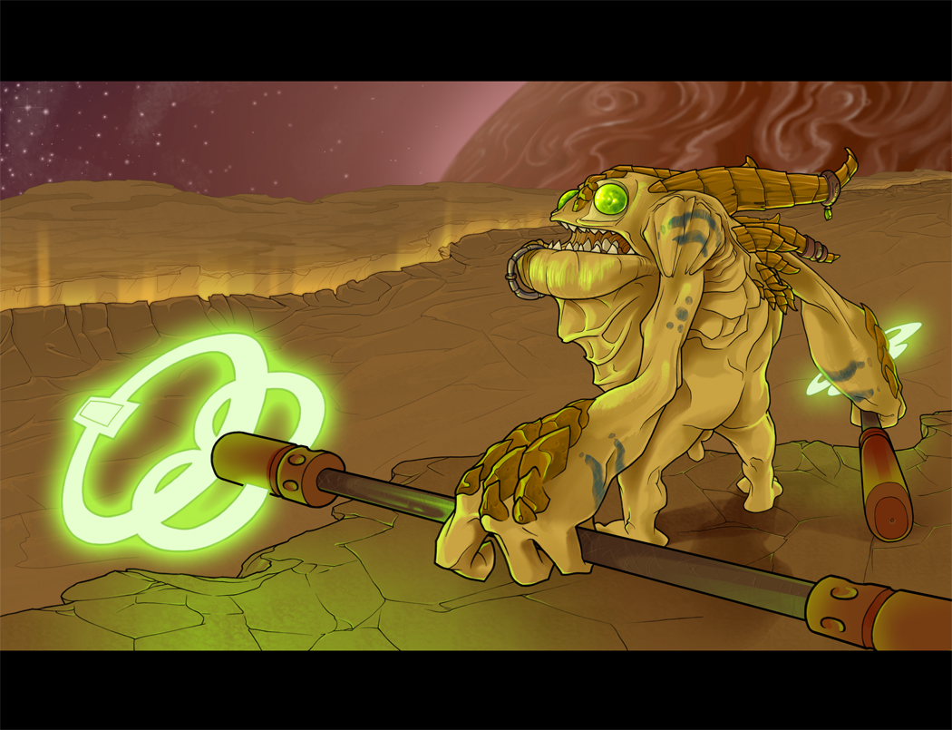
Quatrième partie.. bleh.. c'est devenu de plus en plus laid a force de travailler dessus.
Faut tellement j'me lave pis j'travaille sur mon demo
Fourth part... became uglier by the brush strokes.
I so have to wash myself and start working on my animation project
Related content


Comments: 40


Jesus, this is fantastic. They all have their own personalities, and I have a soft spot for the smoking guy- he's exceptionally creative on your part!
...Lemme know if all of my critiques are getting on your nerves. I just recently realized that saying 'cool' isn't a good enough comment
👍: 0 ⏩: 0

tre bien. the girl with the green hair looks a bit frumpy
👍: 0 ⏩: 0

I like the guy with the green hair and the purple fog surrounding him.
👍: 0 ⏩: 0

Amo realmente l'individuo nel mezzo con i capelli verdi ed il wow di likness di fantasma sbiadendo guarda realmente buono gli altri erano grandi ma l'individuo verde dai capelli ha resistito realmente per me lo amo realmente!!

👍: 0 ⏩: 1

ooook.. I just understood a bit of it.. is this spanish?.. no its like... what? italian? would you be so kind to translate :S
👍: 0 ⏩: 1
yeah sry i feel so dumb i thought you only spoke french and i really wanted to comment on your work, so i translated it at freetranslations.com but then i saw all the english comments and realized you must be bilingual or something sry bout that!! and i thought i translated it into french but...
here's what i meant to say: I really liked the guy with the green hair! His goatee was really nice and i loved his pants!! smoke/phantom they were awesome!!
👍: 0 ⏩: 1
thank you for your effort  (Smile)")
")
👍: 0 ⏩: 0

woman on the right has the creepiest! eyes
*goes to see teh rest of the series (im looking at them in teh wrong order haha)
👍: 0 ⏩: 0

Very very awsome. I can't tell whether the guy in the middle's lower body is gassy or liquidy-perhaps some strange inbetween? The way it globulates and spatters on the floor makes me think liquid, but the transparencies make it look like a gas. I am confused. But it is incredibly well drawn, so don't let me bring you down with myself not being able to tell gas from liquid
👍: 0 ⏩: 1
think of it as that fake smoke they use in movies.. its gas but its well affected by gravity and it always looks like its flowing on the floor
👍: 0 ⏩: 1

La couleur, les traits et l'ambiance ainsi que le coté technique est tout simplement débile!!
Mais je dois t'avouer qu'il n'y a aucun des personnages qui soient à 'mon gout', car tu me connais, j'aime les personnages plus subtils, plus 'dramatiques'.
Mais c'est un travail écoeurant quand même. Une journée je vais aller chez toi t'espionner pour voir tes techniques de coloration et de travail en général.
👍: 0 ⏩: 0

wah oui oui c moi ki te laisse un comment en meme temps ktavoir écri un mail talleur
bon pour dire que jadore lair du mec qui fume jadore sa tete aik d genre de tattoos
jaime bien la fille comme tu peux ten douter, celle kié kasiment tou nu
belle tite shape ki donne le gout de toucher voir si c dla peau ou du plastique
xxxx big hug
luv u
cri
👍: 0 ⏩: 0

The brilliance is in the details.
Great job on the seeping walls and the smoke. I must say you have an unatainable ability to pick up on the littlest of things to finish the piece off.
👍: 0 ⏩: 1
wow.. dont know what to say.. thank you!
👍: 0 ⏩: 0

ah mannnn pkoi tu fais pas des boules méga-hards qu'on puisse jouer du Tam-Tam dessus tk!
humm ya la fille ac les cheveux verts a retravailler
mais comme d'hab ya tes couleurs qui sont TBS l'éclairage et l'ambiance de "ca va chauffer" qui sont aussi TBS
j'aime bin aussi les plis dans l'drap du mec proche de la porte!
👍: 0 ⏩: 1
eh pas dla porte du cadre! DU CADRE, DIS-JE! Allez savoir pourquoi g dit porte!
👍: 0 ⏩: 0

Le mec à droite c'est Ozzy Osbourne!
C'est pas mal chouette, j'suis claquée et j'ai rien à dire, alors

👍: 0 ⏩: 0

nice! j'aime bien celui qui fume pis celui completement a droite!
Moi too jdevrais travailler sur mon demo...
👍: 0 ⏩: 0

MAN, I love how you color! Just beautiful as usual!!!
👍: 0 ⏩: 0

Very cool, great concept for a movie  (Wink)")
Can't help thinking the most left woman's head is somewhat big though. Other than that - excellent piece! 
👍: 0 ⏩: 0

I didn't really like the sketch, but I do like the colors, Gj!
👍: 0 ⏩: 0

J'adore le mec en avant-plan, decidement!!!
Ben heille jvois pas pk tu dis ca, jle trouve tres bien! Les couleurs sont super harmonieuse, ya juste la fille avec la couette... si je peux permettre (hahaha) jtrouve kelle sort un peu etrange comparativement aux autres... c'est p-e sa tete qui est un peu grosse par rapport a où elle se trouve dans l'image... c pas agacant, mais ca parait p-e un peu, je sais pas... tk, c elle que j'aime malheureusement le moins... par contre, pour ce qui est du reste...
J'adore les teintes que ta utilise, c vraiment harmonieux, c comme... ca donne le bon impact aux persos, c vraiment nice! P-e si ca aurait ete juste un peu plus fonce où ya pas de lumiere, comme dans le fond du corridor, ca aurait ete un peu plus dark p-e! Mais le type en avant sort super bien, ye bien agence et j'aime la tite ligne sur sa cape avec le symbol c original. Celui avec la cigarette je l'aimais moins mais en couleur il a vraiment bien sorti! avec la fumé et tout c nice! j'aime comment il est habillé par rapport a son habilité evidente (un gars avec un sabre qui se promene en genre de coton ouaté c hot! hahaha). La fille avec les pas-de-pupilles je croyais qu'elle avait les cheveux longs sur le lineart (genre son haut de manteau jcroyais que ctais ses cheveux au debut) mais j'aime les couleur que tu as utilise, c un beau bleu pour les jeans avec le haut un peu vert c tres beau. Pis le mec-fantome aussi a bien sorti, j'aime son manteau en tk! Et puis ses cheveux verts fit avec ceux de l'autre fille, parfait!
C anodin, mais j'aime le tit chiffre d'etage!
Fak c ca, bon travail en tk, je l'aime beaucoup! et les designs des persos, bien sur!
")
👍: 0 ⏩: 1
la fille a gauche est totalement off.. a ruine toute la shit.. en plus davoir une trop grosse tete, a la une démarche merdique.. stait sensé etre approprié paske stune espece de techno organique donc a marche comme un robot, mais cest pas dutout évident.. pour ne pas dire absent.. fak cest laid
Chus d'accord que ca aurait pu etre plus ombragé, mais j'l'ai pas remarqué.. toujours d'la misère à prendre d'la distance face a mes dessins pour voir ce genre de problèmes la
Pis c'est le numéro de l'appartement... 28F... C'est une porte futuriste (HAHAHA) avec un numero dappart digital.. remarque, ya même un ti oeil magique.. on voit juste pas la poignée.. anyway cest surement une porte qui slide.. tsé dans le futur.. tout slide.. ouais
merci du comment
👍: 0 ⏩: 0

j'avait jamais remarqué avant comment le mec a droit completement yétait sexy a mort o_o
👍: 0 ⏩: 0

trop fort, sa donne tout son sens une fois en couleur man, jcapote
👍: 0 ⏩: 0

I agree 100% with as above. Your stuff is sooo ... really, I cannot begin to describe. But it DOES impress the hell outta me, all the time, EVERY single time. In two years, when I complete my DMT programme, THEN I'm coming to you for personal training, dude!

👍: 0 ⏩: 0

I.. uh.. yeah, so like.. how the hell do you do it.
Uhm.. I have a folder with your nick, and your pics as wallpapers (new one each day), so yeah, just thought you wanted to know.
You are one of the few artists who amaze me, all the time, everytime.
Again, the colors are so freakin' nice, and the character drawings as in how they are bent and like, yeah.
YEAH YEAH YEAH!!!
You get what I mean, YEAH!!!
👍: 0 ⏩: 1
wow! I do that only with pics of girls I find very attractive
hahahahah
thx, im really flattered, hope never to dissapoint you
👍: 0 ⏩: 0

I just want that guys pants-smoke ^-^ Still looks cool, though VERY earthy-toned. And something is wrong with that chick's on the left head. And the other chick has very floppy boobs ^-^ Still spiffy though!
👍: 0 ⏩: 0

j'aime bien le type qui fume sa clop................pis va te laver!!!
👍: 0 ⏩: 0

This just reeks coolness. ^___^ Love the lighting, the tense expressions, the individual character designs...wicked. Will check out your gallery!
👍: 0 ⏩: 0


I really like the muted tones in this--it gives it a nice atmosphere.
👍: 0 ⏩: 1
yah, desaturated the whole thing after I finished it but I still think its too colorful :/
👍: 0 ⏩: 1
Heh. I know what you mean. I love desaturated drawings so much. ^_^ They're just so subtle and wonderful...
👍: 0 ⏩: 0

moi je trouve que c'est un super travaille je suis pas une experte mais j'aime ce que je vois
👍: 0 ⏩: 0


Je t'aime Thom, toi pis tes travaux ambicieux de la mort.
la fille avec les sein presqu'à l'air est composée d'une belle pallette.
Cé beau mon Thom!
👍: 0 ⏩: 0